Skip to content

General

Stuff that doesn’t fit in any other category

Trip Report: Chambers Bay for spectators

When I first heard—way back in 2011—that the US Open was coming to Chambers Bay golf course, located less than three hours from my home in Beaverton, Oregon, I knew I wanted to go. Having played the course (just once), I thought it'd be great fun to watch the pros play at the same place (though with a very different setup…and a very different skill set!)

After much planning and a year of waiting, we finally made the trek last Thursday. We arrived at the course at 7:00am, and didn't leave until after 8:00pm. Overall, it was an amazing experience—heck, I even got to hold the actual trophy during a backstage tour of the TV production facilities. (That was an amazing experience, and well worth the $10/year cost to belong to the USGA, even ignoring all the good stuff they do for the game.)

But having been there for Thursday, I was quite content to return home for the final rounds this weekend, watching on the big screen in high def. Why? Because as amazing as Chambers Bay is to both visit and play (if you're a golfer, it's well worth its outrageous cost), it's a terrible place to watch pro golfers play the game.

[continue reading…]


The bizarre world of digital movie pricing

Recently DirecTV had a free HBO preview weekend; as we're not subscribers, I set our DVR up to record a number of movies. One of those films was X-Men: Days of Future Past. I'd never seen any of the X-Men movies, and I really liked this one. So I decided to watch the other six films in the series, renting them on iTunes and Amazon Instant Video.

I was able to rent all movies except The Wolverine, which is only available as a purchase on either Amazon Video ($12.99) or Apple TV ($14.99). So I had to buy one movie, and rented the other five. In total, I paid $34.94—about $5.82 each—to watch six movies, including buying The Wolverine. That's not outrageously expensive. (I paid an extra $2 to buy the iTunes version, as it's a better viewing experience than Amazon Instant Video.)

But (excluding The Wolverine), that's my cost to watch them just once. If I or anyone in my family wants to watch them in the future, we'll have to pay again. If I want to own the movies, to make them free to watch any time, I could either buy them digitally or on Blu-Ray.

To buy all six movies on iTunes, I'd pay a whopping $89.94, as each is priced at $14.99. (You'd think the first three films, all being at least nine years old, would be cheaper…but you'd think wrong.) Over on Amazon Instant Video, it'd still cost $77.94 to buy the six movies on digital, as they're $12.99 each.

Clearly, if digital is that expensive, then the Blu-Rays will be even more, right? After all, they have to be mastered, duplicated, boxed, sealed, and shipped to retailers. There are physical returns to worry about, and management of all the stuff in all of those steps…so these Blu-Rays are going to be incredibly costly, right? No, not right at all.

A quick trip to amazon.com leads to X-Men and The Wolverine Collection, which contains all six of the movies on Blu-Ray. And the cost for all six movies? Only $34.96, or exactly two cents more than I paid to to rent five and buy one in digital form!

(I found the exact same collection on walmart.com for the same price, too, so this isn't some Amazon-only special pricing. And even at the full list price of $69.99, this collection is still cheaper than the digital versions.)

Even if I wanted to buy all six movies separately, the total cost for all six would be $73.78—still cheaper than either iTunes or Amazon Instant Video! (Most of this cost savings is because the older movies are indeed cheaper than the newer movies. And the newer movies are, in some cases, more than their digital counterparts.)

In a nutshell, I should have simply bought the six-disc collection and been done with it. (It's also not too much work to rip them myself if there's not a bundled digital copy, so I can watch on Apple TV, iPad, etc.)

I'd have spent all of two pennies more than what I did, and I'd own the actual movies, free to use when I like and how I like. Sometimes I really hate Hollywood.


Improve the performance of your audio/video system

I take my audio and video very seriously; my audio/video room is built on a separate foundation from the rest of the house, the sub-floor is acoustically isolated from the foundation, and the walls and floor have been tuned for perfect response regardless of listening position. In short, I don't mess around with my audio/video stuff.

But I always think there's room for improvement, which is why I was so excited by the arrival of my long-backordered Chromatic Response Augmentation Panels, pictured at right.

These panels (a steal at only $229.95 per set of 25; I ordered an eight-pack) are simply incredible. How do they work, you may ask? You apply them to your audio and video cables, and the chemically-coated colors in the panels act on the electrons in the wiring, aligning them for fewer collisions and better flow rate.

Why should you want to reduce collisions and increase flow rate? After installation and 100 hours of continuous testing in my audio/video room, here's why: They're amazing! My audio playback was impressively better than before I installed the augmentation panels. The sound stage was broader yet more nuanced, stereo separation improved by 87%, and I noted a subtle but discernible reduction in noise below the 20Hz level. Incredible!

My 1977 master recording of Steve Fullerton and the Vienna Beach Orchestra performing Riccardo's monumental 1771 symphony "En Periodico De Nada Fulleste" sounds better than I've ever heard it before.

My video playback was similarly improved: The blacks were blacker, the color palette was stunning in its breadth, and interlacing was basically gone. Watching the director's cut of the seminal 1968 film "The Peacekeepers," I was drawn into the movie like never before. It was almost like I was right there, demonstrating with everyone. Intense!

They may look like Sticky notes, but these augmentation panels have demonstrable real-world benefits in both the audio and video realms. Frankly, I'm blown away by these little panels of color!

When installing the panels, make sure you follow the instructions precisely—each type of cable requires a different repeating color sequence. Why? Because the types of electrons vary depending on source and destination, and the panels must be ordered properly to reflect these differences. For instance, here's my RCA cable wrapped with the panels:

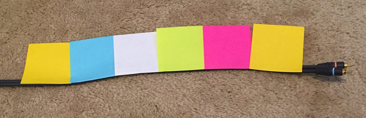
While RCA uses a YPGWB—Yellow Pink Green White Blue—repeating pattern (see note below), Toslink cables use BBWGPPY, HDMI cables are GGWBPYBG, speaker wire is GPWWBYYP, etc. It's all explained in the 200-page installation instructions, which can be easily followed by anyone with a dual degree in physics and chemistry.

(Note: Because of their country of origin, the augmentation panels' patterns go from right to left, not left to right. Make sure you get the directionality correct, or you'll lose all the benefits of the panels.)

Note, too, that the panels must end 1/2" from the end of the cable, so as to let the electrons slow a bit before reaching the termination point. Otherwise you'll risk blowing out your equipment due to the high-speed electron collisions.

Anyway, if you're the type that wants the best out of your audio/video system, I highly recommend the Chromatic Response Augmentation Panels; at only about $2,000 to do all my cable runs, it's an amazing bargain. I've heard that the factory is making the stuff as fast as they can, but quantities are currently quite limited—so order your CRAP now before it's all gone!


Stupid by design: Voice command uselessness

I drive a 2014 Subaru Legacy; for the most part, I'm happy with the car. But there are some design features that are just comically stupid. Here's one example…

The image at right shows the steering wheel controls on the left side of my steering wheel. The up/down arrows icon is a toggle switch to quickly change the audio track being played (or the radio station preset); it works great, and I use it all the time.

The stupid comes in just below that, with the face/speaking icon button. This button activates voice command mode, which does many useful things, such as dialing the phone, setting a destination for the nav system, etc. But you can also—you guessed it—use it to change tracks. Here's how that works:

  1. Press face/speaking icon.
  2. Wait about one second for the car to say "voice command please."
  3. Say "next track" or "previous track."
  4. Listen to car say "track up" (or "track down"), then the track changes.

Now I ask…who is ever going to use this method of changing tracks? The very first thing you do to use it—pressing the face/speaking icon—requires touching the steering wheel. The same wheel where, roughly an inch above that button, is a toggle switch that will switch tracks in precisely one step!

Did they include the voice command track changing features because someone in Marketing said they had to? Did they think there are people who prefer a slower, more cumbersome process to simply tapping a toggle switch? Did they think there are people who need audible feedback about what they've asked the car to do? (Never mind that they get that feedback by hearing the new track after using the toggle button.) Do they think there are a group of people who will use steering wheel buttons but would never use steering wheel toggle switches?

I honestly have no idea why they included the voice command ability to change tracks, but it definitely strikes me as stupid by design…or am I overlooking some really-obvious use that I'm just not seeing?


My post-CNN news sources

With the horrendous redesign of CNN, I quickly determined I had to find a new news source (or sources). After browsing the comments to my post, and doing some searching, here are the changes I've made in my news reading.

The first change is the biggest—I now use an RSS reader for the majority of my news reading. I've always used an RSS reader for most non-news sites, but preferred reading news directly on a web page (not sure why).

But as most sites seem to be heading in the image overload direction, I decided to find news sites with good RSS feeds, and read them using Vienna, my RSS reader of choice.

Why Vienna? I'll write about that in a future post, I think…but its excellent keyboard controls, and its ability to open articles in background tabs, are two of its key features for my reading habits.

The second change is obviously what sites/sources I use in Vienna. Here's my list of new sources, with both the web site and RSS URLs provided:

BBC - US and CanadawebRSS
UPI - Latest NewswebRSS
UPI - US NewswebRSS
Reuters - Top NewswebRSS
Reuters - US NewswebRSS

There's obviously some overlap between these sources, but that's OK; it's easy to mark/skip duplicates in Vienna. When I'm visiting a site on the web, all three (BBC, UPI, and Reuters) present a clean interface, without invasively large photos, and zero auto-playing videos or scrolling marquees. In short, all three are a joy to use on the web, unlike the "new and improved" CNN.

Sorry, CNN, but you've permanently lost at least one viewer; your new site makes it too hard to get what I want, which is news. The BBC, UPI, and Reuters understand that news is what viewers come to a news site to see. Perhaps there's a lesson there for CNN, if they can see it behind those enormous photos and CPU-sucking videos.


Send your Retina iMac’s desktop to deep space

Last week, I used the just-released Hubble Space Telescope images of the Andromeda galaxy to create a couple of desktop images for my Retina iMac. I liked the results so much that I spent some time collecting other suitable images from the Hubble site, and then cropping and/or scaling them to create interesting high-res desktop images. (I used Acorn for all the edits; it had no troubles, even with TIF images as large as 20,323x16,259!)

The end result is a collection of 50+ Retina iMac-sized (5120x2880) desktop wallpapers, courtesy of the Hubble Space Telescope. Here's the full collection:

Tip: If you click on the caption below the image, you'll be taken to the source page on the Hubble telescope site where I found the image.

There are at least two versions of nearly every image—one or more where I cropped out an interesting area of the photo at 5120x2880, and one where I scaled down and then cropped as needed to get as much of the full image as possible.

There are three ways to get an image (or all the images):

Method One: One at a time

  1. Command-click on the image (anywhere other than on the navigation arrows) you'd like to download. This will create a new background tab (in Safari, Chrome, and Firefox, at least), loaded with that image's high-resolution page on my OneDrive.
  2. At the top of the page you'll see a Download icon and text; click there to save the file to your Mac.
  3. Repeat for each image you want, and then organize as you wish, and set them up as rotating desktop images.

Method Two: Another way to get one at a time

Open the full folder on OneDrive, and browse/download directly from there. Click on any image, then click the Download icon to download the selected image to your Mac.

Method Three: Gimme the full set!

If you want all 54 images, just download this zip file from OneDrive.

Images courtesy of NASA/ESA, and full image credits can be found on the linked image page for each image reproduced above.


It’s snowing…in slow motion!

It's just started snowing here in central Oregon, so I shot a bit of slow motion snowfall. The end result is very oddly mesmerizing (open the video in a new window to see it at full size):

The snow looks like some fake Hollywood effect when seen in slow motion. But hey, it's falling, it's sticking, and the kids may get a white Christmas after all!

I hope you and yours have a wonderful holiday…I'm outta here to go play in the snow!


Fake fire … enhanced

To make our winter-air-blocked non-functional fireplace more visually engaging, I printed a huge fireplace image across multiple pages, and taped them to the fireplace blocker. The end result was usable, but definitely not professional:

So I set out to find a shop to print a 36"x48" poster of the huge image. And because this was clearly an optional project, I wanted to do it as cheaply as possible. After much web searching, I found Poster Print Factory. Their online poster creation tool was easy to use, and the cost ($35 including shipping) was the lowest I found by at least $10.

It took about a week, but the poster arrived and the quality is fine. It's printed on relatively thick stock, and the image itself looked stunning. So now, our artificial fire has been enhanced by a high quality poster overlay:

So much nicer to look at than the silvery surface of a piece of foam insulation! Anyway, if you're looking for some inexpensive poster-sized prints, I was happy with what I got from Poster Print Factory.


Span one large image across multiple printed pages

I was looking for a way to print a large image across multiple pages, so I could make my own do-it-yourself poster-size printout. By way of background, I wanted to print a huge virtual fire, to cover a piece of insulation we put in front of a drafty fireplace in the winter. (We don't like to burn wood, so the fireplace goes unused, but staring at a piece of shiny foam insulation all winter isn't all that interesting.)

Conceptually, this seemed pretty easy: find a huge image, open it in some app that handles images, and print. What I found is that doesn't work, at least not in the apps I had at hand (Acorn and Preview). After some web searching, I stumbled across an odd but effective solution: use Excel.

Open a new blank Excel workbook, then select Insert > Photo > Picture From File, and select your massive image. Now when you hit Print, you'll see the output spans multiple pages. I used Page Setup to select a borderless US Letter size, and printed out 16 pages of a roaring fire.

After some cut-and-tape operation, the drafty fireplace's insulation became more visually appealing:

Note that this was a "proof of concept" operation, so I printed in draft mode (hence the vertical striping on the printout) and wasn't overly careful about lining up the pages. I had originally planned to print the final version on glossy photo paper, but instead opted to buy a 36x48 poster-size printout from an online vendor. (I haven't yet received the print, but when I do, I'll post about its quality. Until then, though, I don't want to link to the vendor, as I don't yet know what I've bought.)

I knew Excel could do a lot, but I never thought to try it for printing huge images across multiple pages.


RIP Mac OS X Hints, Nov 4 2000 – Nov 4 2014

Note: The following is my unofficial eulogy for Mac OS X Hints; IDG has not announced any plans regarding the site, though I would hope they'll leave it online, even if no new hints appear in the future. The site is now officially in read-only mode; there will be no new hints. So it's officially comatose, at least.

Dearly beloved…

On this, the occasion of its 14th birthday, we're gathered here to mark the passing of Mac OS X Hints.

While it can be hard to tell exactly when a web site has died, the signs are fairly obvious. It's been over 45 days since the last new hint appeared on the site. There is no way for new users to sign up for an account. There's been one new comment posted in the last two days. A sidebar box proudly proclaims Latest Mountain Lion Hints. The site design, logo, and icons were last updated when I worked for Macworld, over four years ago. To paraphrase a Star Trek character, "it's dead, Jim."

To be fair, it's a bit more Monty Python "I'm not dead!" than officially dead, but really, the site is a dead man walking. Now that I'm done with movie analogies, let me explain why the passing of Mac OS X Hints isn't a bad thing. (Note that Mac OS X Hints' passing is in no way a reflection of its management by Macworld. In fact, the opposite is true: I believe the site would have ceased to exist years ago without their involvement.)

The simple truth is that the need for OS X hints has tapered off to near zero over the last 14 years. And that's a good thing.

[continue reading…]