In their September 2017 keynote, Apple launched the Apple Watch Series 3, the Apple TV 4K HDR, and three new iPhones—the 8 and the 8 Plus, and the X.
Here are my quick thoughts on each, and my buying plans…
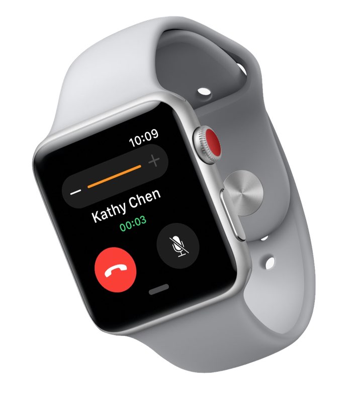
Apple Watch Series 3
This is a nice evolution of the watch. The LTE doesn't really interest me, as I'm sure it'll require another $5 or $10 a month to my wireless carrier, and I almost always want my phone with me. (If I swam regularly, I might feel differently about that.) The much-faster CPU would be a nice upgrade over my original-generation watch, but the Series 3 is nearly a full millimeter thicker than the original…and honestly, I think the first version was already borderline too thick.
Will I buy? At this time, the outlook is doubtful; my watch is working fine, and a faster CPU isn't worth the added thickness and $359 of my money.
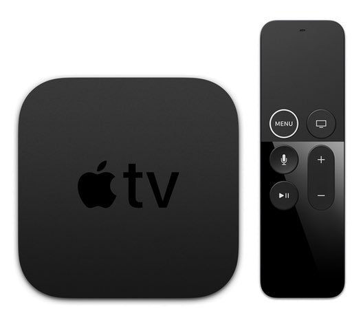
Apple TV 4K HDR
Support for 4K is welcome, and long overdue. I'm not so sure about HDR; sometimes I find HDR images tend to look artificial, and I don't know if I'd find the same issue in moving images. A real added bonus was Apple's decision to provide the 4K version of movies you've purchased for free—this from a company that charged us to upgrade the quality of our music files a few years back.
I wish Apple wasn't so damn set on streaming everything, though—I would much prefer to store movies directly on the device, to make it more portable and not subject to the vagaries of wifi, device positioning, and network load. Those times are gone, though, so now the only choice is whether or not to spend $20 more for the 64GB version.
Will I buy? Yes, and I'll spend the extra $20 for the extra 32GB. I've been moving an Xbox One back and forth from the game TV to our 4K TV to watch 4K content, so this will be a simpler solution.
iPhone 8 and 8 Plus and iPhone X
Let me get this out of the way: I do not like the iPhone X. Well, that's not true. I think almost all of it is absolutely stunning, and I really want one. Unfortunately, that's "almost all," and there are two things that aren't perfect that will keep me from buying this phone…
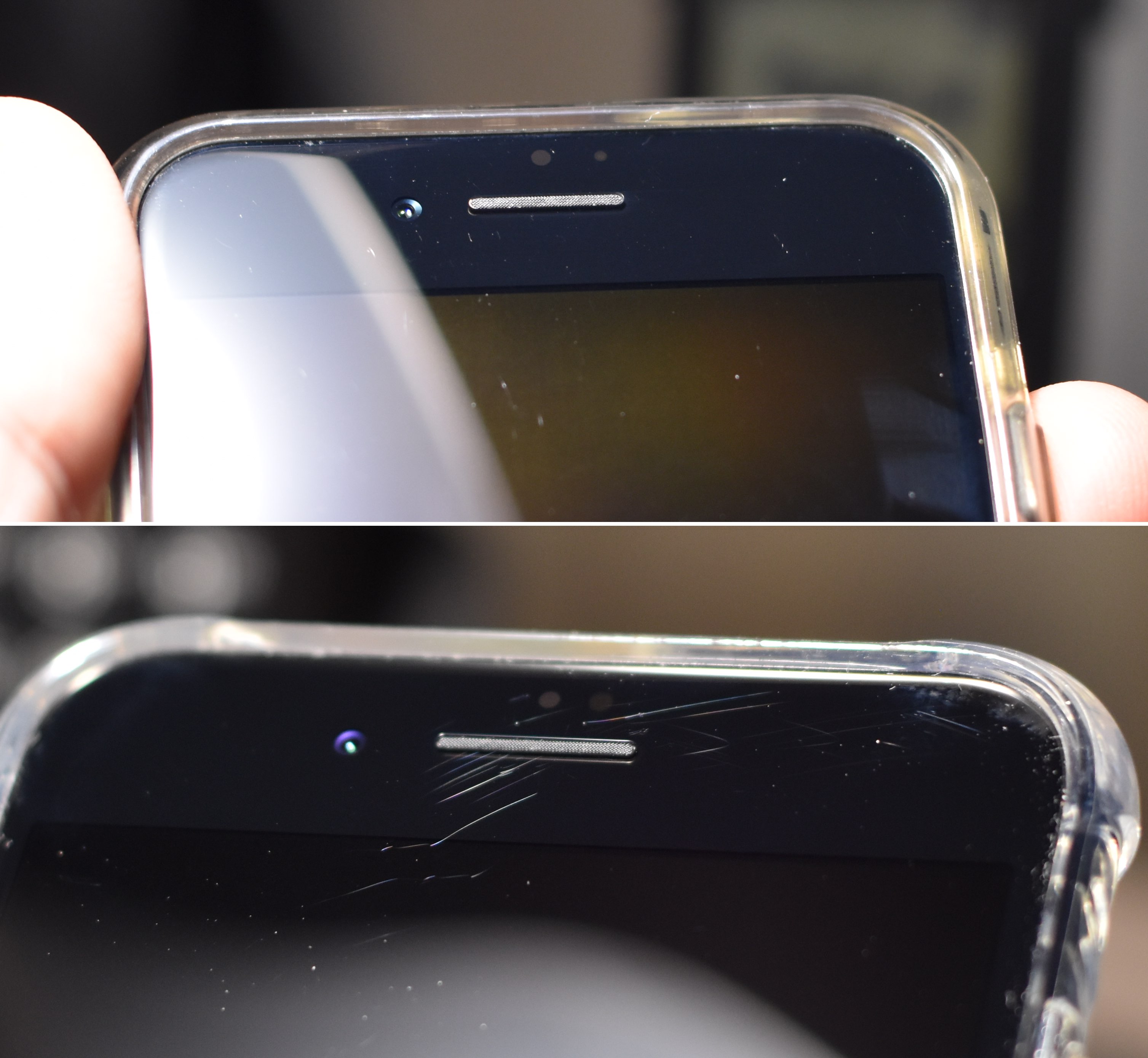
The Notch. I absolutely, positively hate the cutout at the top of the phone for the sensors. In case you (somehow) missed it, this is the notch…
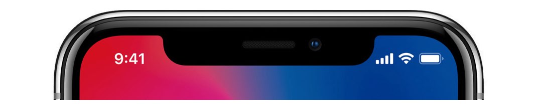
I would have much preferred if Apple just blacked out that entire region, giving up that marginally-usable pixel space for a cleaner appearance. I understand that videos can play cropped, so as to not be "notched," but it's the presence of the notch in other normal views that really gets to me. It's everywhere.
Many people won't notice, or won't care about the notch. I wish I could be one of those people, but I can't. During the keynote, all I could focus on whenever the phone appeared was the stupid notch. It simply grabs my eye, and I cannot unsee it when it's there. (Maybe a future software update will stop drawing the desktop up there, which would make it look much nicer to my eye.)
Face ID. Apple has told us facial recognition is more secure, and I have no reason to doubt them. They also told us it's fast, and it seemed to be in the demo. But secure and fast can't override the absolute convenience of Touch ID. I can use Touch ID as I remove my phone from my pocket (press plus press-click), and it's ready to go as soon as it's out of my pocket. I don't have to look at my phone unless I want to; if I have to look at my phone every time I want to unlock it, that's going to get annoying. Very quickly.
Apple Pay is even worse. Today's system is as near-magic as any tech I've ever used: Hold the phone near the register, rest finger on the home button, and you're done. With Face ID, it appears (based on the demo in the keynote), I'll have to both double-tap the side button and look at the phone to use Apple Pay. Ugh.
There are also some security considerations with Face ID, as pointed out by Ian Schray. The police cannot compel you to put your finger on your phone without a warrant…but can they compel you to simply look at your phone?
Other than these two no-go items, I really like everything else about the iPhone X. It's only marginally larger (.20 inches taller, .15 inches wider) than an iPhone 7, yet has a screen that's 30% larger and has more pixels than the gigantic Plus model phones. It also has the double cameras, which I would love to have on my next phone.
While you may not consider the notch and Face ID as deal breakers, they really are for me. I'll go look at one in person, of course, but I simply cannot unsee the notch, and I hate the idea of having to look at my phone to unlock it, and taking more steps (and time) for Apple Pay.
So that leaves me with the 8/8 Plus versus my current 7. I think the new CPU, faster Apple-developed GPU, better cameras and sensors, 240fps slow-mo 1080p video, wireless charging, and the glass design make the iPhone 8 a compelling upgrade. As noted, I'd love to have the dual cameras to work with, but I think the Plus-size phone is just too big for daily use, so I think that's out of the question. (I will visit the Apple Store again to see the 7 Plus before I decide for sure.)
Will I buy? As of now, yes, I plan on buying an iPhone 8, and hoping that…somehow…Touch ID survives for a long time to come, lest that iPhone 8 be my last new iPhone.


 Enter
Enter 


 The one (good) notable exception to "no store browsing" is the