Skip to content

macOS


Fix a broken search in Photos

I was having some issues with my desktop photos (which I load from Photos) not working properly, and I noticed that one particular photo wouldn't preview in the Wallpaper System Settings panel. I noted the name, searched for it in Photos, and came up with no matches. Then I tried other searches, for photos I knew were there as I could see them onscreen, and still, no matches. Clearly Photos' search was broken.

I tried the (long, slow, painful) photo library rebuild process, but still, no search.

After much digging, I found a solution that works, which is to force Photos to rebuild its search database. Here's how to do that:

  1. Make sure you have good backup of Photos before you start, just in case.
  2. Also make sure you quit Photos before proceeding.
  3. In Finder, navigate to your Photos.library file and right-click on it. Select Show Package Contents from the pop-up menu.
  4. In the new window that opens, open the database folder. Inside of that folder is a search folder. Delete it, but leave the database folder open.

That's it, you're (almost) done. Now launch Photos, and it will start rebuilding the search database. This can take a while, depending on the size of your database—it took about five or so minutes for my 65,000ish image collection. There's also no onscreen indication that anything is happening, so use Finder: Open the newly-created search folder in Finder, and check the size of the psi.sqlite file. When the size stops changing, the rebuild is done.

I found this answer in a post by Michelle Lyons in this Apple Discussiosn thread. Michelle notes they found the answer elsewhere, but don't link to that source, so I don't know who originally discovered this. All I know is it worked for me!


I despise this icon

That ugly garish purple travesty shows up in the menu bar whenever your screen is being recorded by any number of apps. From Apple's perspective, they probably consider it a good thing, as it lets a user know their screen is being recorded, and I understand that logic.

But it also shows up when you record your own screen via an app such as ScreenFlow. I find it incredibly intrusive, and there's no option for a user to say "Yes, Apple, I know my screen is being recorded—because I myself started the recording!—please disable that ugly purple icon in my menu bar."

Left in place, the purple icon screams for attention any time it's onscreen, regardless of what you're trying to show in your screen recording. It's unlike every other item in the menu bar, and at least for me, my eye is constantly drawn to it.

So please, Apple, let the user disable that menu bar icon. A logical way to do this would be to show a "Disable this one occurrence" menu item when the menu bar icon is clicked. That way, it's not a blanket override, but you could easily banish it for a given recording.

Until that happens, however, we (all two of us) here at Many Tricks so dislike the icon that we've implemented a workaround, but it's not ideal.

[continue reading…]


The macOS’ version of the cp Unix command won’t create links

 
Update: Apple fixed this in macOS 14.4; the cp command can once again create hard links.

I ran into this while working on a Keyboard Maestro macro that creates hard links: The macOS version of cp won't create links, at least not in Sonoma. In Ventura, it works even though it throws the same error as it does in Sonoma.

Copying as hard links is part of the cp feature set, fully covered in its man pages. But it doesn't work in macOS. To confirm, try this:

When I ran into this, I searched and discovered that someone else had run into the same issue,1Apple Developer login required but that's the only mention I could find.

I have filed this bug as FB13255408 with Apple, and I'm hopeful they fix it soon. There is a workaround, obviously: Use ln instead. This works fine for individual hard links, but using cp to quickly copy an entire folder as hard links is a nicer implementation.


More helpful help for Terminal commands

I use Terminal a fair bit, for any number of things. But I don't use it all the time, and that means I sometimes struggle to remember syntax of commands. "Was it rsync source destination or the other way around? Or was it ln that was backwards of what I thought it should be?"

You can open the man page for a command, of course, but sometimes there's so much there that finding the simple thing you want is tough. Enter tldr, installable via Homebrew or MacPorts. tldr skips most of the detail of the man pages, providing user-curated examples of how to use a given command.

As an example, here's the aforementioned rysnc command's man page:

[continue reading…]


Replace the mini music player that Apple took away

Back in the early Mac OS X iTunes era, there was a wonderful small window available that had control buttons, volume control, a visual progress bar, and a text display showing the artist, song, and album—it could even display a graphic equalizer in lieu of the artist-album-song info:

It was perfect. Sadly, it was last seen in iTunes 10 in Mac OS X 10.7. And today's version, while offering a mini mode, isn't nearly as mini or as functional as it used to be; read on for some details…

tldr summary: Mario Guzman's Music MiniPlayer is a full-retro near-perfect replacement for the original mini player. It's free, and I love it. If you're not into retro UI, Silicio on the App Store is also free and quite good, though you can't freely resize the window.

[continue reading…]


Speedier screen sharing startup in Sonoma

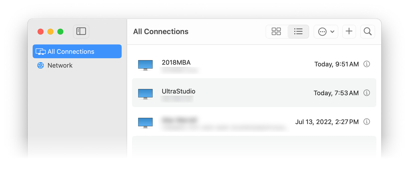
macOS Sonoma introduces a revised Screen Sharing application that lives in the Applications → Utilities folder1Though that's not really where it is, but that's not important…. It presents a list of recently-connected devices:

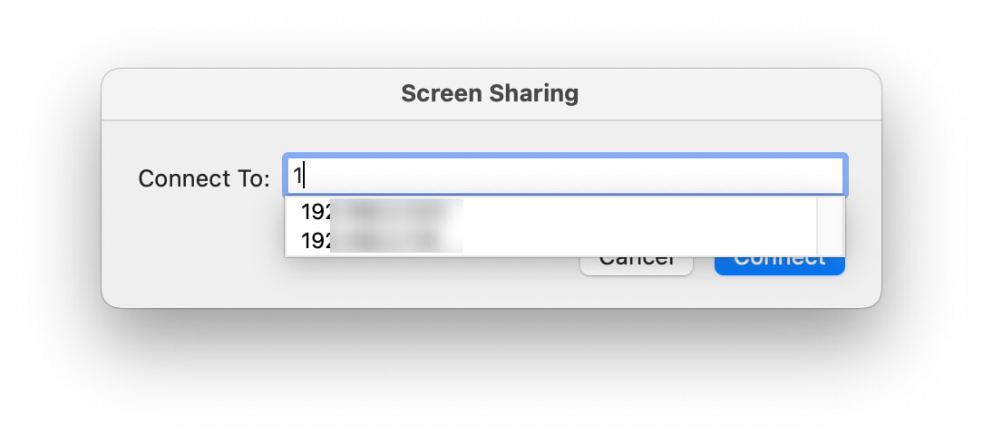
Select one, and you'll see the username and password dialog for that machine. While the GUI is nice to have, it's also slower than the old method: In Ventura and earlier, you could launch the (not in Utilities) Screen Sharing application, and start typing the IP address:

Select the host from the list, and you were done. This is much quicker than launching an app and waiting for the GUI, then navigating and selecting the desired machine. After just a bit of digging, I found a much quicker way to connect to my Macs in Sonoma (and earlier versions of macOS): The "vnc" URL scheme.

[continue reading…]


How to enable the “Beta updates” feature in macOS 13.4+

As of macOS 13.4, there's supposed to be a "Beta updates" button in System Settings > General > Software Update, as seen here:

Sure enough, that button is there on my iMac…but it wasn't on my MacBook Pro. Everything I read on Apple's site and elsewhere said it should simply exist, but it didn't. After much futzing around, I stumbled on the solution:

Click the ⓘ button on the Automatic Updates line to open the settings for automatic updates. My guess is that you'll find that the "Install macOS updates" setting is disabled. Enable it and click Done. The "Beta updates" feature may appear now, but if it doesn't, open that same panel again, and disable the "Install macOS updates" setting. You will now definitely see the "Beta updates" feature.

Nowhere in Apple's documentation does it mention that automatic updates must be enabled (at least once) in order to see the "Beta updates" feature. But that seems to be the case, as this fix has now worked for three Macs.


Why hidden UI is bad UI—example number 4,516,672,523

If only there were some way to add to the Favorites (or Smart Mailboxes or etc.) section in Mail's sidebar…

…oh wait, there is. As long as you magically hover in exactly the right general area to see the previously-invisible UI for adding favorites.

Thankfully, you can also right-click on a mailbox and select Add to Favorites. I consider the contextual menu items to be semi-hidden UI, as you still have to go looking for them. There is no way to do this using Mail's menus, however.

The best solution would be to have the down-arrow and plus sign always visible next to each item where it's applicable. A user setting could be included for those who prefer the clean look.

I really hate hidden UI.