Skip to content

A very quick look at the Retina iMac’s graphics performance

While I'm still busy setting up my Retina iMac—given I always do this by hand, it's time consuming—I did take a few minutes to see how the graphics performance compares to that of my mid-2011 iMac.

To test the Macs, I use a visual benchmark called Unigine Valley. This benchmark puts the graphics card through a real workout, and is fun to watch while running. Before the results, here's a quick comparison of my two iMacs:

2011 iMac2014 iMac
CPU3.4GHz Core i74.0GHz Core i7
RAM16GB24GB
GraphicsAMD HD 6970MAMD R9 M295X
VRAM2GB4GB

And here's how they did…

2011 iMac

2014 iMac

I'm no math whiz, but it looks like the new Retina iMac is over twice as fast in the graphics realm as my older machine. I knew it'd be faster, of course, but I wasn't expecting that kind of speed up. Wow.


Quick poll: How many iDevices do you own?

From fiscal 2002 (the iPod's launch year) through fiscal 2014, Apple sold 1,224,700,000 iPods, iPhones, and iPads. That's a lot of iDevices! In looking around our (four person) home, I count more than I would have expected. So that got me thinking, how many of these things do other people own?

Hence this simple poll. It doesn't matter if the device is in use or not in use, working or not working…I just think it might be interesting to see how many of these things each of us owns.

Voting is 100% anonymous; I'm not collecting or tracking IP addresses or any other identifiable information. So take a second and tell the world how many iDevices you own.


Yosemite: Tweaking Safari’s URL bar settings

Safari in Yosemite is a familiar yet new beast. Among the interface changes, I really didn't like the way the URL bar behaved. In particular, these things bugged me:

  1. Not being able to see the full URL.
  2. The width of the URL entry box.
  3. The drop-down that appears when you click in the URL bar (when you have a page loaded).

Thankfully, the fixes for these three issues are easy, if not completely obvious.

Full URL not visible in URL bar

By default, Safari truncates URL to just the base "dot" address, regardless of where you are on a site. So if you're reading my hint about using a dark Dock, Safari's URL bar will display this:

https://robservatory.com

But you're really on this page:

https://robservatory.com/yosemite-dark-dock-and-app-switcher-with-light-menu-bar/

If you prefer knowing where you are in the site hierarchy at all times, the fix is simple. Open Safari's Preferences, go to Advanced, and add a checkmark next to "Show full website address."

The URL box will now show the full URL of the page you're viewing. Of course, that will lead to a second problem—the URL box isn't large enough to display much of the extended URL. Thankfully, that too is an easy fix.

[continue reading…]


Yosemite: Dark Dock and App Switcher with light menu bar

High Sierra update: This trick no longer works in High Sierra. As far as I know, there is no workaround.

Here's my first (only?) Yosemite hint, courtesy of my Many Tricks partner, Peter Maurer. Peter wanted a light menu bar, but preferred the contrast given to application icons in the dark Dock—like this:

Here's how to achieve that effect.

  1. Open Terminal, then copy/paste this and press Return: defaults write NSGlobalDomain AppleInterfaceStyle Dark
  2. Paste or type killall Dock and press Return. The Dock will relaunch in its dark mode.
  3. Copy/paste this and press Return: defaults remove NSGlobalDomain AppleInterfaceStyle

The first step sets dark mode, step two restarts the Dock to switch it to dark mode, and step three turns off dark mode—but the Dock won't notice, and will remain in its dark state (until it's next restarted, which isn't often). Because the Command-Tab switcher is associated with the Dock, it will also be dark.

If you're going to script this, you'll want to insert a delay between the second and third steps, so that the Dock can finish launching before you disable dark mode. Neat trick!


How I configured my 5K TV with bundled computer

After seeing the new iMac with Retina 5K display (I'm just going to call it a Retina iMac from here on out, or even riMac for short), I decided it was time to upgrade my aging but still oh-so-functional mid-2011 27" iMac.

For those contemplating the same upgrade, you may be mulling decisions on processor, RAM, storage, and graphics cards; here's the logic behind each of my choices in those areas, in case it helps you with your decision.

CPU

This was the simplest decision to make—I always buy the most powerful CPU I can afford. In the case where the choice is a Core i5 vs. Core i7, I will always go for the Core i7. That's because only the Core i7 supports hyper threading, which, as Apple writes, is "a technology that allows two threads to run simultaneously on each core. So a quad-core iMac has eight virtual cores, all of which are recognized by OS X. This enables the processor to deliver faster performance by spreading tasks more evenly across a greater number of cores."

In addition, by upgrading the CPU, I make the machine more usable many years down the road—whether for my own use, or when reselling to someone else.

[continue reading…]


Goodbye cron task, hello launchd agent

On April 29th, 2005, Apple launched Mac OS X 10.4, aka Tiger. With Tiger came launchd, a new Unix-side job scheduling tool. launchd was intended to replace cron, the long-established (and quite cryptic) tool for such tasks.

And now, a mere nine-plus years later, I decided it was time to give up cron and move to launchd myself. Mr. Bleeding Edge, that's me! (Note: Unless you enjoy the Unix side of OS X and currently use cron to schedule tasks, this article won't be of much interest to you.)

Why now, after so long as a holdout? Primarily because I kept running into issues with cron tasks that needed to do things as "authorized me," such as mounting an encrypted disk image, or even just mounting a network share. Or my Mac would be asleep for a scheduled cron task, and it therefore wouldn't run. (launchd will queue any missed tasks to execute when the Mac reawakens.) Finally, my cron file was getting huge and unwieldy, and making simple changes was fraught with danger of breaking something.

So I dedicated a portion of a recent weekend to figuring out launchd, and migrating my cron tasks to this brave no-longer-at-all-new world. If you're still hanging on to cron, read on to see what I've learned about launchd—maybe it'll inspire you to move, too (or not).

[continue reading…]


Leaked—Tim Cook’s October 16th monologue notes!

[Serious, reserved look]
At Apple, your trust means everything to us. And we know that recently we've lost that trust. We released a horridly-rushed iOS 8.0.1 update that clobbered a number of users' phones. Our celebrity users had their most private moments shared with the world. Our web site crashed when people tried to order the new iPhone 6. We had to ship iOS 8 without HealthKit and iCloud Drive. We spammed everyone with a U2 album that not everyone wanted. Hell, the last time I tried to give one of these talks, most everyone on the internet had to listen to a Chinese version of myself at the same time.

[Earnest appearance, eye contact with everyone!]
As you can see, we've made a number of seriously un-Apple-like mistakes recently, and quite frankly, that's not acceptable. Not acceptable to you, our customers. Not acceptable to me, and certainly not acceptable to everyone else here at the company. This is not the Apple we all know and love[dramatic pause]…users have been putting up with this for way too long, and today, it ends! [demonstrative]

[continue reading…]


Portable power pack products prevent powerless problems

"Hello, my name is Rob, and I have a portable power problem. It's been six days, 13 hours, and 23 minutes since I last bought a portable power solution."

OK, so that's a bit over the top. But still, I find portable chargers appealing, as I don't like being without power when away from a wall outlet. Whether it's a long flight, a camping trip, or a Mother Nature-induced power outage, I like having alternatives. That's why there are currently eight chargers in my collection, as seen in the image at right (click for larger).

And while I can't pretend to be anywhere near as thorough as The Wirecutter, I thought it'd be interesting to compare all eight of these portable chargers.

The following table provides baseline specs on all eight chargers, and shows how much power you're getting for each ounce of weight you carry (mAh per Ounce) and how much you'll pay per milliampere-hour (mAh per Dollar)—so you can choose by power effectiveness or cost effectiveness. (The order of the table corresponds to the numbering in the above-right photo.)

My two favorites are highlighted; the Jackery is an ideal size to carry around nearly everywhere, and the EC Technology is excellent for camping trips or other extended periods away from power. Beyond the table, I share a few thoughts on each of these power bricks, in case you're really interested in these things.

#ProductSize (LxWxH, inches)Volue (cubic inches)Weight (oz)Capacity (mAh)mAh per OunceCost ($)mAh per Dollar
1OrigAudio w/ Oracle logo3.751.750.805.34.11,000243.9----
2Sony CPV3 Portable Power Pack4.001.500.754.53.02,800933.3
3Sony USB Portable Charger5.132.750.638.89.610,0001,041.7
--Sony Cycle Energy - 2+3 sold as a set13.312.612,8001,015.9$83.85152.7
4Zagg 6000 battery pack4.252.751.7019.97.56,000800.0$55.89107.4
5EC Technology Power Bank6.302.900.8014.615.422,4001,454.5$45.95487.5
6Jackery Giant+ Portable Charger4.303.100.8010.710.412,0001,153.8$39.95300.4
7Boostcase Hybrid Battery Case5.502.380.405.22.82,200800.0$99.9522.0
8JunoPower JunoJumper5.472.950.599.57.26,000833.3$99.9960.0

Read on for a little blurb on each charger…

[continue reading…]


An odd iOS8 wallpaper placement issue

While creating and testing my iPhone 6 wallpapers, I ran into a little issue with how iOS 8 (I think that's the culprit) places wallpaper. You can see the issue by watching (and listening; yes, there's an audio track!) the movie at right.

You won't see this problem unless you try to use a wallpaper with a visible row for iOS's page indicator dots; I prefer this style of home screen, as I like the separation it adds between the dock and the icon area.

When placing such a wallpaper, however, if you don't bounce it off the top of the display, it winds up being positioned just a bit too low—the row that's supposed to contain the page indicator dots won't quite be in the right spot. As I wrote on my iPhone 6 wallpapers post, here's the workaround in text:

  1. Tap the desired home screen icon to see the full-size version.
  2. Disable Perspective Zoom. (It won't work right with the navigation highlight row I use.)
  3. Pinch and zoom out so the image is at it's 100% size.
  4. Now drag the image up and let it bounce—this is the critical step.

This really strikes me as a bug, because the images I'm using are 750x1334, which exactly matches the iPhone's resolution. So with perspective zoom off, and the image shrunk to its smallest (actual) size, there should only be one way to put that image on the screen. But, as seen in the video, that's not the case.

This is probably of use to only a couple other people on the planet who like divider rows for the page indicator dots…but if you're one of those people, hopefully this helps you get your wallpapers properly positioned.


Wallpapers: iPhone 6

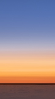
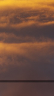
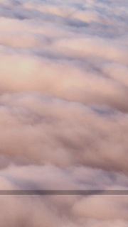
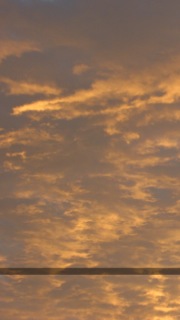
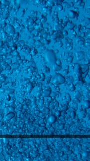
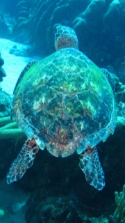
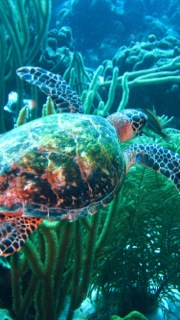
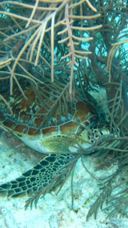
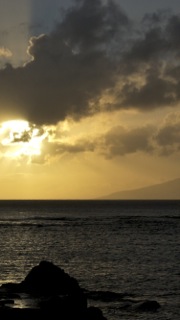
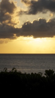
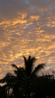
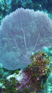
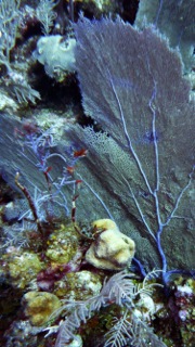
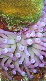
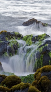
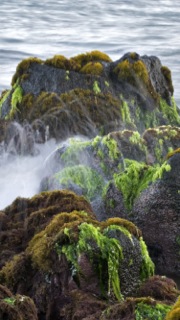
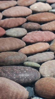
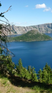
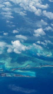
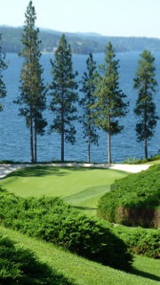
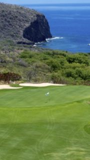
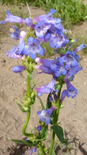
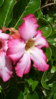
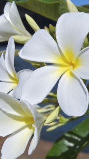
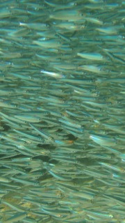
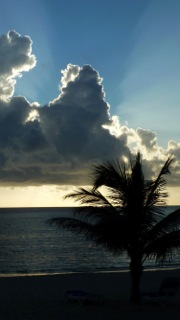
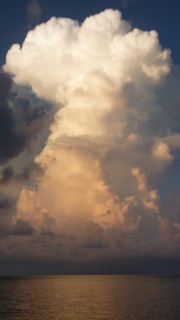
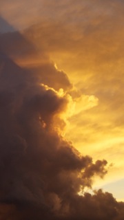
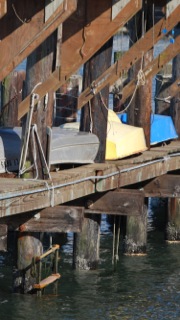
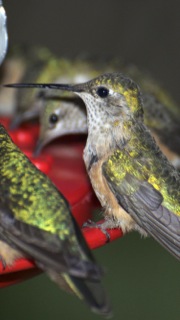
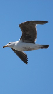
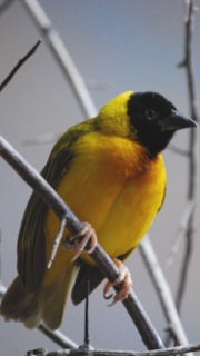
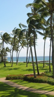
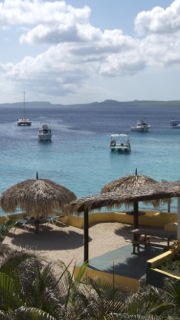
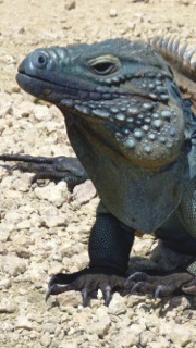
Once I had my iPhone 6 syncing, it was time to get to work on my home and lock screen wallpapers. I have made these for every iOS device I've owned—here's the full collection.

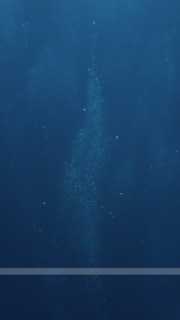
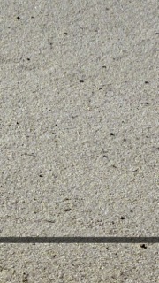
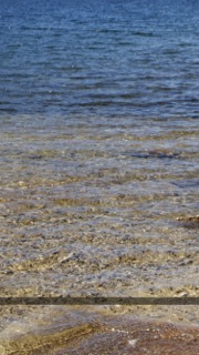
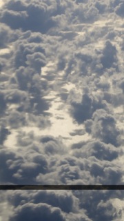
My home screen wallpapers feature a bar to highlight the paging dots, and are typically "low noise" to make it easy to see icons and text. The lock screen wallpapers have no such restriction, and include a little bit of everything.

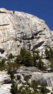
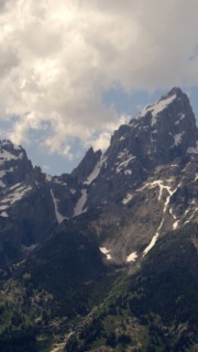
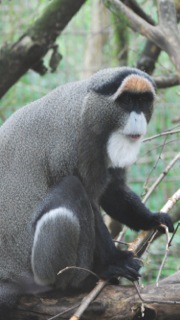
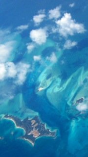
These wallpapers are 750x1344 pixels in size, and are designed for use on the iPhone 6, as that's what I have. (If you use a Plus, and really like an image or two, let me know and I can make one for the larger phone.) Note that the images shown in the image sliders below (hover and click to cycle) are low-quality 180x320 JPEG representations of the actual photos; to get the high-quality images, download the entire bundle [24MB] and install only those you wish to use.

Home Screens (16)Lock Screens (52)

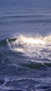
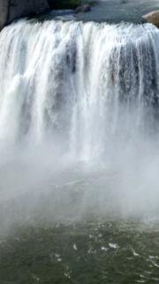
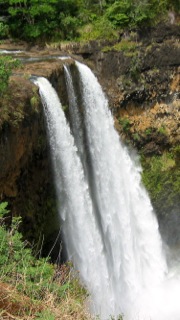
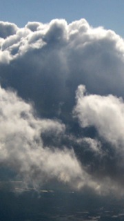
Note: Due to a quirk in iOS 8, you need to use these steps when installing one of my home screens, otherwise the nav bar (the bar that shows the page navigation buttons) won't be located in the right spot. Here's how, assuming you're in the "Choose a new wallpaper" section of iOS:

  1. Tap the desired home screen icon to see the full-size version.
  2. Disable Perspective Zoom. (It won't work right with the navigation highlight row I use.)
  3. Pinch and zoom out so the image is at it's 100% size.
  4. Now drag the image up and let it bounce—this is the critical step.

If you've done the above steps right, then you'll see quite a few pixels of the nav bar above the Perspective Zoom button (top image). If you haven't done it properly, then the nav bar will barely clear the button (bottom image).

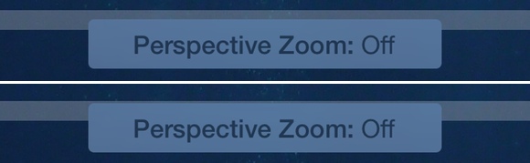
Given the images are the same resolution as the screen, I have no idea why this happens…but it does, and this is the only way to make sure the nav bar winds up where you want it.

License: All photographs in these wallpapers are © Rob Griffiths, and are freely provided for personal use only. You may not include these wallpapers on other sites, nor in any commercial product, without my prior permission. (I hate having to put this here, but prior experience has shown it to be necessary.)