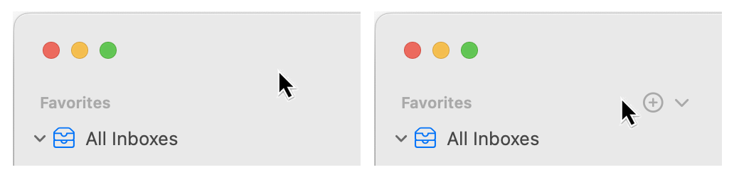
If only there were some way to add to the Favorites (or Smart Mailboxes or etc.) section in Mail's sidebar…
…oh wait, there is. As long as you magically hover in exactly the right general area to see the previously-invisible UI for adding favorites.
Thankfully, you can also right-click on a mailbox and select Add to Favorites. I consider the contextual menu items to be semi-hidden UI, as you still have to go looking for them. There is no way to do this using Mail's menus, however.
The best solution would be to have the down-arrow and plus sign always visible next to each item where it's applicable. A user setting could be included for those who prefer the clean look.
As part of my job, I occasionally have to make screencasts, usually demonstrating features in our various apps. Sometimes I need to record the entire screen, as I'll be demonstrating things that require activating and selecting menu items. I have a demo account I use for these recordings that lacks all of my usual menu bar add-ons, so the look is quite clean.
And in versions of macOS prior to Big Sur, I also hid the menu bar clock (via System Preferences → Date & Time → Clock, uncheck "Show date and time in menu bar.") But in Big Sur, the menu bar clock is also the button you click to open Notification Center…so there's no way to remove the clock from the menu bar.
Most of the time, this isn't a problem. But when recording screencasts, it's a big issue. I often record segments across days, and at multiple times a day. I then splice those bits together, often times not in a linear fashion. With the default Big Sur settings (displaying the full date and time), this leads to a real annoying time travel experience as the clock jumps around like crazy.
The following two tips help greatly with this problem, though being able to hide the clock entirely would be a much better solution…
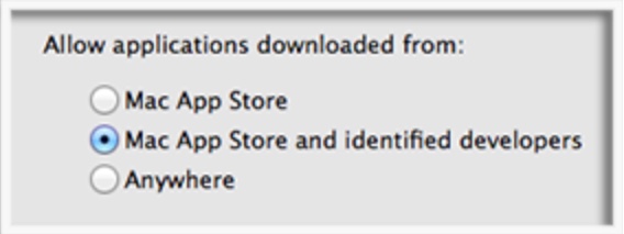
Mac OS X 10.7 and earlier: Launch whatever app you want, the OS doesn't care.
Mac OS X 10.7.5: Gatekeeper appears, but is a benign master, defaulting to allowing apps from anywhere. You can still install and run anything without any intervention from the OS.
Mac OS X 10.8 through 10.11: The benign master is slightly less benign, as the default setting changed (somewhere in that timeframe) to only allowing apps from the Mac App Store and registered developers. You could still disable Gatekeeper completely, though, as the "Anywhere" button was still present. If you didn't do that and tried to launch an app from outside the store or a non-registered developer, you had to click OK in one dialog box. Still not awful, but you were aware you were working outside the Gatekeeper's happy zone.
macOS Sierra (10.12): The benign master is now clearly just the master—the "Anywhere" button is gone. (Gatekeeper can still be disabled in Terminal, if you wish: sudo spctl --master-disable.)
And when you try to run an app from an unidentified developer, you really have to jump through some hoops…
When I posted my 787 takeoffs and landings video, I ran into a weird problem: When embedded here, the video would play in Safari at 4K (2160p), but when viewed on YouTube, the max resolution available was 1440p. After failing with web searches, I asked Twitter about it…
…but didn't hear anything back. I pretty much gave up on the issue until today, when I stumbled across this article, which describes the exact problem I'm having. The summary of the article describes both the problem and the apparent cause:
What appears to be Google's shift to the VP9 codec for delivering 4K video on the YouTube homepage is preventing Safari users from watching videos uploaded to the service since early December in full 4K resolution, but not from viewing webpage-embedded videos in the same resolution.
Bingo! Google seems to now be using the open and royalty-free VP9 codec for 4K videos viewed on its YouTube site, but reverts to the H264 codec when those same videos are embedded on other sites.
Note that this issue only affects videos uploaded after December 6, 2016:
Videos uploaded to the service prior to Dec. 6 in 4K resolution can still play back in full 4K resolution on Safari from the YouTube homepage.
I was curious about which macOS browsers this issue affects, so I thought I'd do a little experiment…
Once a month, I download roughly 25 gzipped (.gz) files from Apple—these are our Mac App Store sales reports, with one file for each App Store region. I could have Safari expand these files (via the "Open 'safe' files after downloading' item in its preferences), but I prefer to leave that option unchecked. (Why? I often download archives that I want to leave archived, and I like to keep originals of many of the things I download).
If you work with lots of compressed files, you're probably familiar with what happens in Finder (see note) when you go to expand any semi-large number of files: The infamous Dancing Dialog™. It looks something like this…
[Note: Technically, this isn't Finder, it's Archive Utility doing the expansion. But this is the service that Apple provides to expand compressed files, and it's what 99% of macOS users will use. It can be changed via the Get Info dialog, but very few people will take that step. So to most users, it seems it's Finder handling the expansion. For ease of reference, I'm going to say it's Finder doing the expansion.]
Not only is this randomly-resizing dialog box visually annoying, it turns what should be a super-fast process into one that takes a ridiculous amount of time. The end result is that users think they have a slow machine—"it took over 12 seconds to expand 25 tiny little archives!"—when what they really have is a horrendously slow GUI interface to a super fast task.
Just how fast is the task, if the GUI doesn't get in the way? Thanks to the Unix core of macOS, we can answer that question using Terminal, the geeky front-end to the Unix core. The Unix command to expand .gz archives is gzip; so to expand all the .gz files in a folder (and keep the originals), you'd use this command in Terminal:
gzip -d -k *.gz
If you try this, you'll find out it's nearly instantaneous—press Return, and the files are expanded. Unix actually gives us a way to see exactly how fast it is, via the time command:
$ time gzip -d -k *.gz

real	0m0.013s
user	0m0.002s
sys	0m0.005s
This was for a set of 24 .gz archive files (on a solid state drive), and the real line in the output shows exactly how long it took to expand them all: 0.013 seconds. By comparison, I made a screen recording (with an onscreen stopwatch for timing) of Finder expanding the same 24 files; it took 12.8 seconds for all the dialog dancing to end. Think about that…
Expand 24 .gz files
Finder: 12.8 seconds
Terminal: .013 seconds
Terminal is 984.6x faster than Finder
To put those results another way, if expansion time is linear, gzip could expand 23,631 files in the time Finder takes to expand 24 files. That's nuts!
(You can watch this video for a visual comparison of expanding the same set of files in Finder and Terminal.)
So it's not the computer that's slow, it's the GUI interface to the computer that (in this particular use case) is incredibly, horrendously slow. And there's no need for it—the separate individual progress bars, appearing and vanishing in under a second each, provide no useful feedback to the user. They just slow down the task.
Finder (née Archive Utility) should just execute the task without any visual feedback (though it should pop up a window if there are exceptions). If visual feedback is really required, a window with a single progress bar for the entire task would be OK, but would still slow operations down.
This is a great example of how an everyday task can make you think you have a slow computer, when what you really have is a fast computer with a slow interface element. Given how often we all deal with compressed files, it'd be nice to see Apple clean up this mess. Until they do, however, you can harness the power of Unix—even while in Finder—to speed up the task. Here's one way to do just that.
I'll admit it: I'm a desktop image (nee wallpaper) addict. I love to use a wide variety of images, and change them often throughout the day, just to keep my work environment fresh. On my two external displays, I use iPhoto images—general photos on one, kid pictures on the other. But for the main iMac screen, I prefer to use photos taken by others—typically stunning landscapes and cityscapes from all over the world.
With the arrival of my 5K iMac, however, my existing collection was no longer sufficient. Yes, they were all 2560x1440 images, which matches the "apparent" resolution of the Retina iMac. But in order to make that image fill the Retina iMac's screen, it's first scaled up to 5120x2880, then displayed by OS X at 2560x1440. As a result, my desktop images aren't nearly as sharp looking as they were on my old 27" iMac's display.
As an example, here's a segment of two versions (2560x1440 and 5120x2880) of the Sydney Skyline, as screen-captured when set as my Retina iMac's desktop picture. As you move the divider bar right, you're revealing more of the 2560px version; move it left, and the 5120px version takes over.
After scrolling back and forth a bit, you might be thinking these pictures are identical, and I'm just seeing things. While I may be seeing things, the pictures are not identical. (Compare some closely-spaced lights and the crispness of vertical lines in each image to spot the differences.)
Read on for a closer look at the image, which really shows what you're losing by using a 2560x1440px desktop image on a Retina Mac…as well as a list of places I've found that have 5120x2880px images available.
For those who aren't familiar, Console (found in Applications > Utilities) is an application that shows you what's happening beneath the lovely skin of OS X. Open the application, and you'll see a combination of status and error messages from any number of sources.
If you've never looked at Console before, you might be surprised by just how much stuff gets written there. But with the release of Yosemite, things have really taken a turn for the worse—the amount of stuff written to Console is greater than I recall for prior OS X releases.
As a test, I set up a new Yosemite virtual machine, installed ScreenFlow (and nothing else), then launched and interacted with a number of Apple's apps for two minutes while recording the screen. The results are quite sobering; here's what two minutes of Console logging looks like, reduced to a 10-second movie:
As you can see, there are a lot of Console entries in just two minutes.
High Sierra update: This trick no longer works in High Sierra. As far as I know, there is no workaround.
Here's my first (only?) Yosemite hint, courtesy of my Many Tricks partner, Peter Maurer. Peter wanted a light menu bar, but preferred the contrast given to application icons in the dark Dock—like this:
Here's how to achieve that effect.
Open Terminal, then copy/paste this and press Return: defaults write NSGlobalDomain AppleInterfaceStyle Dark
Paste or type killall Dock and press Return. The Dock will relaunch in its dark mode.
Copy/paste this and press Return: defaults remove NSGlobalDomain AppleInterfaceStyle
The first step sets dark mode, step two restarts the Dock to switch it to dark mode, and step three turns off dark mode—but the Dock won't notice, and will remain in its dark state (until it's next restarted, which isn't often). Because the Command-Tab switcher is associated with the Dock, it will also be dark.
If you're going to script this, you'll want to insert a delay between the second and third steps, so that the Dock can finish launching before you disable dark mode. Neat trick!
One of the touted features in Mavericks is better multi-monitor support. And at some levels, that's true. Unfortunately, my overall experience is that things are worse, not better, than they were before—especially if you don't use full screen mode often (or at all). [continue reading…]
 Mac OS X 10.7.5:


 While clearing out the applications that seemingly pile up on my drive on a continuous basis, I