Images replace content in USA Today’s iOS app
Yesterday, I noticed that USA Today had a new iPad app out—they released it as a separate app, so it didn't replace the old version. After trying the new app, I'm incredibly glad they chose to release the new version as a new app, because it sucks. Absolutely, positively, sucks.
Like the recent CNN redesign, USA Today has chosen to focus on pretty pictures instead of information. In other words, it's become another news app that has decided not to show any news.
Here's a side-by-side comparison of the old (left) and new (right) apps:

As you can see, the new app is dominated by one massive image, and very little of anything else. Here's a quick comparison of just how bad things are in the new app:
| Data points… | Old App | New App |
|---|---|---|
| Stories visible | 6 | 3 |
| Words shown | 148 | 43 |
| Weather visible | Yes | No |
| Navigation visible | Yes | No |
| Ads visible | 0 | 1 |
| Largest image on page | 386x220 | 1024x475 |
| % of page covered by image | 10.70% | 61.80% |
If you're scoring at home, which I am, the new app has a 50% reduction in the number of visible stories, and a 71% reduction in the number of words. And that insanely-huge 'hero image' covers nearly 62% of the page!
In addition, there's no visible weather, and navigation between sections is now hiding in a hamburger menu. Overall, the usability of the app has gone from very good to basically worthless.
This is progress? I don't think so. I'm staying with the old app, and giving the new one a one-star review on the App Store. Bad move, USA Today!


 We occasionally take our kids to a local place,

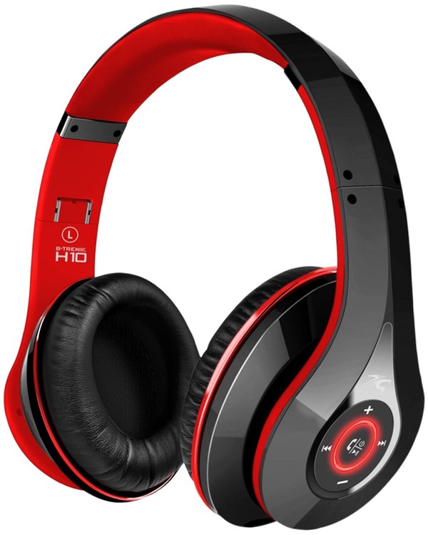 While browsing Amazon one day, I stumbled onto these headphones, with possibly the longest product name I've ever seen in Amazon: