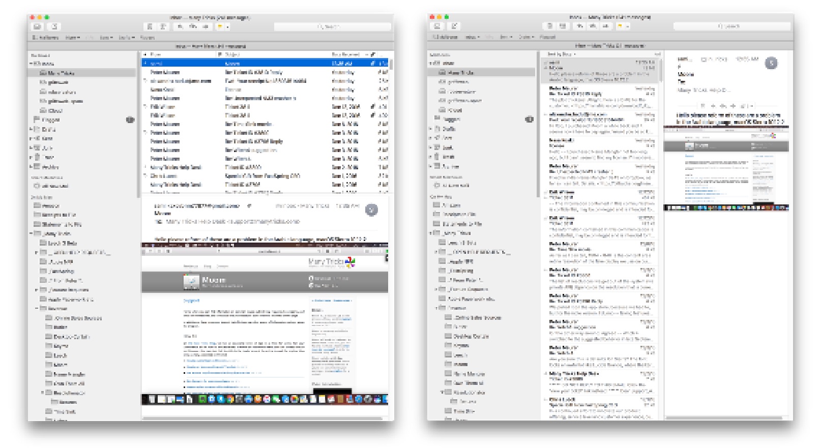
To me, the modern view in Apple's Mail app is basically useless: I keep my Mail window at 1,020 pixels in width, because really, there's no need for it to take up more space than that. But at that width, the modern view's message preview is so tiny as to be basically worthless:
Obviously, that's classic view on the left and modern view on the right. With the classic view, I can read each email as soon as I select it in the list; with modern, I have to double-click a message to open in a new window, which is a waste of time and screen space. Modern only gets truly usable if I'm willing to make the window roughly 1,500 pixels in width.
So which layout do you use? Vote in the Twitter poll for the next day (well, 23 hours and counting).
Once a month, I download roughly 25 gzipped (.gz) files from Apple—these are our Mac App Store sales reports, with one file for each App Store region. I could have Safari expand these files (via the "Open 'safe' files after downloading' item in its preferences), but I prefer to leave that option unchecked. (Why? I often download archives that I want to leave archived, and I like to keep originals of many of the things I download).
If you work with lots of compressed files, you're probably familiar with what happens in Finder (see note) when you go to expand any semi-large number of files: The infamous Dancing Dialog™. It looks something like this…
[Note: Technically, this isn't Finder, it's Archive Utility doing the expansion. But this is the service that Apple provides to expand compressed files, and it's what 99% of macOS users will use. It can be changed via the Get Info dialog, but very few people will take that step. So to most users, it seems it's Finder handling the expansion. For ease of reference, I'm going to say it's Finder doing the expansion.]
Not only is this randomly-resizing dialog box visually annoying, it turns what should be a super-fast process into one that takes a ridiculous amount of time. The end result is that users think they have a slow machine—"it took over 12 seconds to expand 25 tiny little archives!"—when what they really have is a horrendously slow GUI interface to a super fast task.
Just how fast is the task, if the GUI doesn't get in the way? Thanks to the Unix core of macOS, we can answer that question using Terminal, the geeky front-end to the Unix core. The Unix command to expand .gz archives is gzip; so to expand all the .gz files in a folder (and keep the originals), you'd use this command in Terminal:
gzip -d -k *.gz
If you try this, you'll find out it's nearly instantaneous—press Return, and the files are expanded. Unix actually gives us a way to see exactly how fast it is, via the time command:
$ time gzip -d -k *.gz

real	0m0.013s
user	0m0.002s
sys	0m0.005s
This was for a set of 24 .gz archive files (on a solid state drive), and the real line in the output shows exactly how long it took to expand them all: 0.013 seconds. By comparison, I made a screen recording (with an onscreen stopwatch for timing) of Finder expanding the same 24 files; it took 12.8 seconds for all the dialog dancing to end. Think about that…
Expand 24 .gz files
Finder: 12.8 seconds
Terminal: .013 seconds
Terminal is 984.6x faster than Finder
To put those results another way, if expansion time is linear, gzip could expand 23,631 files in the time Finder takes to expand 24 files. That's nuts!
(You can watch this video for a visual comparison of expanding the same set of files in Finder and Terminal.)
So it's not the computer that's slow, it's the GUI interface to the computer that (in this particular use case) is incredibly, horrendously slow. And there's no need for it—the separate individual progress bars, appearing and vanishing in under a second each, provide no useful feedback to the user. They just slow down the task.
Finder (née Archive Utility) should just execute the task without any visual feedback (though it should pop up a window if there are exceptions). If visual feedback is really required, a window with a single progress bar for the entire task would be OK, but would still slow operations down.
This is a great example of how an everyday task can make you think you have a slow computer, when what you really have is a fast computer with a slow interface element. Given how often we all deal with compressed files, it'd be nice to see Apple clean up this mess. Until they do, however, you can harness the power of Unix—even while in Finder—to speed up the task. Here's one way to do just that.
Back in 2013, Apple introduced the new Mac Pro, an amazing wonder of design. But it was also a study in compromise for "Pro" users, requiring all peripherals to be externally attached, and not allowing for any after-purchase upgrades (video card, CPU, etc.). It was also shockingly expensive.
I can only imagine how hard it must have been for Apple to try to build a perfect Mac "Pro" desktop for everyone. As nicely designed as the new Mac Pro was, it missed the perfect mark for many Pro users by quite a bit.
So how does Apple try to design one Mac that can satisfy a diverse group that encompasses design professionals, gamers, scientific researchers, video creators, and who knows what else? Quite simply, they shouldn't try, as such an exercise is destined to fail. (See "new Mac Pro," above.)
Instead, Apple should design one Mac that can become anything and everything to each type of "Pro" user. While that may sound daungting, the good news is that Apple's already done this in its recent past. And done it very well, I might add…
David really doesn't like Messages (for many valid reasons), and has often tweeted and written about other, better messaging platforms, including his current best-of-breed example, Facebook's Messenger.
And you know what? In general, I agree with David: Messages sucks. It's got latency issues, messages sometimes vanish, shared URLs are ugly, search is troublesome, it lacks many features found in other apps, etc. Yet still, it's my messaging app of choice, and will remain my messaging app of choice, probably forever. Why?
First of all, it's bundled with every Mac and iOS device sold, which means that most of the people in my social group already have it and use it. I don't have to send a link to someone and explain how to install the app, set up an account, find my name/phone number, add me to their group of friends, and initiate a conversation.
Does that make Messages good? No, just because an app is bundled doesn't mean it's excellent. (See previous generations of Internet Explorer on Windows, for instance.) But it does make it pervasive, and in a messaging app, that's what I want.
But even beyond that—even if Messages were so abysmal it lost 50% of the messages I sent and often force rebooted my devices and remotely spilled my milk—I would probably continue to use it. Why? Because Apple isn't in the business of making money off of who I talk to, what I talk to them about, or what devices I use to do that talking. Apple wants to sell devices, not data about how people are using Apple's devices.
A candy store at the local mall had the most amazing wall of colorful lollipops, and I thought it'd make a wild desktop image for a retina iMac. As I snapped the pic on my iPhone, it took a bit of upscaling to reach 5120x2880, but I think it still looks fine; here's a small-scale version:
Please see this newer post, with a new script that provides subtotals by subfolder, which is what I really wanted when I wrote this one.
Recently I've been trying to go paperless (well, mostly paperless) via a Fujitsu ScanSanp ix500. (I'll have more to say about the scanner in a future post).
One way to go paperless is to just go from now forward—start scanning stuff and don't worry about history. I decided that I'd go the other route, and work through our old paper files: some would be scanned and kept, much would just be recycled. The process went really quickly, compared to what I had expected. It helps that the Fujitsu is a wicked-fast document scanner!
But I was curious about how much I was scanning, in terms of total PDF pages—not files, but counting the pages in the files. Spotlight to the rescue; the field kMDItemNumberOfPages returns the number of pages in a document, and it seemed accurate in testing via mdls:
Until very recently, I wasn't a user of Bluetooth stereo heaphones. I don't necessarily have a good answer as to "why not?," other than I recall trying a pair early on, and not being impressed by sound quality and battery life. That was, of course, years ago, but I hold grudges for a long time, it seems.
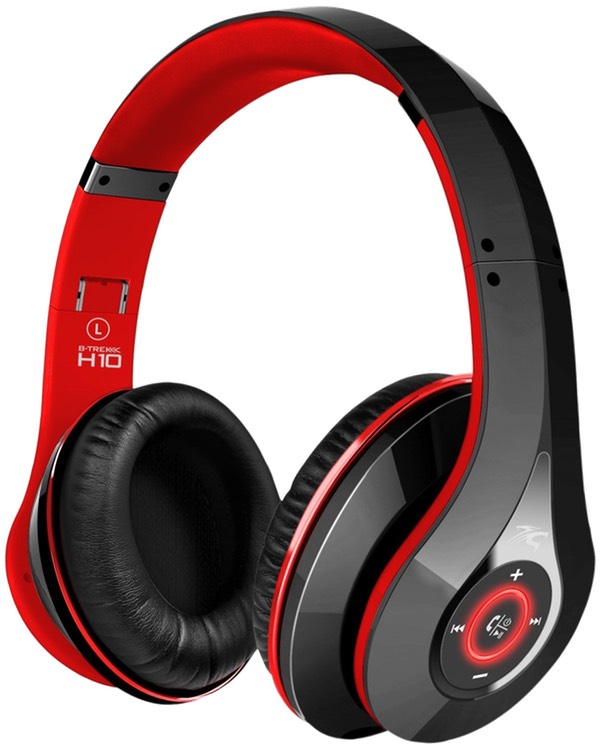
Recently I thought I'd try cutting the cord again; there are any number of Bluetooth headphones available—including some veryexpensivemodels. Needless to say, these are not in my budget as a casual music listener. I was more interested in something in the $100 or less price range, and in an over-the-ear (versus on-the-ear or in-the-ear) model.
Rolls right off the tongue, doesn't it? I'll just call them Sentey Bluetooth Headphones. Although they list for $100, every time I've looked, they've been listed for sale at $50. And with over 100 very positive reviews—and Amazon's easy return policy—this felt like a safe bet. So I ordered a pair, and have had them for a few days now.
So were they worth $50? Absolutely; keep reading for my review.
When Apple released its new accessories, I thought it might be time to revisit my input setup. For a few years, I've been using the original Magic Trackpad and the Logitech Wireless Solar Keyboard.
While this setup has worked well for me, I missed the precision of a mouse (so much so that I kept a corded one nearby, and plugged it in when I needed to do such work). So I thought I'd check out Apple's new gear, with the thought of either upgrading to the new Magic Trackpad, or perhaps moving to the new Magic Mouse as my pointing device, and maybe replacing the Logitech with the new Apple keyboard.
Unfortunately, the local Apple Store only had the mouse in stock, not the keyboard or trackpad. Unable to compare the pointing devices, I just bought the mouse. After setting it up, I loved the added precision it provided over the trackpad. But if I was going to be using a mouse regularly, I wanted to narrow the reach from keyboard to mouse, so I pulled out my old Apple wireless keyboard, which is about six inches narrower than the Logitech.
This setup seemed really good, except that I'd be giving up a lot of features by removing the trackpad: I use it with BetterTouchTool and our own Butler (as well as Keymo and Moom) to execute all sorts of gesture-related actions.
While I didn't own the original, our family did get one of the follow-on models. But that tweet really got me thinking about just how far we've come in 34 years. And while the original PC did start at $1,565, that price didn't get you much of a usable machine, as noted by oldcomputers.net:
A basic system for home use attaches to an audio tape cassette player and a television set (that means no floppy drives or video monitor) sold for approximately $1,565. PC-DOS, the operating system, was not available on cassette, so this basic system is only capable of running the Microsoft BASIC programming language, which is built-in and included with every PC.
If you really wanted a usable IBM PC, you were looking at a much higher cost (from the same site):
A more typical system for home or school with a memory of 64K bytes, a single diskette drive and its own display, was priced around $3,000. An expanded system for business with color graphics, two diskette drives, and a printer cost about $4,500.
Keep in mind this is 1981 money. Adjusted for inflation, those costs are dramatically different in 2015 dollars:
$1,565 (Basic IBM PC) --> $4,109
$3,000 (Home IBM PC) --> $7,876
$4,500 (Business IBM PC) --> $11,814
Doesn't seem quite so cheap now, does it? But what's really amazing is what you can do with that same amount of money today. I'll use the Home IBM PC as a comparison, so I've got $7,876 to spend. Here's what you can get for that in 2015…
I stopped by the Apple Store today to look at the Apple Watch (summary: amazing tech, but it's a watch, yawn) and the new ultralight MacBook, which is potentially much more interesting to me than a watch.
I spent some time typing (definitely less travel and firmer, but felt fine to me), and looking at the colors (silver—boring, gold—schlocky, space gray—omg perfect!). Speed for simple tasks seemed more than fine, though I'd hate to push it with Motion or Final Cut or anything like that. It's definitely amazingly thin and light.
But the thing I really wanted to look at was the screen. This is a retina device, with a stated screen resolution of 2304x1440. On the MacBook Pro side of the fence, each of the stated pixel values is halved to get the effective ultra-sharp resolution you'll see in the machine's default mode. The 13" rMBP's 2560x1600 screen is effectively 1280x800 as shipped; the 15" rMBP's 2880x1800 gets you 1440x900. In both cases, each full-resolution dimension is halved to find the default usable screen resolution.
Given that the new MacBook's screen is 2304x1440, I was expecting to see the display effectively at 1152x720. This is less than you get on an 11" Air (1366x768), which is odd given the larger screen. I was curious how it would look. I should however, have read Jason's reviewer's notebook before heading to the store, as he points out that this isn't the case.


 While browsing Amazon one day, I stumbled onto these headphones, with possibly the longest product name I've ever seen in Amazon: