Skip to content

macOS

Revisiting iTunes/iOS sync issues

After getting my iPhone 6 in early October, I was initially excited by all the cool tech in my new phone. Until I tried to sync it, that is. I eventually got so frustrated that I emailed Tim Cook for help. From that email, I wound up talking to Apple's engineers, who eventually solved my sync issues—it turns out they were related to duplicates of long-ago-purchased songs.

Welcome to
Sync Hell

And for a while, things were great in iPhone 6 land. Then I ripped a few new CDs, and noticed that they didn't show up on the phone. Uh oh. Even worse, when I looked at my iPhone in iTunes, the Music section contained hundreds, if not thousands, of the dreaded gray dotted circles.

This seemingly innocent symbol means that the indicated song did not sync—the information about the song made the journey to the phone, but the song itself did not. Argh! Read on to see how I muddled through this issue, with some advice that may, or may not, help you with your own sync issues.

If you don't want to read everything, here's a tl;dr version:

  • My iPhone sync issues returned, along with a huge-fake-but-limiting amount of data shown in Other.
  • There's a known-to-Apple "very slow performance" issue in iOS/iTunes that can make some iPhones sync very slowly (fixes have been made, but not yet released).
  • A factory restore failed to complete until I rebooted the iMac.
  • After the restore, the sync worked, but I still had a huge Other category.
  • After the iOS 8.1.1 update, the huge Other category vanished.
  • I had to manually unsync/resync a number of songs to clear their gray dotted circles.
  • It may help to do a voodoo dance, sacrifice three Nokia phones, and rub your stomach while patting your head before syncing.

Read on for the gory details…except maybe for that last item, which I totally made up.

[continue reading…]


Seeking clarity in Retina iMac desktop images

I'll admit it: I'm a desktop image (nee wallpaper) addict. I love to use a wide variety of images, and change them often throughout the day, just to keep my work environment fresh. On my two external displays, I use iPhoto images—general photos on one, kid pictures on the other. But for the main iMac screen, I prefer to use photos taken by others—typically stunning landscapes and cityscapes from all over the world.

With the arrival of my 5K iMac, however, my existing collection was no longer sufficient. Yes, they were all 2560x1440 images, which matches the "apparent" resolution of the Retina iMac. But in order to make that image fill the Retina iMac's screen, it's first scaled up to 5120x2880, then displayed by OS X at 2560x1440. As a result, my desktop images aren't nearly as sharp looking as they were on my old 27" iMac's display.

As an example, here's a segment of two versions (2560x1440 and 5120x2880) of the Sydney Skyline, as screen-captured when set as my Retina iMac's desktop picture. As you move the divider bar right, you're revealing more of the 2560px version; move it left, and the 5120px version takes over.

After scrolling back and forth a bit, you might be thinking these pictures are identical, and I'm just seeing things. While I may be seeing things, the pictures are not identical. (Compare some closely-spaced lights and the crispness of vertical lines in each image to spot the differences.)

Read on for a closer look at the image, which really shows what you're losing by using a 2560x1440px desktop image on a Retina Mac…as well as a list of places I've found that have 5120x2880px images available.

[continue reading…]


Yosemite’s constant clattering clutters Console

For those who aren't familiar, Console (found in Applications > Utilities) is an application that shows you what's happening beneath the lovely skin of OS X. Open the application, and you'll see a combination of status and error messages from any number of sources.

If you've never looked at Console before, you might be surprised by just how much stuff gets written there. But with the release of Yosemite, things have really taken a turn for the worse—the amount of stuff written to Console is greater than I recall for prior OS X releases.

As a test, I set up a new Yosemite virtual machine, installed ScreenFlow (and nothing else), then launched and interacted with a number of Apple's apps for two minutes while recording the screen. The results are quite sobering; here's what two minutes of Console logging looks like, reduced to a 10-second movie:

As you can see, there are a lot of Console entries in just two minutes.

[continue reading…]


Encrypt files then backup to a cloud service via script

Most cloud services tell you that their data stores are safe, that your data is encrypted in transit and on their drives, that employees don't have access, etc. For the vast majority of the stuff I store in the cloud, this is more than good enough for me—the data isn't overly sensitive, and if someone were to hack their way in, all they'd get are a bunch of work and personal writing files and some family photos.

For other files—primarily financial and family related—those assurances just aren't enough for me. But I still want the flexibility and security that comes from having a copy of these files in the cloud. So what's a paranoid user to do to take advantage of the cloud, with added security, but with a minimum of hassle?

The solution I came up with involves using local encrypted disk images and a shell script. Using this script (and some means of scheduling it), you can automatically encrypt and back up whatever files you like to a cloud service.

[continue reading…]


Use two CD drives to import multiple CDs into iTunes

I happen to have two external drives connected to my iMac—one that reads and writes the usual mix of CDs, DVDs, etc., and another that includes Blu-Ray playback (but not writing). Today I discovered that you can use both drives at once (sort of) to speed up multiple CD rips. Here's how it works.

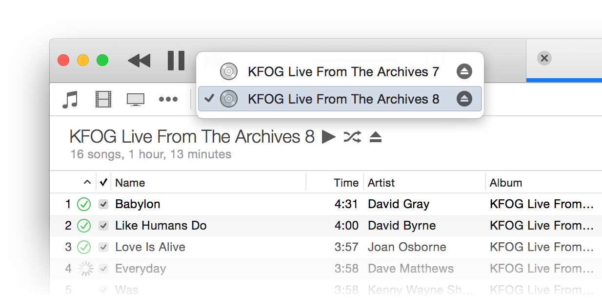
When you have two drives in iTunes, you'll see one CD icon in the iTunes 12 bozo bar—that's my name for the row of device controller buttons seen at right.

Click on the CD icon, though, and you'll see both inserted discs are available:

There really isn't a trick to using two drives at once in iTunes, other than saying "Yes" when this dialog appears onscreen:

iTunes won't actually rip both CDs at once, but it will queue the second CD up, and start ripping it automatically when the first one finishes. As soon as you see that changeover, click on the CD icon and switch to the just-imported CD.

Eject the just-imported CD, insert the next CD to rip, and say "Yes" again when iTunes asks if you'd like to import it. Repeat as necessary, until you're done. I imagine that if you had three CD drives, this would work just as well—I can't test that assumption, though.

While not fully automated batch ripping, this process does let you make relatively quick work of a stack of CDs—for those of you who (like me) still prefer such relics of a prior age.


RIP Mac OS X Hints, Nov 4 2000 – Nov 4 2014

Note: The following is my unofficial eulogy for Mac OS X Hints; IDG has not announced any plans regarding the site, though I would hope they'll leave it online, even if no new hints appear in the future. The site is now officially in read-only mode; there will be no new hints. So it's officially comatose, at least.

Dearly beloved…

On this, the occasion of its 14th birthday, we're gathered here to mark the passing of Mac OS X Hints.

While it can be hard to tell exactly when a web site has died, the signs are fairly obvious. It's been over 45 days since the last new hint appeared on the site. There is no way for new users to sign up for an account. There's been one new comment posted in the last two days. A sidebar box proudly proclaims Latest Mountain Lion Hints. The site design, logo, and icons were last updated when I worked for Macworld, over four years ago. To paraphrase a Star Trek character, "it's dead, Jim."

To be fair, it's a bit more Monty Python "I'm not dead!" than officially dead, but really, the site is a dead man walking. Now that I'm done with movie analogies, let me explain why the passing of Mac OS X Hints isn't a bad thing. (Note that Mac OS X Hints' passing is in no way a reflection of its management by Macworld. In fact, the opposite is true: I believe the site would have ceased to exist years ago without their involvement.)

The simple truth is that the need for OS X hints has tapered off to near zero over the last 14 years. And that's a good thing.

[continue reading…]


Mac OS X Hints turns 14

Fourteen years ago today, I launched Mac OS X Hints, with this simple post. The Mac OS X 10.0 Public Beta was only a couple months old, and many Mac users (myself included) were feeling lost in the land of Unix and Terminal. (Despite anything Apple said at the time, Terminal was very much a required aspect of using Mac OS X in those early days!)

Related post: RIP Mac OS X Hints, Nov 4 2000 - Nov 4 2014

At the time of launch, I knew nothing about content management systems or PHP; I knew enough HTML to be dangerous, and very little about anything else—including design, as you can see from the image at right.

That image, courtesy of the Internet Archive's Wayback Machine, was taken one month after launch. Could it be any brighter and uglier? Probably not. While I did many things wrong during that launch, I did get a few things right…

  • The site was all about the community; it was my intent from day one that it would be a users helping users site, not a "me telling the world what to do" site.
  • The content management system I chose, Geeklog, has proven to be very long lived—fourteen years on, and it's still what powers the site. In all that time, we had (I believe) exactly one hacking incident. Not bad.
  • The site had a laser focus on hints; I'd do a pick of the week, but outside of that, it was all about the hints.

So despite my poor design and lack of PHP skills, the site flourished. So much so that Macworld purchased the site and hired me in June of 2005. I spent nearly five years with Macworld, before leaving in 2010 to join Many Tricks.

In looking back, never in my wildest dreams did I imagine the site would flourish to the point where it would actually change my career. But it did, and for that, I'm eternally thankful to everyone who helped make macosxhints.com what it was. So happy birthday, Mac OS X Hints!


Yosemite: An alternative zoom-to-fit action

As you're probably aware, Apple changed the functionality of a green button click in Yosemite: it not longer "zooms to fit" (which could have different behaviors per app), but instead it enters Full Screen mode (if the app has one; otherwise, it does zoom to fit). If you want zoom-to-click, you can option-click the green button; there's no apparent way to toggle these two functionalities.

But today, I discovered a second zoom-to-fit shortcut: double-click the window's title bar. This is easier to do, as you don't have to hit the small green button target; just get the mouse anywhere in the title bar, and double-click.

Note that this won't work if you have "Double-click a window's title bar to minimize" enabled in the Dock System Preferences panel.


Yosemite: Tweaking Safari’s URL bar settings

Safari in Yosemite is a familiar yet new beast. Among the interface changes, I really didn't like the way the URL bar behaved. In particular, these things bugged me:

  1. Not being able to see the full URL.
  2. The width of the URL entry box.
  3. The drop-down that appears when you click in the URL bar (when you have a page loaded).

Thankfully, the fixes for these three issues are easy, if not completely obvious.

Full URL not visible in URL bar

By default, Safari truncates URL to just the base "dot" address, regardless of where you are on a site. So if you're reading my hint about using a dark Dock, Safari's URL bar will display this:

https://robservatory.com

But you're really on this page:

https://robservatory.com/yosemite-dark-dock-and-app-switcher-with-light-menu-bar/

If you prefer knowing where you are in the site hierarchy at all times, the fix is simple. Open Safari's Preferences, go to Advanced, and add a checkmark next to "Show full website address."

The URL box will now show the full URL of the page you're viewing. Of course, that will lead to a second problem—the URL box isn't large enough to display much of the extended URL. Thankfully, that too is an easy fix.

[continue reading…]


Yosemite: Dark Dock and App Switcher with light menu bar

High Sierra update: This trick no longer works in High Sierra. As far as I know, there is no workaround.

Here's my first (only?) Yosemite hint, courtesy of my Many Tricks partner, Peter Maurer. Peter wanted a light menu bar, but preferred the contrast given to application icons in the dark Dock—like this:

Here's how to achieve that effect.

  1. Open Terminal, then copy/paste this and press Return: defaults write NSGlobalDomain AppleInterfaceStyle Dark
  2. Paste or type killall Dock and press Return. The Dock will relaunch in its dark mode.
  3. Copy/paste this and press Return: defaults remove NSGlobalDomain AppleInterfaceStyle

The first step sets dark mode, step two restarts the Dock to switch it to dark mode, and step three turns off dark mode—but the Dock won't notice, and will remain in its dark state (until it's next restarted, which isn't often). Because the Command-Tab switcher is associated with the Dock, it will also be dark.

If you're going to script this, you'll want to insert a delay between the second and third steps, so that the Dock can finish launching before you disable dark mode. Neat trick!