I recently bought a set of PowerBeats Pro, which I generally love (more on the headphones in a future post), but today, while trying to register my product with Beats, I ran into a clear example of form trumping function.
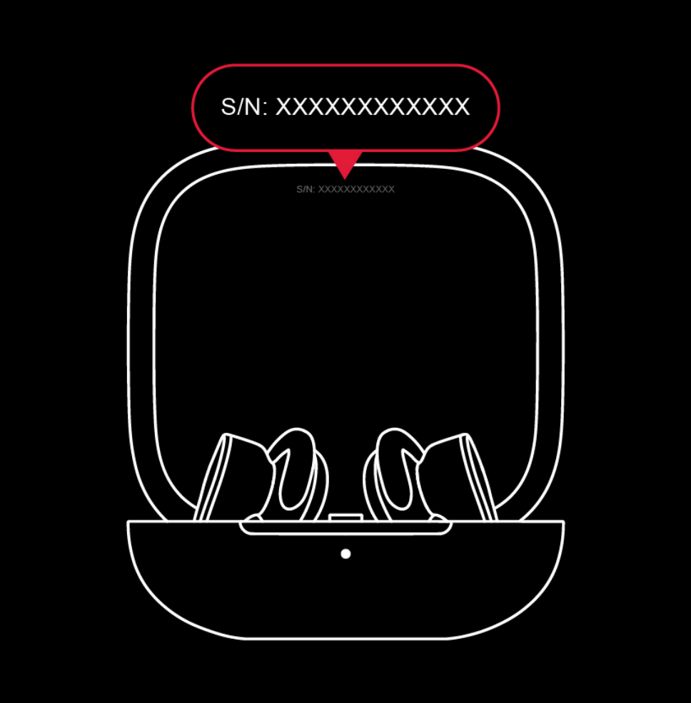
To register your Beats, you need the serial number; Beats provides a graphic that shows you where to find it…
While it's not the world's loveliest box…ok, so it may be the world's ugliest box…
…it's been rock solid since day one. However, it's aging and its CPU won't be supported in an upcoming pfSense release, so I decided to replace it. (That way, I'll have a spare if the new one breaks…at least until that unsupported version of pfSense is released.) Here's the new box…
That's a Protectlifanless Firewall Appliance with a quad-core Celeron J3160 CPU, 4GB of RAM, and 32GB of storage. And yes, it's just a bit smaller and more elegant than my old box—the entire thing is roughly the size of my old box's external cooling fan.
Say I’ve resized a window to the dimensions I want. Is there a way to figure out what these are so I can create a resize action in Moom?
Basically, the user wants to save a window size as a custom action, to make it easy to reapply that action to any window. (If it were just one window in one app, you could use Moom's Save Window Layout feature to save that layout for easy recall.)
There is a way to see this info in Moom, but it requires enabling our debug log and digging through a bunch of output. As an easier alternative, I was certain that AppleScript could do this; I fiddled a bit on my own, and did some web searching, which led me to this thorough post on StackExchange.
Using the very first bit of the first script there, I came up with this version:
Of course, me being me, I decided I'd spend a couple hours making it more useful, even though I probably won't use it all that often. So I modified it to work for whichever app is frontmost, and made it run from Keyboard Maestro. I then assigned it a gesture trigger with my mouse, so I can easily see any window's dimensions with a simple mouse movement.
A friend recently sent me a link to a large collection of 1980s computing magazines—there's some great stuff there, well worth browsing. Perusing the list, I noticed Softline, which I remember reading in our home while growing up. (I was in high school in the early 1980s.)
We were fortunate enough to have an Apple ][ in our home, and I remember reading Softline for their game reviews and ads for currently-released games.
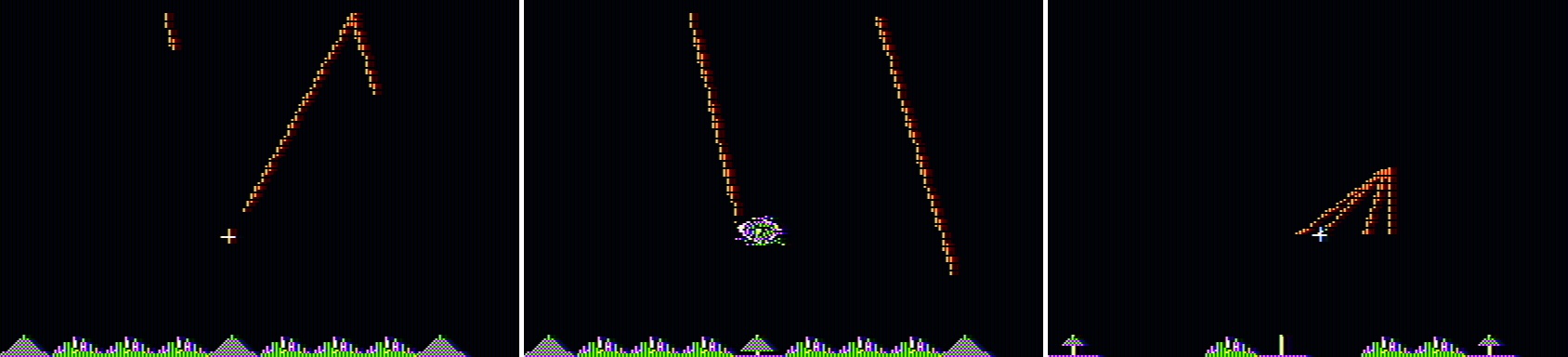
It was those ads that caught my eye as I browsed a few issues. Consider Missile Defense, a fun semi-clone of the arcade game Missile Command. To give you a sense of what games were like at the time, here are a few screenshots from the game (All game images in this article are courtesy of MobyGames, who graciously allow use of up to 20 images without prior permission.)
While I have older hardware (a 2013 MacBook Pro) that I use for testing macOS betas—it's now running Catalina—it's often handy to have the latest macOS beta running in VMware Fusion on my iMac. With past OS releases, this has been a relatively easy process. With Catalina, however, attempting the install results in a black screen.
Thankfully, some enterprising Fusion users (Bogdam and intel008) have figured out a workaround. I tried it, and while it did work for me, I had to change the instructions just a bit (read on for the details).
We don't publish all of these, as we're not necessarily ready for them to be put to use by everyone (otherwise, they'd be visible prefs). But there are cases when a user has a specific need for a setting, or when troubleshooting, that these hidden prefs can be very useful. As such, I often have to send someone a defaults write command.
Read on to see how I use Excel's formatting features—plus the ever-valuable Keyboard Maestro—to disguise some of this workbook's formula results, yet still easily copy them for sending to a user.
These images were automatically cropped from the master image (after I cropped that; more detail on what I did is coming in a follow-up post), via ImageMagick.
So this would be that post: How to auto-crop huge images using ImageMagick. If you're not familiar with it, ImageMagick is a set of command-line tools to manipulate images. There are a number of ways to install ImageMagick, but I used Homebrew (brew install imagemagick).
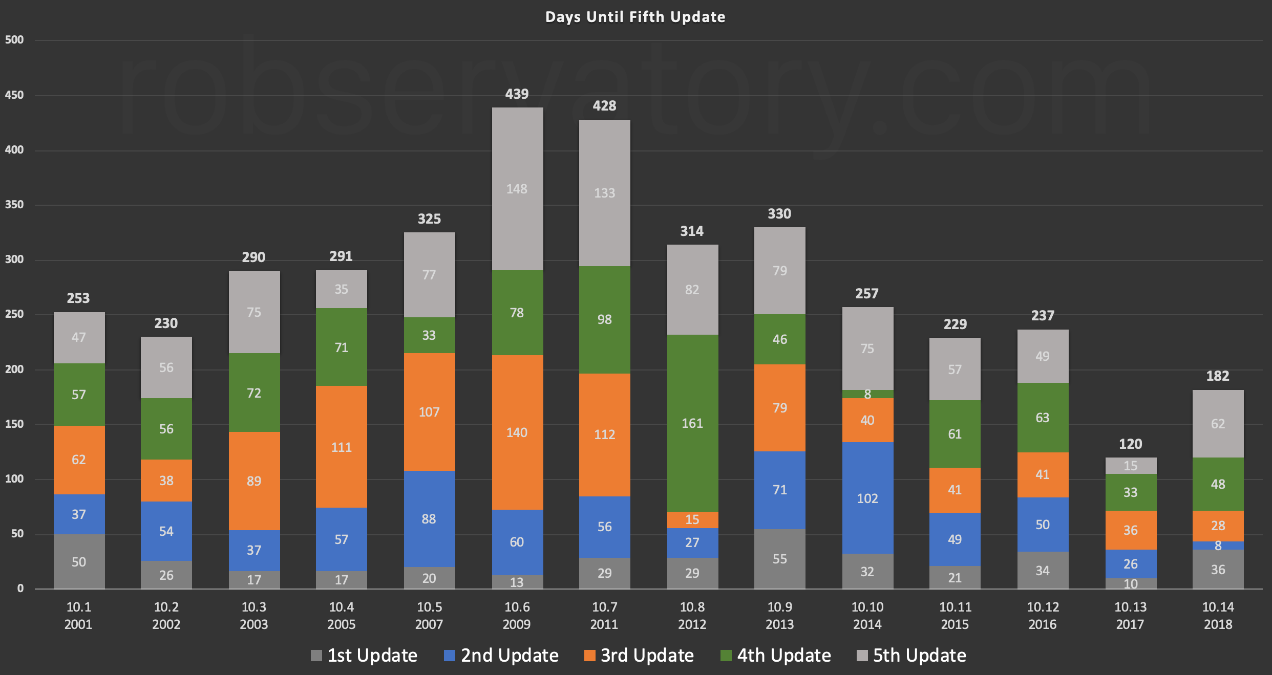
Updated for the fifth release of macOS Mojave (10.14), which came out on January 22, 2019
When the third release of macOS High Sierra came out, I charted the pace of its updates compared to all prior Mac OS X/macOS releases. I said I planned to keep that chart current, but decided that I'd use the fifth release (typically around six months from the OS release date) as the baseline.
Here's the latest update for Mojave's fifth update—a bit late, as that update (10.14.3) came out back in January. (Note that 10.0 is not shown, as it had only four releases.)
macOS 10.13 is clearly the outlier of the bunch, taking just 120 days to reach its fifth update, but macOS 10.14 is the only other release to hit its fifth update in under 200 days.
It certainly appears that Apple started pushing more updates more quickly when macOS 10.13 was released, but it's hard to say just why: Is it a new strategy to push updates more quickly, is it buggier macOS releases, or are they catching bugs due to better reporting, the public betas, etc.? I don't have a clue, but it's clear that "more and faster" is a good summary of the last two macOS versions' update releases.
Long-time readers know that I am not a fan of the Touch Bar. I understand that many people like it, but for me, forcing my eyes to the keyboard is not a time saver, especially when the Touch Bar has also taken over the physical Escape key.
If asked, I imagine Apple would say that sales of Touch Bar equipped Macs have been strong, much stronger than their non-Touch Bar alternatives. And I have no doubt that that's true, because Apple has seriously handicapped the non-Touch Bar Macs.
Want a 15" non-Touch Bar MacBook Pro? Sorry, that machine no longer exists—and when it did exist, it was multiple generations older than the Touch Bar models available at the time.
So let's look at the 13" MacBook Pro, where you can still buy a non-Touch Bar model. I configured a non-Touch Bar machine with the fastest CPU available, 16GB of RAM, and a 512GB SSD. I then configured a Touch Bar model to match. Here's how certain features on the two models compare…
In Part 1 of my 2014 vs 2019 iMac comparison articles, I provided an overview and a number of comparison benchmark results. In Part 2, I looked at changes in gaming performance between the two machines.
But there was one more thing I wanted to do: Compare Blu-ray ripping speeds. At the time, though, I didn't have any new movies to rip, and I really didn't want to spend the time re-ripping an existing movie. Now, though, I do have a few new movies to rip, as I'm trying to finish our collection of all the films in the first three phases (now called the Infinity Saga) of the Marvel Cinematic Universe.
That meant buying the films I'd liked the least—The Incredible Hulk and the first two Thor movies. With that came the chance to compare the Blu-ray ripping speed of the two iMacs. I use the method described in my article Revisiting ripping Blu-ray discs, which is this:
Use MakeMKV to create an MKV file on the hard drive that contains the video and audio tracks.
Use Don Melton's Video Transcoding tools to create the final movie from the MKV file.
Using The Incredible Hulk, I timed how long it took to create the MKV file and how long it took to create the finished movie. Without further ado, the results (times are in hh:mm:ss format)…