If only there were some way to add to the Favorites (or Smart Mailboxes or etc.) section in Mail's sidebar…
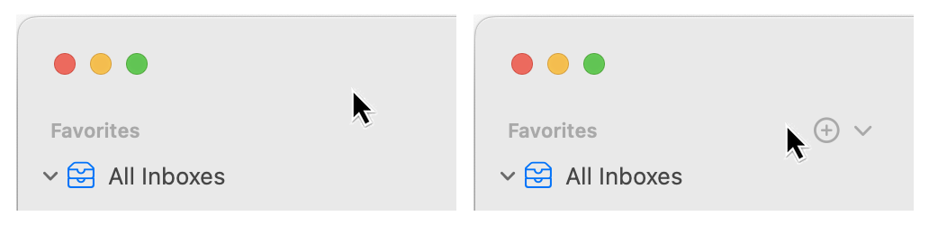
…oh wait, there is. As long as you magically hover in exactly the right general area to see the previously-invisible UI for adding favorites.
Thankfully, you can also right-click on a mailbox and select Add to Favorites. I consider the contextual menu items to be semi-hidden UI, as you still have to go looking for them. There is no way to do this using Mail's menus, however.
The best solution would be to have the down-arrow and plus sign always visible next to each item where it's applicable. A user setting could be included for those who prefer the clean look.
I really hate hidden UI.
"Hidden UI" is an oxymoron.
Apple's UI team has been off track for, oh, how many years now? Well, since the Tim Cook era.
Bad UI takes many forms at Apple including hidden features, inconsistent feature placement within and between devices, and illogical arrangement of features, to name a few.
Apple UI has gone from consistent and logical to the exact opposite. Apple's design mantra has become "change for the sake of change," never mind the user experience.
Comments are closed.