Something’s missing here…
 My story about what happens when you wake a Mac...without the hard drive that booted it being attached!
My story about what happens when you wake a Mac...without the hard drive that booted it being attached!
Tonight, while doing some testing for the ever-growing discussion about my Macworld Spotlight writeup, I stumbled across yet another ‘feature’ of Spotlight that I just don’t get. I’m think I remember reading this somewhere in the hazy past, but it slipped my mind when I wrote the long article for Macworld. But after playing around some more, this new ‘feature’ has jumped well up on my list of Spotlight annoyances.
So just what is this ‘feature’ that bothers me so? It’s this:
Spotlight will, by design, not find exactly what you asked it to find.
At this point, you might be saying ‘huh?,’ but let me explain by way of a simple demo.
I know that not everyone that visits here reads my stuff over on Macworld's site, so I thought I'd put a quick note here, too. Over on Macworld today, you can read my latest opinion piece, A Dim View of Spotlight.
This piece is a follow-up to my original Shining the spotlight on Spotlight article, which (confusingly enough) appeared here on robservatory in May (I wrote it prior to the Macworld changeover). If you read the original, you can skip the whole "what I said back then" section in the new article, and just read through my latest thoughts on why Spotlight still isn't quite everything it could be.
Executive Summary: I don't like the way Spotlight works at all, but I still think it has great potential. Read the story for the specifics on why I feel that way!
One of the things I like the most about OS X 10.4 is Automator, Apple’s new tool to help automate routine tasks. There’s an amazing amount of power hiding beneath a relatively simple user interface. The fact that users can create their own Automator actions (not workflows, but the actual actions that show up in the Action column), as described in this hint published today, means that Automator can be easily extended by those with a bit of programming experience.
Considering both Actions and Workflows, there are already over 100 entries on Apple’s Automator Actions download page, which is quite cool. (This does, however, pale in comparison to the 1,289 Dashboard widgets currently available for download.) In any event, Automator is a good tool to have around, and I’ve already put it to use on a number of occasions.
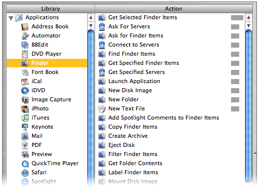 There is, however, something that irks me about its interface. Consider the screenshot at right of the Actions associated with the Finder Library entry (hover and click to zoom).
If you scan the list of Actions, you’ll find that they’re not in alphabetical order. Well, they’re sort of alphabetized. Look a bit closer, and you’ll see that the list is actually sorted by the relevance indicator, just like the search results in Mac Help. While this makes sense in Mac Help, as you’re searching for something that’s not definite, it makes no sense at all in this context. What is this list relevant to? The Finder Library entry? If that’s the case, then how come “Get Selected Finder Items” sits at the top of the list with 100% while “Filter Finder Items” (which sounds very similar) scores 0% and is sitting down near the bottom?
Within the relevance sort, the sort is then alphabetic, so with some practice, you can eventually find what you’re looking for. But Apple’s use of the seemingly-undefined relevance criteria makes the task much more difficult than it should be. Consider the iTunes Library entry; it has four levels of relevance, which means the alpha sort restarts four times—and one of those times is for one lousy item! It takes way too long to find a given entry in a list ordered in this manner, and there’s no reason for it at all that I can see.
You might think that using the Applications Library entry (the first one in the list) would solve the problem, since it selects all actions and displays them at once. But no, even in this situation, the relevance sort order is maintained! As a result, I never use this entry, as it’s really, really hard to find anything.
The solution seems simple to me: Apple, please sort the Automator actions by alpha, not relevance. If you’re going to insist on a sort by relevance, then at least give us the option to sort by alpha instead…
A while back, I wrote about the many faces of Apple’s OS X applications. At the time of that writing, I identified six-ish unique interface looks:
With the release of iTunes 5.0, it seems there are now seven interfaces. For lack of a better description, I guess I would call this one Smooth Metal 3—it seems to incorporate aspects of both Smooth Metal 1 and Smooth Metal 2, yet it doesn’t exactly match the look of either of its cousins. Its predecessor, iTunes 4.9, fell squarely in the Old School Metal bucket. Here’s how the new iTunes interface looks, compared to the old:
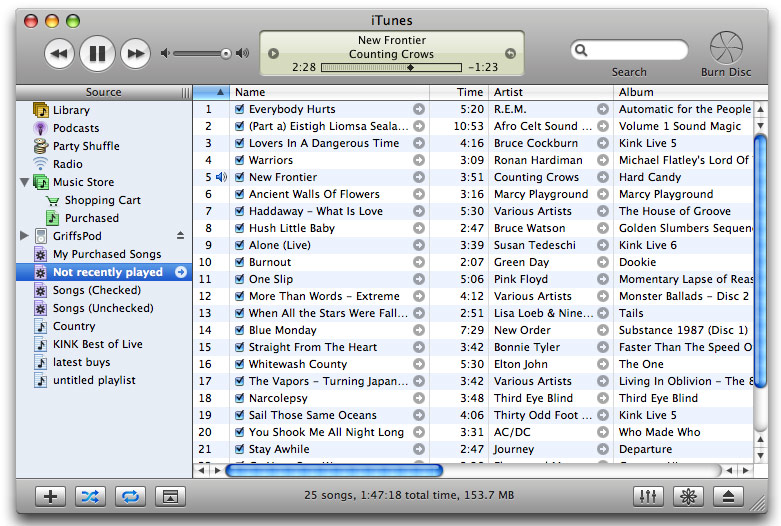
On the left is iTunes 4.9; on the right is iTunes 5.0. Click either image for a full-size version of each screenshot. There are many differences between the two interfaces, some obvious and some not so obvious. Keep reading to see some of the changes in detail, as well as my opinion on the new iTunes look.
 In comparison to other platforms, installing software on OS X is a breeze. Usually, you just drag and drop the program from the disk image to its destination, and you're done. Even some complex programs can be a snap to install -- Office 2004, for instance, has its installer hidden in its code, and it's smart enough to run the first time you launch any Office app. So even though it installs stuff to a bunch of places, it's transparent to the user.
The third option is Apple's installer, which helps guide the user through the software installation process. The installer is the ideal solution for programs that need to install things in many spots, and require administrative access to do so. And while using the installer is still a very simple process, I still find it a frustrating process at times.
As an example, consider my recent installation of a new version of Snapz Pro X, the indispensible screen capture tool. Please note that this is not intended to be a slam on Apple's installer or Snapz Pro X (which I rely on every day!). Rather, it's just an example of how the process can be a bit frustrating and confusing, along with a couple of suggested improvements.
 Given my background with macosxhints.com, it's quite clear I'm an OS X fan. But that doesn't mean I think it's perfect. While there are many, many things it does quite well, there are also areas that bother me, and make using OS X tougher than it should be.
One such area is the consistency of applications' interfaces. Long a hallmark of the Mac experience, major pieces of that consistency have been falling away slowly but surely as OS X and its applications evolve. With the recent release of OS X 10.4, I thought I'd take a look at the state of application consistency in OS X. Generally speaking (Java applications excepted), menus remain a high point of consistency. File and Edit are always there, with there generally familiar choices. After that, of course, the menu structure is up to the program designer. But overall, I have no complaints with menu consistency in OS X. It's the actual application interfaces that are bugging me.
[continue reading…]
 I spend a lot of time using OS X. A typical day will involve somewhere between 12 and 15 hours usage, with somewhat less than that on the weekends. I've been doing this basically ever since the Public Beta. After all that time, there are obviously some things that make we wonder "What was Apple thinking?" when they made a certain decision.
So without further ado, here's a list of ten such questions -- in this case, I'm focusing on the Finder and the user interface in general. Answers aren't provided, of course, but please feel free to comment if you have any insight on any of them...
 OS X 10.4 (Tiger) has been officially available since April 29th. I've been lucky enough, thanks to a developer seed, to have been testing various builds for a couple of months. In that time, there are a number of things I've grown to love about Tiger (and a number I dislike, though those will come in a future write-up). With over 200 new features, I thought I'd try to pick out the 10 that I've liked the best so far.
Note that these are observations about OS X 10.4 only. Sometime I'll write a longer story discussing OS X in general, both what I like and dislike. But for now, here are my ten favorite 10.4 features...
One of OS X's most-touted new features is Spotlight, the system-wide tool designed to help stop your data from playing hide-and-seek. Spotlight resides in the top right corner of the menu bar, and also functions in many programs, including Mail, the Finder, and Address Book. Third-parties can tap into an API to include the power of Spotlight in their applications.
In theory, Spotlight is brilliant. After some time to index the hard drives in the machine, Spotlight can help you find the oldest, obscurest information buried in the confines of today's huge hard drives. That's the theory, anyway. Despite that, and after having used it for a couple of months now (I had a seed key for testing the developer builds), I'm still undecided about the helpfulness of Spotlight.

There are some things it does well -- it clearly makes it much easier to find the proverbial needle in the haystack that is your hard drive. It makes it really simple to look at all the cool things in the System folder. Select that folder in the Finder, then run a Finder search on kind:images within that folder, for instance. It will theoretically help me find long-lost documents as long as I can remember some snippet of text that was in them. All of these are good things, and for these, I'm thankful.
However, from my perspective, Spotlight has a number of issues that very much give it the feeling of a "version 0.95 release." Read on to see the things that make me question Spotlight's completeness...