Back in the early Mac OS X iTunes era, there was a wonderful small window available that had control buttons, volume control, a visual progress bar, and a text display showing the artist, song, and album—it could even display a graphic equalizer in lieu of the artist-album-song info:
It was perfect. Sadly, it was last seen in iTunes 10 in Mac OS X 10.7. And today's version, while offering a mini mode, isn't nearly as mini or as functional as it used to be; read on for some details…
 Because it was perfect, Apple had to ruin it by creating a replacement Music mini player1They can't even decide what it's called: Mini Player on the web, but MiniPlayer in the Music app's menu. As you can see in the screenshot at right, the mini player is anything but mini in its default layout.
The first few versions weren't like this; they maintained the wide-and-thin appearance of the original, but with a new UI. But over the years, the default has moved away from the minimal window appearance, and has also seen changes in how it works—and none of those changes were for the better.
The first problem, of course, is that it's not mini. At all. The second problem is that you can't have both controls and song info. If you're hovering, you get controls (as seen in the screenshot). If you're not hovering, you get song info. The focus is clearly on the image of the album cover, which I guess should make me go "ooooh!" and forget about the usability and size issues. But it doesn't.
Apple, though, has us mini window fans covered, or at least they think they do: On the above-linked page for the Mini Player, they say, "You can also shrink the Mini Player window to an even smaller size." Why, yes you can, though it's then quite ugly and less functional than the original (as you'll see).
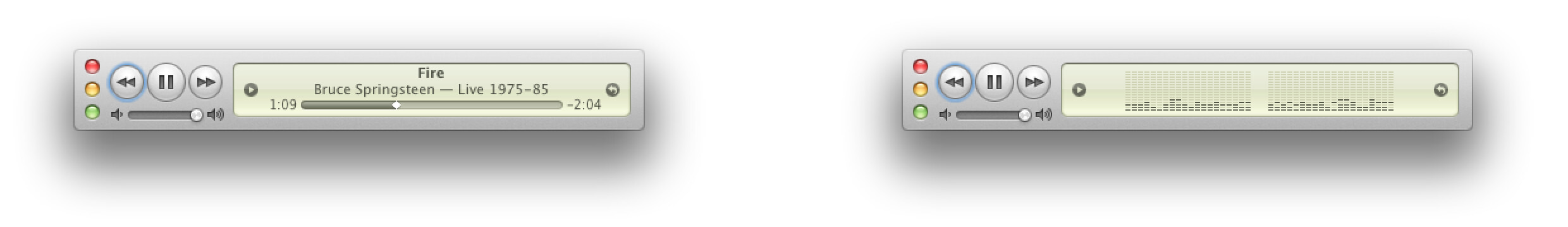
Thankfully, Mario Guzman has made everything right in the world again with his stunning, gorgeously-retro, completely free, and absolutely perfect replacement for what Apple took away: Music MiniPlayer.
 Sure, the UI is a
 bit lot retro (that's sort of the point!), but just look at how useful (and small), elegant (and small), and absolutely perfect (and small) that UI is. That's it at right, directly above Apple's smallest-size mini player.
Mario's window is slightly wider than Apple's but notably shorter. And in that small space, he manages to pack in a ton of useful information and features—including direct access to playlists via the small "play" arrow next to the song information (though you can't get the real-time equalizer display).
By comparison's, Apple's smallest player looks (seriously) like something that was hurriedly thrown together—there's nothing there that's visually interesting. Just a thin gray line for a progress bar, song info, and a timestamp (and the controls, on hover).
If you miss iTunes' old mini player window and like retro UI, get Mario's replacement—it's perfect in every way. If you really want retro UI, you can also grab Music Widget—a remake of the original iTunes remote—and Music Remote, a recreation of the remote control for the Mac OS X Public Beta Music Player app. Both are also free, and here's what they look like2Mario's images, reproduced here so as to not leach bandwidth from his server:

Great stuff, Mario!
I find so much change for change sake to be change for the worse. I'm a dinosaur in that I still choose to buy physical CDs, rip them to iTunes, and store the CDs in a large binder.
I like the album nature of the music, in that I'll often buy a CD if I hear a specific song I like elsewhere and may find I like what the artist produces or may find it was a one off. When I'm playing music, I'd really like the display to include text over the album art displaying the Album Name, Track Name, Artist Name, and year it was released. Apple is trying to only be involved in selling you individual tracks or however they make money, so they don't seem to care about any of that and don't have a way to manipulate it in the preferences.
Their helpful way of supplying album art during the ripping process is nice but may get changed in the background when a song metadata changes in the cloud for some reason. What's even worse is that they seem to corrupt the database of album art on the iPhone on a regular basis so incorrect pictures are displayed while the music is playing. The only way I've found to fix it is to erase all the music from my iPhone and re-sync it from iTunes. (I have an iPhone Pro 14, so lightning speed makes this untenable. Maybe next year I'll justify upgrading to get USB C speeds.)
Comments are closed.