Skip to content

Rob Griffiths

The bizarre world of digital movie pricing

Recently DirecTV had a free HBO preview weekend; as we're not subscribers, I set our DVR up to record a number of movies. One of those films was X-Men: Days of Future Past. I'd never seen any of the X-Men movies, and I really liked this one. So I decided to watch the other six films in the series, renting them on iTunes and Amazon Instant Video.

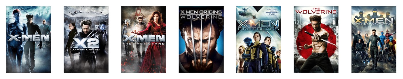
I was able to rent all movies except The Wolverine, which is only available as a purchase on either Amazon Video ($12.99) or Apple TV ($14.99). So I had to buy one movie, and rented the other five. In total, I paid $34.94—about $5.82 each—to watch six movies, including buying The Wolverine. That's not outrageously expensive. (I paid an extra $2 to buy the iTunes version, as it's a better viewing experience than Amazon Instant Video.)

But (excluding The Wolverine), that's my cost to watch them just once. If I or anyone in my family wants to watch them in the future, we'll have to pay again. If I want to own the movies, to make them free to watch any time, I could either buy them digitally or on Blu-Ray.

To buy all six movies on iTunes, I'd pay a whopping $89.94, as each is priced at $14.99. (You'd think the first three films, all being at least nine years old, would be cheaper…but you'd think wrong.) Over on Amazon Instant Video, it'd still cost $77.94 to buy the six movies on digital, as they're $12.99 each.

Clearly, if digital is that expensive, then the Blu-Rays will be even more, right? After all, they have to be mastered, duplicated, boxed, sealed, and shipped to retailers. There are physical returns to worry about, and management of all the stuff in all of those steps…so these Blu-Rays are going to be incredibly costly, right? No, not right at all.

A quick trip to amazon.com leads to X-Men and The Wolverine Collection, which contains all six of the movies on Blu-Ray. And the cost for all six movies? Only $34.96, or exactly two cents more than I paid to to rent five and buy one in digital form!

(I found the exact same collection on walmart.com for the same price, too, so this isn't some Amazon-only special pricing. And even at the full list price of $69.99, this collection is still cheaper than the digital versions.)

Even if I wanted to buy all six movies separately, the total cost for all six would be $73.78—still cheaper than either iTunes or Amazon Instant Video! (Most of this cost savings is because the older movies are indeed cheaper than the newer movies. And the newer movies are, in some cases, more than their digital counterparts.)

In a nutshell, I should have simply bought the six-disc collection and been done with it. (It's also not too much work to rip them myself if there's not a bundled digital copy, so I can watch on Apple TV, iPad, etc.)

I'd have spent all of two pennies more than what I did, and I'd own the actual movies, free to use when I like and how I like. Sometimes I really hate Hollywood.


The new scaled Retina MacBook

I stopped by the Apple Store today to look at the Apple Watch (summary: amazing tech, but it's a watch, yawn) and the new ultralight MacBook, which is potentially much more interesting to me than a watch.

I spent some time typing (definitely less travel and firmer, but felt fine to me), and looking at the colors (silver—boring, gold—schlocky, space gray—omg perfect!). Speed for simple tasks seemed more than fine, though I'd hate to push it with Motion or Final Cut or anything like that. It's definitely amazingly thin and light.

But the thing I really wanted to look at was the screen. This is a retina device, with a stated screen resolution of 2304x1440. On the MacBook Pro side of the fence, each of the stated pixel values is halved to get the effective ultra-sharp resolution you'll see in the machine's default mode. The 13" rMBP's 2560x1600 screen is effectively 1280x800 as shipped; the 15" rMBP's 2880x1800 gets you 1440x900. In both cases, each full-resolution dimension is halved to find the default usable screen resolution.

Given that the new MacBook's screen is 2304x1440, I was expecting to see the display effectively at 1152x720. This is less than you get on an 11" Air (1366x768), which is odd given the larger screen. I was curious how it would look. I should however, have read Jason's reviewer's notebook before heading to the store, as he points out that this isn't the case.

[continue reading…]


Improve the performance of your audio/video system

I take my audio and video very seriously; my audio/video room is built on a separate foundation from the rest of the house, the sub-floor is acoustically isolated from the foundation, and the walls and floor have been tuned for perfect response regardless of listening position. In short, I don't mess around with my audio/video stuff.

But I always think there's room for improvement, which is why I was so excited by the arrival of my long-backordered Chromatic Response Augmentation Panels, pictured at right.

These panels (a steal at only $229.95 per set of 25; I ordered an eight-pack) are simply incredible. How do they work, you may ask? You apply them to your audio and video cables, and the chemically-coated colors in the panels act on the electrons in the wiring, aligning them for fewer collisions and better flow rate.

Why should you want to reduce collisions and increase flow rate? After installation and 100 hours of continuous testing in my audio/video room, here's why: They're amazing! My audio playback was impressively better than before I installed the augmentation panels. The sound stage was broader yet more nuanced, stereo separation improved by 87%, and I noted a subtle but discernible reduction in noise below the 20Hz level. Incredible!

My 1977 master recording of Steve Fullerton and the Vienna Beach Orchestra performing Riccardo's monumental 1771 symphony "En Periodico De Nada Fulleste" sounds better than I've ever heard it before.

My video playback was similarly improved: The blacks were blacker, the color palette was stunning in its breadth, and interlacing was basically gone. Watching the director's cut of the seminal 1968 film "The Peacekeepers," I was drawn into the movie like never before. It was almost like I was right there, demonstrating with everyone. Intense!

They may look like Sticky notes, but these augmentation panels have demonstrable real-world benefits in both the audio and video realms. Frankly, I'm blown away by these little panels of color!

When installing the panels, make sure you follow the instructions precisely—each type of cable requires a different repeating color sequence. Why? Because the types of electrons vary depending on source and destination, and the panels must be ordered properly to reflect these differences. For instance, here's my RCA cable wrapped with the panels:

While RCA uses a YPGWB—Yellow Pink Green White Blue—repeating pattern (see note below), Toslink cables use BBWGPPY, HDMI cables are GGWBPYBG, speaker wire is GPWWBYYP, etc. It's all explained in the 200-page installation instructions, which can be easily followed by anyone with a dual degree in physics and chemistry.

(Note: Because of their country of origin, the augmentation panels' patterns go from right to left, not left to right. Make sure you get the directionality correct, or you'll lose all the benefits of the panels.)

Note, too, that the panels must end 1/2" from the end of the cable, so as to let the electrons slow a bit before reaching the termination point. Otherwise you'll risk blowing out your equipment due to the high-speed electron collisions.

Anyway, if you're the type that wants the best out of your audio/video system, I highly recommend the Chromatic Response Augmentation Panels; at only about $2,000 to do all my cable runs, it's an amazing bargain. I've heard that the factory is making the stuff as fast as they can, but quantities are currently quite limited—so order your CRAP now before it's all gone!


The all-in-one Apple Watch spreadsheet

Let me get this out of the way first: I am not a watch guy. I own a watch I use for running. I own a few dress watches that I used to put on when I had a big fancy business meeting to attend. But those haven't seen the light of day in decades. So I have zero interest in owning an Apple Watch. (I might be interested if you could use one to replace the phone, but it's clearly an accessory device.)

But I am fascinated by this new business Apple's going into; the sheer number of products and prices is pretty amazing: By my count, Apple will be shipping 38 separate models of watches. There's a gallery page at Apple's site where you can page through all of the watches, and get the details on each specific model. You can also view the watches in the store, where you can find pricing info.

Update: Kirk McElhearn pointed me to Apple's Watch Sizing Guide, which contains information on band lengths. I've added two columns (Band Sizes, Band Size Range) to reflect these values.

Both of these solutions, though, require lots of paging and scrolling to get all the details. I was curious as to how all the watches compared, so I pulled data from those sources and made one massive spreadsheet:

If you'd like to download the file and look at it in Excel (or Numbers or whatever), here it is. Feel free to share; I merely compiled the publicly-available data and don't really care what you do with it (though leaving the attribution in place would be nice).

There are some interesting facts hidden in all that data:

  • The lightest watch isn't any of the Watch Sport versions. Instead, it's the Classic Buckle Apple Watch (56 grams), which is a full six grams lighter than the next-lightest watch.
  • The heaviest watch—at a whopping 125 grams—is the Apple Watch Stainless Steel link (42mm in either stainless or space black). That may not sound like much, but 125 grams is over four ounces, or to put it another way, it's like wearing a quarter-pound hamburger on your wrist (weight before cooking, of course). It's also 2.2x as heavy as the lightest watch.
  • Color adds weight: in the Watch Sport category, the bands' weight varies by color. Black is 37g, then pink (42g), green (43g), blue (44g) and white (47g). So somewhat oddly, to go light, go with black.
  • Band size only changes weight by one gram (modern buckle) or three grams (leather loop).
  • In the Apple Watch family, you can't get a 38mm leather loop, or a 42mm modern buckle. I have no idea why they restricted these choices; it seems odd.
  • In the Apple Watch Edition family, there's no 38mm classic buckle, and no 42mm modern buckle. Again, this seems an odd restriction.

I don't have any plans on keeping this current as Apple (inevitably) adds more watches to the mix, but it was interesting seeing all the "day one" models in one spot.


Use Intel’s Power Gadget to keep an eye on your CPU

If you're the type who likes to keep an eye on your system, you may be familiar with tools such as Activity Montior's CPU meters, or iStat Menus, which displays a ton of system info via its menubar icon. Neither of these tools, however, really show you what the CPU itself is up to—and that's where an Intel-provided tool enters the scene.

The Intel® Power Gadget shows you exactly what your CPU is up to: how much power it's using, what speed it's running at, and its temperature. As seen in the image at right (click for larger), it graphs these three values over time.

The data you're seeing there is from my 4GHz Retina iMac, and the screenshot was grabbed while it wasn't doing much in particular. What really stands out to me is how often my 4GHz CPU is running at something closer to 3GHz; if the CPU isn't being called on for its full power, I'm assuming it slows itself down to reduce power usage.

But as soon as you do something that demands the CPU's full power, the napping stops. Here's a brief movie I created showing the CPU tracking when I started ripping a Blu-Ray:

The machine is basically idle at first, then I start the rip after 15 seconds or so. As soon as the hard work starts, the power and temperature charts shoot upwards, and over time, the CPU speed pegs right around 4GHz; the naps are gone.

I'm not sure how much real-world use this tool has, but from a geeky perspective, it's pretty cool being able to see exactly what your CPU is up to at any point in time. (You can even send the data to a log file, in case you really want to study power, speed, and temperature over an extended time period.)


My thoughts on Apple Watch upgradeability

Lots of people are talking about the possibility of an upgradeable Apple Watch.

In particular, the ultra-expensive Apple Watch Edition is the version that seems to inspire these conversations: Who'd pay $5,000 (or $10,000 or whatever) for a non-upgradeable high-end watch?

While this seems a fair question, I honestly don't think upgradeability of hardware will be a major stumbling block for folks with this kind of money. Instead, they'll be focused on two questions: Does the watch do what I want it to do now, and does it make the statement I want it to make? If they answer yes to both of those questions, then they'll buy the watch.

A year from now, if Apple comes out with Apple Watch Edition 2 (gads, could that naming get any worse?), they'll ask themselves the same two questions, and then either buy a new watch or keep the old watch. Remember that functionality will improve on the existing hardware, as Apple ships software updates over time, so it's not like the watch will lose functionality as time passes.

Apple has never been in the "let us help you upgrade" business. They're in the "let us help you buy a new device" business, and I don't see their entry into the watch market changing that focus. If you want a new watch, they'll sell you one. Perhaps, just perhaps, there will be a formal trade-in program for existing Apple Watch customers—but I think that's all it would be, a simple trade-in credit when buying a new watch.

I just can't envision "Apple Watch Specialists" at the various Apple stores, sitting around on benches, loupes on eyes, swapping out watch motherboards. That's not Apple's business, and it's not a business I think they want to be in.

There is one minor exception to this: clearly there must be a relatively easy way to replace the battery on the watch; there's just no way they're going to require folks to mail in their watches for battery service. Perhaps the battery will even be a user-serviceable part…wait, what am I saying, this is Apple we're talking about.

I believe the level of Apple-provided hardware upgradeability in the Apple Watch (all versions) will match that of the iPad or Mac lines: none. In theory, we'll find out the answer in a few weeks when the Apple Watch is released. But in reality, Apple could take another year (or more) to figure out what to do for existing customers, as that's not an issue they'll need to address until the second generation Apple Watch is released.


Stupid by design: Voice command uselessness

I drive a 2014 Subaru Legacy; for the most part, I'm happy with the car. But there are some design features that are just comically stupid. Here's one example…

The image at right shows the steering wheel controls on the left side of my steering wheel. The up/down arrows icon is a toggle switch to quickly change the audio track being played (or the radio station preset); it works great, and I use it all the time.

The stupid comes in just below that, with the face/speaking icon button. This button activates voice command mode, which does many useful things, such as dialing the phone, setting a destination for the nav system, etc. But you can also—you guessed it—use it to change tracks. Here's how that works:

  1. Press face/speaking icon.
  2. Wait about one second for the car to say "voice command please."
  3. Say "next track" or "previous track."
  4. Listen to car say "track up" (or "track down"), then the track changes.

Now I ask…who is ever going to use this method of changing tracks? The very first thing you do to use it—pressing the face/speaking icon—requires touching the steering wheel. The same wheel where, roughly an inch above that button, is a toggle switch that will switch tracks in precisely one step!

Did they include the voice command track changing features because someone in Marketing said they had to? Did they think there are people who prefer a slower, more cumbersome process to simply tapping a toggle switch? Did they think there are people who need audible feedback about what they've asked the car to do? (Never mind that they get that feedback by hearing the new track after using the toggle button.) Do they think there are a group of people who will use steering wheel buttons but would never use steering wheel toggle switches?

I honestly have no idea why they included the voice command ability to change tracks, but it definitely strikes me as stupid by design…or am I overlooking some really-obvious use that I'm just not seeing?


The iOS App Store’s paid apps lottery game

In case you missed it, Apple is promoting "pay once" games in the iTunes App Store:

I think it's amazing that Apple is highlighting pay-once games; anything that helps focus attention away from the freemium model is great in my eyes. I hope this is a regular feature and kept up to date.

Looking at just the apps I can see on the screen without scrolling, there are about a dozen I think I'd like—for a total cost of around $85 or so. But that's where I reach the freeze point: Instead of sending Apple my $85 and trying out a bunch of cool games, I do nothing. That's because if I decide to buy these games, I might as well spend the money on lottery tickets.

You 'win' the iOS lottery if you get a great game for your money. You 'lose' the iOS lottery when you wind up purchasing a steaming pile of donkey dung of a game. Sorry, you lost this time, but please play again soon!

[continue reading…]


How to search the archived Mac OS X Hints site

Late last year, just after its 14th birthday, Mac OS X Hints was officially put into a coma. The site exists online, but it's no longer accepting hints, and exists in a static state.

While it's great that this information is still online—as there are tons of still-useful tidbits there—it's apparently not searchable. When you enter something in the search box and press Enter, nothing happens…well, not nothing: The page reloads with an empty search box. Without search, the huge database isn't quite so useful.

The good news is that Google and Bing have indexed the static site, so you can use their search engines instead of the site's search engine. Even better is that you can build complex queries that aren't possible when searching directly on the site.

To search the hints site from Bing or Google, just include site:hints.macworld.com in the search string. A few quick examples:

While this isn't quite as handy as searching directly on the Hints site, it works well. (To make it easier, I've created a Butler search engine entry that searches hints via Bing.)


Another way to look at 74.5 million iPhones in 90 days

My buddy Kirk came up with some analogies about just how much "stuff" 74.5 million iPhones represents. While I found his comparisons very interesting, as a Finance guy, I have a different method of comparison for you to consider…

I started with guesstimating the mix of of iPhone models and variations sold, using nothing more than common sense that says the mid-tier version would be most popular, with a few more people opting for high-end over low-end:

PricingSales Mix
ModelEntryMidHighEntryMidHigh
6$649$749$84915%60%25%
6+$749$849$94915%60%25%
5s$549$59950%50%
5c$450100%

I then estimated the sales mix by iPhone model, using Tim Cook's statement that the iPhone 6 was the most popular. I distributed the rest of the mix assuming that the newer models would sell more than the older models. Once I had the mix percentages, that let me calculate an average selling price for each phone. Combine that with the estimated sales mix, and out pops revenue by phone line:

ModelAvg SaleShare of TotalUnits (Mil)Revenue ($Mil)
675950%37.3$28,273
6+85930%22.4$19,199
5s57415%11.2$6,414
5c4505%3.6$1,676
Totals74.5$55,562

All those numbers and assumptions crunch down to this:

In one quarter, Apple's iPhone business was somewhere around $55.5 billion dollars in revenue.

One quarter. Not a year. A quarter. Ninety days.

But just on that one quarter's iPhone sales, "Apple iPhones Inc." would be number 50 on the 2014 Fortune 500, coming in just below Caterpillar ($55.656 billion), and above UPS ($55.438 billion). Remember, those are full year results, versus just one quarter's iPhone sales.

A couple other fun comparisons using these assumptions:

  • Google's full-year revenue in 2014 was $60.2 billion, ranking them only four spots ahead of one quarter's worth of "Apple iPhones Inc." on the Fortune 500.
  • Using last year's 169,170,000 total iPhones sold, "Apple iPhones Inc." would be number 13 on the Fortune 500, ranking between CVS and Fannie Mae.

74.5 million iPhones in one quarter is a stunningly huge number. Huge enough to put the fictitious "Apple iPhones Inc" company well up the Fortune 500 based on just 90 days' sales. Mind…blown.