Skip to content

Apple Universe

Top-level category for all Apple, Mac, and OS X related topics.

Apple should go back to the future with the Mac Pro


Expensive trash can?

Back in 2013, Apple introduced the new Mac Pro, an amazing wonder of design. But it was also a study in compromise for "Pro" users, requiring all peripherals to be externally attached, and not allowing for any after-purchase upgrades (video card, CPU, etc.). It was also shockingly expensive.

I can only imagine how hard it must have been for Apple to try to build a perfect Mac "Pro" desktop for everyone. As nicely designed as the new Mac Pro was, it missed the perfect mark for many Pro users by quite a bit.

So how does Apple try to design one Mac that can satisfy a diverse group that encompasses design professionals, gamers, scientific researchers, video creators, and who knows what else? Quite simply, they shouldn't try, as such an exercise is destined to fail. (See "new Mac Pro," above.)

Instead, Apple should design one Mac that can become anything and everything to each type of "Pro" user. While that may sound daungting, the good news is that Apple's already done this in its recent past. And done it very well, I might add…

[continue reading…]


The iPhone 7 and third-party battery pack cases

One aspect of Apple's decision to remove the headphone jack from the iPhone 7/7 Plus that I haven't seen discussed anywhere is the impact it will have on third-party battery pack case makers. Traditionally, third-party battery pack cases plug into the Lightning port, and typically provide a micro USB connector in its place. They also then usually have a headphone passthrough, either via a port extender or a special headphone cable extender, to allow you to plug in headphones without removing the battery pack.

I was curious how the case makers were going to address this for the iPhone 7, because blocking the Lightning port means that users will have to use wireless headphones when using a battery pack. I searched Amazon for iPhone 7 battery case, to see what might be in store. However, the results were disappointing—basically, every single product uses micro USB for charge and sync. I could go on, but you get the idea: None of the manufacturers seem to be worried about blocking the Lightning port with their battery cases.

The only exception I found was the SOLEMEMO Ultra Slim Charging Case, which isn't actually designed for the iPhone 7. But as designed for the iPhone 6, this case uses an ultra-slim bottom with a tiny Lightning pass-through, as seen in the photo below (borrowed from one of the reviews on Amazon).

This style of connector would allow you to connect wired headphones (either Apple's Lightning pods, or standard headphones via Apple's Lightning to 3.5mm adapater cable). I don't know if this company will be making an iPhone 7 version or not; the iPhone 6 case should fit the iPhone 7, but the camera opening won't line up with the camera's new position on the iPhone 7.

(I checked Mophie, too, but they're early on in their iPhone 7 case building process; their iPhone 7 link takes you to their Explore our Process page, which describes the method and timeline they follow in making products for new devices.)

So if you're buying an iPhone 7, and you want a battery case right now, and you want to use wired headphones with that case, as of today I see three solutions:

  1. Buy the SOLEMEMO Ultra Slim Charging Case for $35, knowing you won't be able to take pictures. Note that this is a 2400mAh battery pack, so it's not as large as some of the others (but it is very slim).
  2. Buy Apple's $99 iPhone Battery Case. This is an 2365mAh battery pack (up from 1877mAh for the iPhone 6s), and it nicely integrates—at the iOS level—with your iPhone. But it's pricey, underpowered, and has The Hump. For the cost of the Apple pack, you could get two SOLEMEMO packs and have $30 left over!
  3. Buy any of the forthcoming iPhone 7 battery cases and use wireless headphones. OK, so that totally skips the 'use wired headphones' requirement, but it's really the only other option at this time.

I'm hoping we'll see someone come out with something truly innovative here, such as Lex Friedman's suggestion on Twitter:

Adding an actual headphone jack would probably be a home run product; I have no idea if it's technically possible to split the Lightning port's signals in that way (I would bet it's not). Even lacking that, though, it'd be nice to see more third-party cases that pass through the Lightning connector, so that wired headphones could still be used.


Plex and I do not get along

After hearing my The Committed podcast cohosts rave about Plex (a free media server), I thought I'd give it another shot: I'd tried a few months back, but because of the way I store my personal videos (using our own Usher app), it was going to be a big migration project, and I just never got into it. So today, I resolved to try again.

And today, I'm giving up again. I've spent the last few hours fighting Plex, and despite the awesomeness of the streaming (it *is* awesome), it's just not worth the aggravation in configuration and setup—to me, of course. Plenty of others find it works just fine.

But for me, it doesn't work at all, basically. Here's a short list of some of the things that bother me about Plex…

[continue reading…]


Why I still use the admittedly-awful Messages

A while back, David Chartier tweeted this:

https://twitter.com/chartier/status/718107492966862849

David really doesn't like Messages (for many valid reasons), and has often tweeted and written about other, better messaging platforms, including his current best-of-breed example, Facebook's Messenger.

And you know what? In general, I agree with David: Messages sucks. It's got latency issues, messages sometimes vanish, shared URLs are ugly, search is troublesome, it lacks many features found in other apps, etc. Yet still, it's my messaging app of choice, and will remain my messaging app of choice, probably forever. Why?

First of all, it's bundled with every Mac and iOS device sold, which means that most of the people in my social group already have it and use it. I don't have to send a link to someone and explain how to install the app, set up an account, find my name/phone number, add me to their group of friends, and initiate a conversation.

Does that make Messages good? No, just because an app is bundled doesn't mean it's excellent. (See previous generations of Internet Explorer on Windows, for instance.) But it does make it pervasive, and in a messaging app, that's what I want.

But even beyond that—even if Messages were so abysmal it lost 50% of the messages I sent and often force rebooted my devices and remotely spilled my milk—I would probably continue to use it. Why? Because Apple isn't in the business of making money off of who I talk to, what I talk to them about, or what devices I use to do that talking. Apple wants to sell devices, not data about how people are using Apple's devices.

[continue reading…]


Images replace content in USA Today’s iOS app

Yesterday, I noticed that USA Today had a new iPad app out—they released it as a separate app, so it didn't replace the old version. After trying the new app, I'm incredibly glad they chose to release the new version as a new app, because it sucks. Absolutely, positively, sucks.

Like the recent CNN redesign, USA Today has chosen to focus on pretty pictures instead of information. In other words, it's become another news app that has decided not to show any news.

Here's a side-by-side comparison of the old (left) and new (right) apps:

As you can see, the new app is dominated by one massive image, and very little of anything else. Here's a quick comparison of just how bad things are in the new app:

Data points…Old AppNew App
Stories visible63
Words shown14843
Weather visibleYesNo
Navigation visibleYesNo
Ads visible01
Largest image on page386x2201024x475
% of page covered by image10.70%61.80%

If you're scoring at home, which I am, the new app has a 50% reduction in the number of visible stories, and a 71% reduction in the number of words. And that insanely-huge 'hero image' covers nearly 62% of the page!

In addition, there's no visible weather, and navigation between sections is now hiding in a hamburger menu. Overall, the usability of the app has gone from very good to basically worthless.

This is progress? I don't think so. I'm staying with the old app, and giving the new one a one-star review on the App Store. Bad move, USA Today!


Replace the departed free iTunes Radio with free iTunes radio

In case you missed the news, Apple has now officially ended the free streaming of iTunes Radio. To listen to these stations now, you have to subscribe to Apple Music, which isn't something I want to use. (If they offered a "use but don't integrate into library," I'd subscribe in a heartbeat…but they don't.)

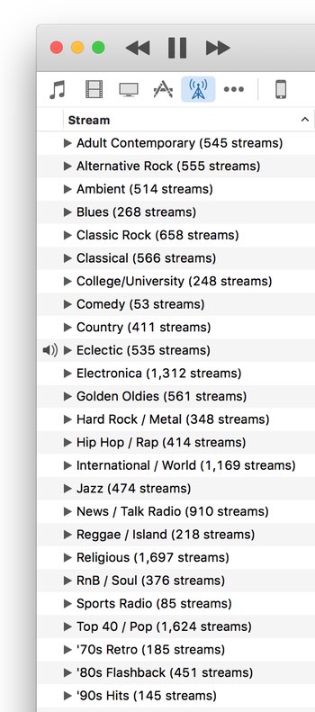
There are any number of other radio services out there - Pandora, Spotify, etc. But I wanted something that existed in iTunes, as I didn't want to have to run another app, nor (shudder) use my browser as a radio station front end. Then I remembered that iTunes has a huge—as in tens of thousands—assortment of Internet Radio stations.

I hadn't looked at internet radio in a long time, as I'd been quite happy with my selection of iTunes Radio stations. But Apple's move inspired me to take another look, and so far, I like what I've found. If you'd like to explore the world of Internet Radio in iTunes, here are a few tips to ease the exploration.

[continue reading…]


Retina lollipops

A candy store at the local mall had the most amazing wall of colorful lollipops, and I thought it'd make a wild desktop image for a retina iMac. As I snapped the pic on my iPhone, it took a bit of upscaling to reach 5120x2880, but I think it still looks fine; here's a small-scale version:

I also thought a tunnelized version would be interesting; here's how that came out:

I have these in my normal "rotate random every 15 minutes" cycle, and still get a kick out of the lollipops when they get chosen.


A look at password entry on the new Apple TV

When I discovered that I could use the grid-style password entry on the new Apple TV, I thought I'd hold a little password entry shootout of sorts. I wanted to compare the three ways I've discovered of entering passwords on the fourth-generation Apple TV. Just for fun, I threw my iMac into the mix, too.

First, some background: I use passwords of the correct horse battery staple variety. For sake of this post, let's assume my password was:

jinxed 187 Golf Bogies

There are 22 characters in total, with two capital letters and three numbers. My actual password consists of the same distribution, though that's all it shares with the demo password above. I then timed how long it took to enter on my iMac, and using the various input methods on the Apple TV. The results aren't all that surprising:

DeviceRemoteMethodTimeTries
Retina iMac--Typed0:021
Apple TV 4th GenSilverLine0:491
Apple TV 4th GenSilverGrid0:411
Apple TV 4th GenBlackLine2:593
Apple TV 4th GenBlackLine1:411

Obviously, typing your password on a physical keyboard is incredibly fast and (assuming you're a decent typist) basically error free. On the Apple TV, what I found is that regardless of method used (i.e. grid or line), the silver remote is both faster and more accurate than the Siri (black) remote. After discarding the Siri remote, I was notably faster using the silver remote with the grid layout than with the line layout.

The other thing to notice is that I only had accuracy issues with the Siri remote. The first time I tried to enter my password for this test, it took me three tries to get my password correct. The 2:59 time shown for the "grid" line is the total of all three times (0:47, 0:57, and 1:15). I then tried again, going very slowly to make sure I didn't make a mistake, which is the 1:41 time shown on the last row. I had no accuracy issues with the silver remote, regardless of line or grid data entry style.

My fastest entry (0:47) with the Siri remote wasn't that far behind the silver remote, but the accuracy was obviously not good. I had to work at half the pace of the silver remote to insure I didn't make any errors with the Siri remote.

Clearly password entry on the Apple TV is a hassle: Even with the silver remote, taking 41 seconds to enter a 22 character password is quite a waste of time. Apple really needs to address this, either by letting us pair a keyboard, or by updating the iOS Remote app to support the new Apple TV. For now, though, I'm sticking to the silver remote for password entry—even on the new line layout—because it's both faster and more accurate than the Siri remote.


Use grid-style password entry on new Apple TV

This morning, after waking my fourth-generation Apple TV, I was prompted for a password, and was very surprised when I saw the password entry screen, because it was not the two-row layout I've grown to hate. Instead, I saw this:

Yes, that's the third-gen Apple TV's password entry screen, on my fourth-gen Apple TV. Just how did I get it to appear? Very easily, though it took me a bit to figure out exactly how I did it. Here's how:

To use the old-style password entry screen on the new Apple TV, wake the Apple TV using the old silver remote, and don't touch the new Siri remote.

And that's it. If you wake the Apple TV with the silver remote, and don't touch the Siri remote until after you get to a password entry screen, you'll get the grid. If the Apple TV pairs with the Siri remote, though, you'll get the new-style line entry screen.

I haven't extensively tested this, but I did try on two different fourth-gen Apple TVs, and got the same results on both. So if you want to use the old password entry grid on your new Apple TV, get yourself a silver remote (if you don't have one already).


With Siri, it seems verb tense matters

My buddy Kirk McElhearn posted a blurb on his blog about Siri and 18th century painters: Siri and the History of Art. In a nutshell, he asked Siri who was the greatest French painter of the 18th century. She replied with "one eighteenth is approximately zero point five five five." Say what?

He asked me to try, but when I tried, here's what I got:

So Siri only knows art history in the USA, it seems? (Kirk lives in the UK.) Actually, no. On closer inspection, when I spoke, Siri heard "Who is the greatest…," versus Kirk's Siri hearing "Who was the greatest…."

So I tried agin, making sure Siri heard me say "was." Sure enough, when Siri hears "was," I get math results. When Siri hears "is," I get art results.

If you want Siri to help you with your history, it seems you should talk to her in the present tense!