Dropbox shows iPhoto what simple really means
Note: Dropbox—sadly—removed this feature in July of 2017, so don't even bother reading any further.
 Did you know that Dropbox lets you create photo albums? No? Me neither, until this morning, that is. And it turns out, it's incredibly easy to do:
- Copy or move a folder of images into your Dropbox folder. Choose any location within the Dropbox folder that you wish; I set up a Photos folder to hold slideshows.
- Open the Dropbox web site, and sign in to your account.
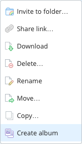
- Navigate to the folder you just uploaded, right click, and choose Create album.
- Click Share album, then copy the link or directly invite those you'd like to see the album.
That's it, your'e done. The only time-consuming portion of the process is uploading the images; creating and sharing the album takes almost no time at all. That's about as simple as it gets.
Now assume you want to do the same thing using iPhoto: create a web-based slideshow of images for anyone to see via a shared URL. Sure, you could use iCloud's Photo Stream, but that's not a web-based solution. Instead, you'll need to use File > Export in iPhoto, and either create a Web Page or a Slideshow. Slideshow is really misnamed, though, as what it really creates is a movie of your images. So Web Page it is.
 When Steve Jobs demoed Leopard at the Worldwide Developers Conference in June, one of the new features included in the revised Desktop is a semi-transparent menu bar. It's clearly visible in the streaming video of the keynote, and in many of the screenshots on Apple's Leopard pages.
 The recently-released OS X 10.4.7 update included a not-announced Dashboard widget update feature which silently checks to make sure that your widgets are valid. I agreed with the need for such a feature, but

 Given my background with it, and its role in leading to an unexpected but welcomed career change, I'm clearly a fan of OS X. But sometimes, I really question the quality assurance (QA) testing that goes into the OS and its associated applications. Consider the following glitch I ran into yesterday with Address Book.