One of the things I like the most about OS X 10.4 is Automator, Apple’s new tool to help automate routine tasks. There’s an amazing amount of power hiding beneath a relatively simple user interface. The fact that users can create their own Automator actions (not workflows, but the actual actions that show up in the Action column), as described in this hint published today, means that Automator can be easily extended by those with a bit of programming experience.
Considering both Actions and Workflows, there are already over 100 entries on Apple’s Automator Actions download page, which is quite cool. (This does, however, pale in comparison to the 1,289 Dashboard widgets currently available for download.) In any event, Automator is a good tool to have around, and I’ve already put it to use on a number of occasions.
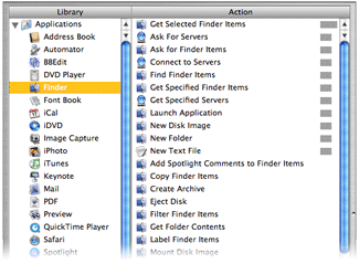 There is, however, something that irks me about its interface. Consider the screenshot at right of the Actions associated with the Finder Library entry (hover and click to zoom).
If you scan the list of Actions, you’ll find that they’re not in alphabetical order. Well, they’re sort of alphabetized. Look a bit closer, and you’ll see that the list is actually sorted by the relevance indicator, just like the search results in Mac Help. While this makes sense in Mac Help, as you’re searching for something that’s not definite, it makes no sense at all in this context. What is this list relevant to? The Finder Library entry? If that’s the case, then how come “Get Selected Finder Items” sits at the top of the list with 100% while “Filter Finder Items” (which sounds very similar) scores 0% and is sitting down near the bottom?
Within the relevance sort, the sort is then alphabetic, so with some practice, you can eventually find what you’re looking for. But Apple’s use of the seemingly-undefined relevance criteria makes the task much more difficult than it should be. Consider the iTunes Library entry; it has four levels of relevance, which means the alpha sort restarts four times—and one of those times is for one lousy item! It takes way too long to find a given entry in a list ordered in this manner, and there’s no reason for it at all that I can see.
You might think that using the Applications Library entry (the first one in the list) would solve the problem, since it selects all actions and displays them at once. But no, even in this situation, the relevance sort order is maintained! As a result, I never use this entry, as it’s really, really hard to find anything.
The solution seems simple to me: Apple, please sort the Automator actions by alpha, not relevance. If you’re going to insist on a sort by relevance, then at least give us the option to sort by alpha instead…
Sept 16th Update: I emailed Sal Soghoian, the AppleScript Product Manager at Apple (and all-around good guy!) to ask for some clarification. I asked “can you shed any light on exactly how Automator sorts its action lists?” He told me that Automator does indeed sort on relevance, and that “relevance is based on input/output types, keywords, keyword order, categories, and the related actions parameter.” He also mentioned that an alpha sort has been a popular request, so hopefully we'll see it soon...
 I know that not everyone that visits here reads my stuff over on Macworld's site, so I thought I'd put a quick note here, too. Over on Macworld today, you can read my latest opinion piece, A Dim View of Spotlight.
 A quick entry tonight, just because the subject came up recently
  Given my background with
  I spend a lot of time using OS X. A typical day will involve somewhere between 12 and 15 hours usage, with somewhat less than that on the weekends. I've been doing this basically ever since the Public Beta. After all that time, there are obviously some things that make we wonder "What was Apple thinking?" when they made a certain decision.