Skip to content

Rob Griffiths

Comparing colors on the 2014 and 2019 iMacs

I knew my new iMac had the wide color gamut (P3) display, but until I used it side-by-side with my old iMac, I didn't realize just how different things would look. In my comparison test of the two iMacs, there are a couple of photos of onscreen images—one set with the default iMac color profile, the next with the Adobe RGB (1998) color profile—the differences are quite obvious, especially on the default profiles.

Here's one last image, with a comparison slider, so you can more easily see how the colors change. (Thanks to Kirk McElhearn for the source photo.)

[continue reading…]


Two year old crushes the new (video card) kid on the block…

My 2019 iMac has the new AMD Pro Vega 48 video card, the fastest video card Apple has offered in a (non-Pro) iMac. But just how fast is it? I'll have more to say about it in an upcoming "games shootout" with my 2014 iMac, but I was also curious as to how (badly) it might compare to the video card—an NVIDIA GeForce GTX 1080—in my 2017 Frankenmac.

While I'd love to be able to compare the performance under macOS on Frankenmac, that's not possible as I uninstalled it a while back—I'd been unable to update to Mojave due to a lack of NVIDIA drivers for Mojave. (Which is related to all of this, in that you cannot use an NVIDIA card—with acceleration—in Mojave, even in an external GPU box, because it seems Apple and NVIDIA aren't on speaking terms right now.)

However, because a number of the benchmark apps I used in my 2019 iMac vs 2014 iMac—Part One comparison test also run on Windows, I was able to do some head-to-head testing, even if the difference in the OS adds a layer of unknown to the results.

Going in, I was pretty sure I knew what the results would show: The Windows PC was going to crush the iMac in anything graphically related, but lose in the CPU tests. While the AMD card is a big step up from previous-generation iMacs, it's nowhere near bleeding edge—it's more like "minor scrape" edge—in the Windows world.

Anyway, I ran a bunch of tests, and the results were pretty much as I expected…

[continue reading…]


2019 iMac vs Late 2014 iMac—Part One

When I replaced two aging laptops with a new MacBook Air, I posted a detailed analysis on the performance differences between the three machines. When Apple released the new iMac with a ninth-generation Intel processor and a higher-end AMD video card, I felt the time had come to replace my similary-aged 2014 iMac…and with that replacement, the opportunity to do the same sort of "old vs. new" comparison for others who may be at or over the five year mark with their desktop Macs.

As with the prior comparison, this is not a review of the 2019 iMac—I'll leave that detailed work to others who do it much better than I. I'm mainly interested in comparing this machine's performance to my current iMac—and for the Geekbench 4 tests, with the 10-core iMac Pro.

Note: If you read the first write-up, some of the following explanatory language will seem quite familiar (as in identical)—where it made sense, I simply pasted the same test explanations I used in the prior article.

Overview

Externally (at least from the front) I can't tell the two iMacs apart—if there have been any user-facing changes in the last five years, they're not visible to my eye. From the back, of course, things are a bit different, as Thunderbolt 2 has made way for USB-C/Thunderbolt 3. For me, this means I need a couple of adapters—my RAID is Thunderbolt 2, and I connect a second HDMI display via the other Thunderbolt port. I haven't yet installed/tested these, though I'm hopeful they'll work.

After logging into both machines, though, it's apparent that something's different with the new iMac's screen. For example, here's a screen from the GpuTest app. (I had to grab the frame from an animating scene, which is why they're not identical shapes.)

As screenshots probably wouldn't reveal these differences, I used the iPhone to take photos, then fixed any skewing and cropped them (but didn't adjust color, brightness, etc.) in Acorn.

Both iMacs were set to the default color profile (iMac), and had identical brightness settings.

[continue reading…]


We’re so done with Samsung appliances…

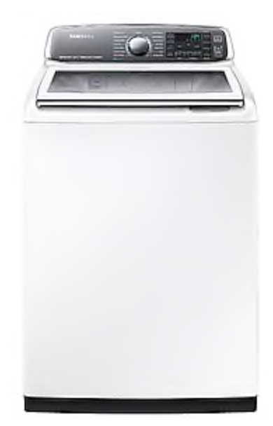
We presently own three Samsung appliances: The 8700 series washer and dryer, and a French door freezer-on-bottom refrigerator. I can say with complete confidence that these are the last three Samsung appliances we will ever own.

Granted, none are brand new—the fridge was bought in 2012, and the washer/dryer pair in 2015. But that's not old in the world of appliances. And while you might expect a few minor issues as appliances age, we've recently had two major things pop up: One in the washer, one in the fridge. What bugs me most is not that these issues occurred, but that they are apparently very well known to Samsung, and yet they've done very little in the way of making owners aware of and/or fixing the problems.

[continue reading…]


An even more improved run-tracking Excel workbook

2020 update: Everything here is out of date now, and has been replaced with my post on the 2020 version of the worksheet. In there you'll find a download link and full instructions. I'm leaving this article up only because it may be linked to from other places.


2019 update: I've uploaded new files (in one zip archive this time) with a few changes and fixes. These files are also set up as "master" files: The idea is you duplicate one, rename it for the current year, then use it. When the next year rolls around, repeat the process. This way, you don't have to use the macro-enabled version to delete data at each new year. Download the new files.

About two years ago, I created a basic-but-functional run tracking workbook (created in Excel). It worked well, and helped me through my 2,016 mile year in 2016. I didn't run nearly as much in 2017 (on purpose), but 2018 is upon us, and I'm going to up my mileage this year—probably not to 2,018, though!

In preparing this year's version of the workbook, I addressed a few things that bugged me about the first one: It was ugly, changing years was difficult, and it was ugly. It was also really ugly. Did I mention it was ugly? Anyway, here's what I've changed with the new version:

  • Years are now easily handled; just input the year you wish to track, and the workbook does the rest, including leap years.
  • All run data can be deleted with one button click—and yes, there's a confirmation first. (Requires macro version of workbook.)
  • The pace calculator is no longer a separate worksheet; it's integrated into the Overall worksheet.
  • It's not nearly as ugly as it was before—layout is improved, gridlines are gone, tables are cleaned up, etc.

As noted, there are two versions of the workbook—one contains a macro that can erase the run data from each monthly worksheet, the other does not contain that macro. This is something you'll only do once a year, but it's much easier with the macro version.

[continue reading…]


Updated: Find Keyboard Maestro macros by shortcut

Note: Revised on December 4, 2018 with a much better implementation of the pop-up palette, and some changes in timing and mouse movement.

One of the "problems" with Keyboard Maestro is that it's so useful I use it a lot, leading to a large collection of macros. Due to the number of macros, sometimes when I want to add a new shortcut, I can't remember if I've used that shortcut before or not. Today's tip comes in two flavors to address that problem: Simple and Complex.

The Simple solution

Short of just trying the shortcut, there's a way to check from within Keyboard Maestro itself: Type the macro's activation keys into the search box, as seen in the box at right.

You can't do this by pressing the actual shortcut keys—you have to type their character representations. You can do this with the "Show Emoji & Symbols" option under the flag icon in the menu bar, if you've enabled it in the Keyboard System Preferences panel. But finding those few special keys (if you even know how to search for them) is a pain.

Technically, you could also use the pop-up character palette macro I wrote, except there's an issue: When the palette activates, it deactivates the search box, so the characters don't make it there. It's also overkill for this task, because there are characters that wouldn't be part of keyboard shortcuts, and you'd never need the HTML codes, just the characters.

So I wrote what wound up being a set of new macros that make searching for assigned keyboard shortcuts much easier.

[continue reading…]


Use SQL to show MySQL tables in decreasing size order

Earlier today, I noticed that the robservatory database was massive—over 1GB in size, which it shouldn't be anywhere near (it's usually around 100MB). This is over the database size limit at my host, so I couldn't add any new content (nor could visitors comment, create accounts, etc.)

My host offers phpmyadmin acccess, so I connected to the database to try to figure out what was going on. Using phpmyadmin, you can browse tables, perform SQL commands, and export and import data—it's a must-have tool for managing remote databases.

The first challenge was to figure out which table was causing the problem. To help with that, I wanted to see which WordPress tables were the largest, as that should be a good hint. A web search found lots of possible solutions, but I liked this one the best. Within that thread, I slightly modified one of the queries to do what I wanted:

[continue reading…]


Kitchen upgrade: Sliding shelves

  • Home

Over the years we've had our home, we've added some pull-out shelves to some of our lower kitchen cabinets. These work great in the narrower cabinets, making it easy to get to stuff in the way back. However, in wider cabinets, if you use two of the sideouts side-by-side, you give up a fair bit of space due to the sliders and baskets. And we seem to need every inch of storage space we can muster.

So I went looking for a full-width solution for our wider cabinets, expecting to have to pay a small fortune for a custom piece. After a lot of time visiting various sites, I decided to try Shelves That Slide, and we're very happy with the results…

[continue reading…]


2018 MacBook Air versus some of its aged predecessors

I recently purchased a new 2018 13" MacBook Air—my first new Mac laptop in over five years. My hope is that this machine can replace two aging laptops: A 2013 13" Retina MacBook Pro (I use this when I want more "power" or screen resolution) and a 2012 11" MacBook Air (I use this when I want portability).

Reviews of this machine are all over the net, so I'm not even going to attempt a full review. If you want an in-depth review of the machine, go read Six Colors' review, or The Verge's review or Wired's review…or just start with Macrumors' round-up of reviews and go from there.

Instead of a full review, I'll provide some brief thoughts on the machine, then move on to my main focus: The performance changes in Apple's smallest laptops from 2012 to today, based on comparisons between my three machines. I was interested in how this would turn out, as the two older Macs are both Core i7 CPUs, versus the Core i5 in the new Air. There's lots out there to read about how the 2018 Air compares to other current machines, or semi-new machines…but I thought it might be interesting to see how performance has changed in five-plus years.

But first, my thoughts on the new Air…

[continue reading…]


A quick-toggle solution for macOS’ translucency feature

Note: This was originally published in 2015; I've updated it with a minor change required for Mojave, and clarified a bit of the text. Further note: There's now an updated script that works in Sonoma.

macOS includes—and enables by default—translucency, which gives you 'wonderful' effects such as this in Calculator:

This is just one example; lots of other apps (Mail and Messages, to name two) contain panes that become grossly distorted by background color bleed-through. I'm not sure who at Apple (Marketing?) thinks this feature is good for productivity , but I find it completely distracting.

As a result, I turn off translucency on every Mac I own. You can do so yourself in System Preferences > Universal Access > Display. Just check the Reduce transparency* box, and you won't get any more bleed-through. (You'll also get a solid Dock, and perhaps the world's ugliest Command-Tab task switcher. Such is the cost of usability.)

* It's ridiculous that Apple calls this transparency, which is defined as "the condition of being transparent," and being transparent means being see-through, clear, invisible, etc. This is clearly translucency, or "allowing light, but not detailed images, to pass through." But I digress…

However, when writing for Many Tricks or Macworld, I often need to take screenshots. And because most users won't disable translucency, I prefer to take those screenshots with translucency enabled, so that they're closer to what most users might see. That means a trip through System Preferences to toggle the checkbox, which gets annoying after the second or third time you've done it.

There had to be an easier way—and after some missteps, I eventually found it.

[continue reading…]