Skip to content

iOS

A modest proposal to improve the iOS Settings app

One of the things about the iPhone I don't like is that Apple requires (recommends?1)Many apps now have settings within the app, which I love, so this "separate settings" thing doesn't seem to be a hard requirement. that apps keep their preferences (settings) in the Settings app.

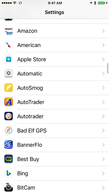
While I understand the theory (don't clutter the app with prefs, all prefs in one spot), the reality is that this structure quickly turns the Settings screen into an endlessly scrolling nightmare. I hate opening the Settings screen, knowing how much flicking it'll take—simulation visible at right—to get to the app whose settings I want to modify.

With some apps having some of their prefs within the app, and some of their prefs on the Settings screen, I find I often have to look in both places to see if the pref I want is available.

What I'd love to see is Apple recommend (require?) that apps do not use the Settings screen, and instead keep their prefs within the app. After all, if you're using app XYZ and you want to change something about its settings, the most logical place to look would be within the app itself. This would greatly clean up the Settings screen, too, restricting it to just Apple's stock apps and system-wide settings.

But barring that change, I'd like to see a more-usable Settings screen. How can it be more usable? By splitting the apps into alpha buckets, so I could tap into a letter/number, and then see only those apps on the list. Something like this very-rough mockup…

A horizontal flick on the alpha row scrolls through the letters (and numbers), then vertical flicks scroll within the chosen letter. This index would appear with the first entry in the third-party apps section, then stick to the top as the user scrolled down.

I'm sure there are better ways to do this, but something needs to be done, especially as device storage sizes increase.


iOS App: Pool Break pool simulator

I recently got back into playing pool, joining a local 8-ball and 9-ball league. It's been many (many) years since I played pool, and I can't really put a table in our home (unless I want to take over the living room or the master bedroom, probably a no go on either one). So I went looking for an iOS pool simulation that would help me visualize angles and cue ball spin (English).

I tried quite a few, and in the end, found Pool Break to be the best for my needs. Here's a very brief snippet of the gameplay…

You can turn the guidelines off; I use them to help understand the cue ball's movements after contact. Pool Break supports 8-ball, 9-ball, straight pool, snooker, and a couple things I've never heard of (Carrom and Crokinole). You can play against the computer, or against others on the Internet. The physics appear to be very good, plus you can change some of the friction values if you wish.

I've only been playing against the computer opponents; if you choose their highest skill level, you probably won't win, even with the aim lines on—they make some absurd shots! The only mode that's lacking is a straight practice mode where I could position the balls as I like to try various shots. But that's a minor nit; Pool Break is a very nice pool simulation…whether it will help my real-world ability to see various angles or not, only time will tell!


iOS App: Jollyturns tracks your day on the mountain

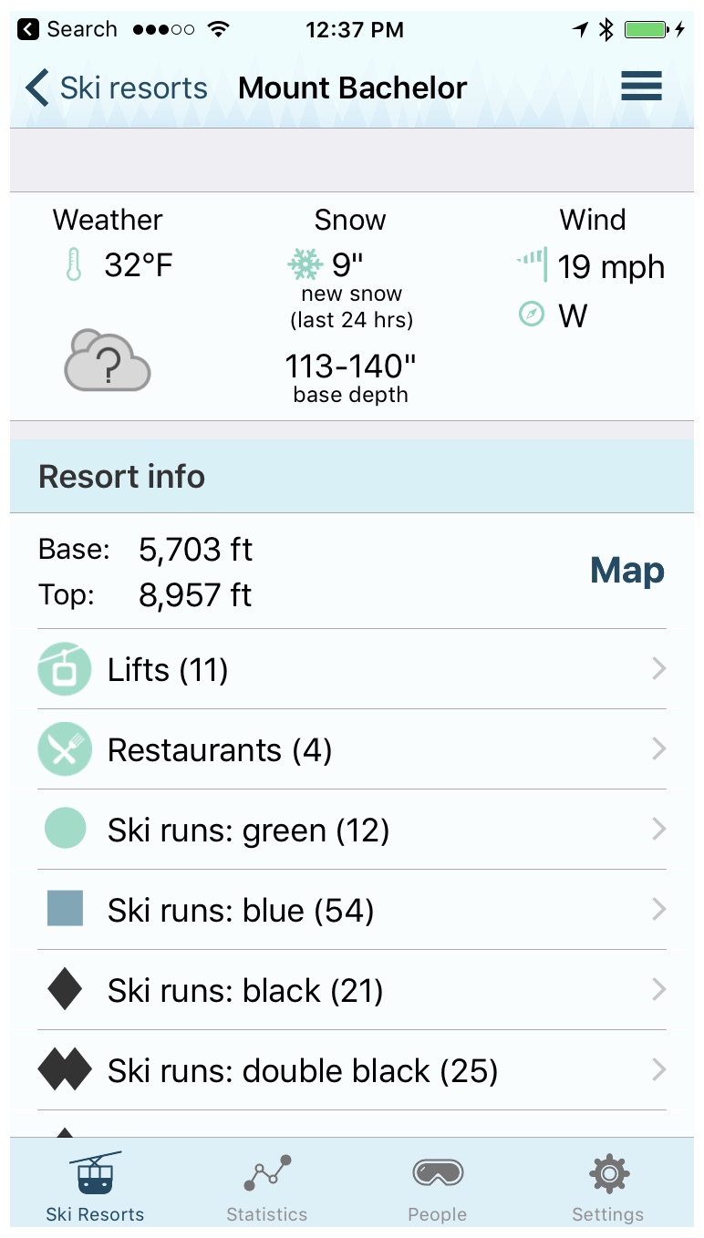
I spent yesterday at Mt. Bachelor, enjoying a bunch of fresh snow and surprisingly light crowds. To track my tracks, I've been using an app called Jollyturns Ski & Snowboarding. The app is free and includes one ski area; you can buy five more for $3.99, or $9.99 gets you "every ski area in the world."

For each area, you can see a summary page with current conditions and info on lifts, runs, and restaurants, as well as a zoomable scan of the official trail map. (For Mt. Bachelor, that means four maps, as they have quite a bit of terrain.)

You can drill down into run type to find a specific run; it'll be highlighted on the map. (Though if your area has more than one map, you may need to switch views to see the run on the proper map.) Click on a lift name, and it will be similarly highlighted on the map. Ditto for restaurants.

Jollyturns can also find and map your friends on the mountain, assuming they're using the app, of course. I haven't yet tested this social aspect of the app.

The one thing Jollyturns doesn't do is track your runs on a map—there's no way to see exactly what you skied in a given day. This is no longer true as of the latest update—you can view your tracks on Google Earth on the iPhone, or export as KML (or a couple of other options). As an example, here's a map from my February trip to Mt. Bachelor, as seen in Google Earth on the iPhone:

Beyond the map, you can also see how much you skied (vertical feet), how far you skied (miles), and your peak speed. I'd love it if it would map my day (I assume there are other apps that do this, but I haven't gone looking…recommendations?), but what it does do, it does well.

Jollyturns also includes an Apple Watch app—it provides a quick view of your vertical feet, distance, and peak speed. I much prefer a glance at my watch versus digging out the iPhone from multiple layers of clothing.

The one caveat I will add is that running Jollyturns can suck your battery down, as it's updating location info via GPS, and doing so quite often. Yesterday, after 4.5 hours of continuous skiing, my phone was down to about 25% battery. So if you want to make sure you get all-day phone battery life while skiing, Jollyturns is probably not the app for you.


See the actual strength of the iPhone’s cellular connection

This is a very old tip, but I'd never seen it before, so I figure it might be new to some others, too. My home has a relatively weak cell signal, varying between one and three dots on the iPhone's display. But sometimes, even when I have three dots, the quality of my calls seems spotty.

While looking for some tool to try to analyze the cell signal's actual strength in my home, I stumbled on this useful tip at Lifehacker: It's possible to make your phone display its actual signal strength in decibel-milliwatts, or dBm. Here's my phone, showing the stock display on the left, and the dBm value on the right:

And this explains a lot: While two dots of five seems like a decent connection, the actual value of -116dBm is bad. (Signal strength goes from a best of 0 to a worst of -140 or so.) How bad? According to this site, it's an unusable signal. So, yea, don't try to call my cell phone when I'm at home!

If you'd like to set your phone to display the actual signal strength (you can tap the indicator to flip between values and dots), read the above-linked article (or any of the thousands of other sites that have the same tip), or just read the rest of this post, where I've recreated the simple steps.

[continue reading…]


iOS App: OSnap! Pro for time lapse and animation movies

A while back, I created a time lapse movie of a lava lamp warming up. I'd wanted to use my iPhone for this, as time lapse is a built-in feature, but the iPhone implements it in an odd way: The iPhone will vary the time intervals between pictures as your recording time increases. This keeps all time lapse movies to a similar duration (20 to 40 seconds), but it means you can't shoot a constant-rate time lapse movie.

I solved the problem for the lava lamp movie by using OSnap! Pro, a $3.99 iOS app (for both iPhone and iPad). I've wanted to write more about this app for a while (I'll be calling it OSnap from here on out), and a recent snowstorm in central Oregon gave me the perfect chance to test the app again before writing about it…

Ah, if only it went so quickly in reality! Making this movie was a breeze with OSnap! Pro; read on to see what makes OSnap so good (and to see a lame-but-short stop-motion animation movie, too).

[continue reading…]


The ridiculous economics of Real Racing 3

I used to play a lot of Real Racing 3 (RR3), an iOS auto racing game. Like, quite a lot. At one point, I owned all 132 cars available at that time, and had completed all the events.

To reach that point, I spent about $60 on in-app purchases—RR3's in-app purchases were really expensive. And yes, that's a lot, but I didn't own a console at the time, and I judged the app worth the cost of a console racing game. (I also took advantage of some programming glitches that enabled occasional free in-app purchase items; without these glitches, I doubt I would have made it as far as I did.)

Once I'd spent $60 and could go no further without spending more, I stopped playing; $60 was my limit. I did keep my iCloud save game file in case I wanted to revisit it someday. That someday was yesterday.

Since I left, the game has grown a lot: There are now 171 cars available, or 39 more than when I stopped playing. To finish the game again, I'd need to acquire (and upgrade) all of those cars (and race a huge number of new races). I thought "maybe it's OK to spend another $60 or so; it's been a few years."

But as I looked into what it might cost to finish the game, I found that the economics are still absolutely ridiculous. How ridiculous? About $3,665 ridiculous. Yes, I estimate it would cost me $3,665 to finish RR3. At that spending level, though, there are some other purchases I could consider…

Instead of finishing RR3, I could purchase a commercial-grade 48" gas range. Or I could buy a loaded Touch Bar Retina MacBook Pro with a 2.9GHz Core i7 CPU, 1TB SSD, and upgraded graphics.

The third option, though, is the best comparison: For $129 less than what I think it would cost me to finish RR3, I could purchase all of the following:

That's a full console-based driving setup, including a 65" 4K TV, for less than what I'd probably have to pay to finish (temporarily, until the next expansion) Real Racing 3. Yes, I'd say that's ridiculous.

But where do my numbers come from, and how could I possibly think it'd cost that much to finish the game?! Read the rest if you'd like the nitty-gritty on my $3,665 estimate.

[continue reading…]


The iOS App Store’s paid apps lottery game

In case you missed it, Apple is promoting "pay once" games in the iTunes App Store:

I think it's amazing that Apple is highlighting pay-once games; anything that helps focus attention away from the freemium model is great in my eyes. I hope this is a regular feature and kept up to date.

Looking at just the apps I can see on the screen without scrolling, there are about a dozen I think I'd like—for a total cost of around $85 or so. But that's where I reach the freeze point: Instead of sending Apple my $85 and trying out a bunch of cool games, I do nothing. That's because if I decide to buy these games, I might as well spend the money on lottery tickets.

You 'win' the iOS lottery if you get a great game for your money. You 'lose' the iOS lottery when you wind up purchasing a steaming pile of donkey dung of a game. Sorry, you lost this time, but please play again soon!

[continue reading…]