Skip to content

Apple

Strangest OS X screenshot …. ever?

Last weekend, I was working on a relatively large--OK, a huge--17.8GB QuickTime movie. This was the raw capture of 35 or so minutes of flying time in X-Plane.

strange screenshot
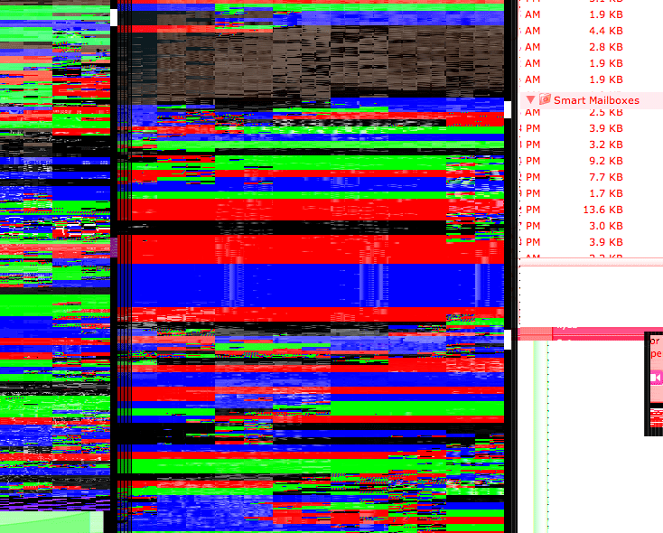
I had the original movie open in QuickTime Player, and I had also exported a notably smaller (200MB) H.264 version, which I was playing with in Motion. Then, for no apparent reason, all heck broke lose--both screens on my system suddenly went 70s psychedelic on me, as seen in the grab at right of a portion of the screen (click for full-size).

In addition to the messed-up colors, things were also not in the right spot on the screen--you can see this with the location of the Smart Folders object in the large screenshot. The system seemed to be working fine; I just couldn't make anything out on either screen--except the menubar (but not the menus themselves). So I used Command-Tab and the 'Q' key to quit various running apps, including QuickTime and Motion.

After quitting nearly everything I had running, the screen returned to nearly normal--the only remaining issue was that objects' shadows were really messed up, showing pieces of other windows instead of a fuzzy gray/black shadow. I logged out and back in, and that fixed that issue.

What this reminded me of, more than anything, was mucking about with my Apple ][ back in the day--if you "poked" some data into the wrong memory locations, you could mess up your display in quite a creative manner! It almost seemed like that's what OS X was doing--I had used all the available RAM, so it started using the video card's RAM for storage instead. Yes, I know this isn't possible, and it's in no way what happened.

Anyway, in five years of OS X usage, this is by far the oddest visual distortion I've ever seen, so I thought I'd share. I was quite impressed that the system itself was still usable--I have yet to restart since that incident, in fact, and all has been fine after the re-login.


A tale of three hardware interfaces…

As some of you may know, I’m relatively paranoid about backups—you can’t have too many, and you can’t make them often enough :). The macosxhints.com site is backed up twice a day via a set of scripts that use ssh and scp (and are scheduled via cron). For my personal machine, I use two external hard drives. The smaller of these two (an older version of this 250GB Maxtor drive) is used throughout the day to make backups of my key files. It also holds secondary copies of key things such as my iTunes music collection, iPhoto library, and digital video snippets. The larger of the two drives is a LaCie 500GB Triple Disk Extreme. At the end of each day, I run a full backup of the machine to the LaCie disk, and then power it down. But this article isn’t really about my backup strategy; it’s about the three interfaces on the Triple Disk Extreme (TDE), and a simplistic comparison of their performance on my machine (Dual 2.0GHz G5, first gen).

The TDE is so named due to its FireWire2, FireWire, and USB2 interfaces. A recent conversation with Chris Breen about FireWire vs. USB2 on the iPods led me to run a few tests on my hard drive, just to see how each interface performed. What got me started down this road is some stuff that Chris wrote in a couple of different iPod reviews:

In my tests, a dual-processor 2GHz Power Mac G5 filled a 6GB mini in 15 minutes and 17 seconds over USB 2.0. Using a FireWire connection shaved a scant 18 seconds off that time.

The nano is also quicker to sync than other iPods. I synced the same 903-track playlist on a 4GB nano and a 4GB iPod mini. It took 9 minutes and 15 seconds to sync the nano. The mini took nearly 7 minutes longer to sync, finally finishing the job in 16 minutes and 13 seconds.

So while USB 2.0 may not fare so well with other devices, as far as iPods go, syncing performance doesn’t appear to be a problem.

I thought I’d use my TDE to run a few tests in the Finder, just to see how things compared there. Read on for my results…

[continue reading…]


Protect your iPod Nano’s screen…

Apparently the new iPod Nano is very susceptible to screen scratches (The Register article, Apple Discussions). My wife and I just bought a white Nano to replace her Mini, so these stories concerned me quite a bit—the last thing you’d want is to have the already-dimunitive screen scratched to the point where text and images are hard to discern. People are talking about returning their devices, class action lawsuits, etc. I really like the Nano, and would rather not return it. And since ours isn’t yet scratched, I thought I’d try some preventative medicine.

Knowing that it will be a while yet before any customized Nano screen protectors and/or cases ship, I took a (very minor) risk and thought I’d try to make my own. I started, of course, with someone else’s handiwork—these Treo screen protectors. These are probably the best screen protectors I’ve seen for the Treo; they’re basically invisible, and they don’t permanently mar your Treo’s screen if/when you remove them. I had a couple left over from my Treo (as the protectors come in a three-pack), so I did a bit of measuring and got out the scissors. A minute or so later, I had my completed Nano screen protector. I peeled off the backing, stuck it to the Nano’s front, and it worked perfectly — it basically disappeared once placed (though I intentionally cut the border slightly larger than the Nano’s screen). It’s hard to take pictures of, but I tried my best; click on either image below for a larger version:

Nano unlitNano lit

As you can see, the protector is nearly invisible (and yes, the perfectionist in me has since gone back and re-centered it horizontally) whether the Nano is on or off. Since I did leave a slight border around the screen area, that edge is visible in the shots above (but it actually looks sort of natural there). Had I chosen to make the cover the exact size of the screen area, it would be even less visible. However, by leaving a border, I’ve made it easier to remove the cover in the future without risk of scratching the screen itself.

One of the reasons I like this screen protector a lot is that it’s easily removable and cleanable. The instructions state that you can lift the cover with a piece of scotch tape, but I’ve had better luck carefully sliding the edge of a sharp knife under the plastic, then prying up the corner. Once removed, you can wash the cover off with water to remove any dust, let it dry, and then put it back in place. I’ve had this one on and off a few times now, and (so far) it hasn’t left any marks on either the Nano’s case or screen.

This may not be a perfect solution, and who knows how well it will hold up over time, but for now, it seems like a reasonable investment to keep the Nano’s screen in scratch-free condition. As always, though, your mileage may vary and proceed at your own risk :).


When is a sorted list not a sorted list?

One of the things I like the most about OS X 10.4 is Automator, Apple’s new tool to help automate routine tasks. There’s an amazing amount of power hiding beneath a relatively simple user interface. The fact that users can create their own Automator actions (not workflows, but the actual actions that show up in the Action column), as described in this hint published today, means that Automator can be easily extended by those with a bit of programming experience.

Considering both Actions and Workflows, there are already over 100 entries on Apple’s Automator Actions download page, which is quite cool. (This does, however, pale in comparison to the 1,289 Dashboard widgets currently available for download.) In any event, Automator is a good tool to have around, and I’ve already put it to use on a number of occasions.

Automator sort orderThere is, however, something that irks me about its interface. Consider the screenshot at right of the Actions associated with the Finder Library entry (hover and click to zoom).

If you scan the list of Actions, you’ll find that they’re not in alphabetical order. Well, they’re sort of alphabetized. Look a bit closer, and you’ll see that the list is actually sorted by the relevance indicator, just like the search results in Mac Help. While this makes sense in Mac Help, as you’re searching for something that’s not definite, it makes no sense at all in this context. What is this list relevant to? The Finder Library entry? If that’s the case, then how come “Get Selected Finder Items” sits at the top of the list with 100% while “Filter Finder Items” (which sounds very similar) scores 0% and is sitting down near the bottom?

Within the relevance sort, the sort is then alphabetic, so with some practice, you can eventually find what you’re looking for. But Apple’s use of the seemingly-undefined relevance criteria makes the task much more difficult than it should be. Consider the iTunes Library entry; it has four levels of relevance, which means the alpha sort restarts four times—and one of those times is for one lousy item! It takes way too long to find a given entry in a list ordered in this manner, and there’s no reason for it at all that I can see.

You might think that using the Applications Library entry (the first one in the list) would solve the problem, since it selects all actions and displays them at once. But no, even in this situation, the relevance sort order is maintained! As a result, I never use this entry, as it’s really, really hard to find anything.

The solution seems simple to me: Apple, please sort the Automator actions by alpha, not relevance. If you’re going to insist on a sort by relevance, then at least give us the option to sort by alpha instead…

Sept 16th Update: I emailed Sal Soghoian, the AppleScript Product Manager at Apple (and all-around good guy!) to ask for some clarification. I asked “can you shed any light on exactly how Automator sorts its action lists?” He told me that Automator does indeed sort on relevance, and that “relevance is based on input/output types, keywords, keyword order, categories, and the related actions parameter.” He also mentioned that an alpha sort has been a popular request, so hopefully we'll see it soon...


And then there were seven…

A while back, I wrote about the many faces of Apple’s OS X applications. At the time of that writing, I identified six-ish unique interface looks:

  1. Old School Metal
  2. Aqua
  3. Smooth Metal 1
  4. Smooth Metal 2
  5. Pro Interface
  6. Other/No Interface

With the release of iTunes 5.0, it seems there are now seven interfaces. For lack of a better description, I guess I would call this one Smooth Metal 3—it seems to incorporate aspects of both Smooth Metal 1 and Smooth Metal 2, yet it doesn’t exactly match the look of either of its cousins. Its predecessor, iTunes 4.9, fell squarely in the Old School Metal bucket. Here’s how the new iTunes interface looks, compared to the old:

Small old iTunesSmall new itunes

On the left is iTunes 4.9; on the right is iTunes 5.0. Click either image for a full-size version of each screenshot. There are many differences between the two interfaces, some obvious and some not so obvious. Keep reading to see some of the changes in detail, as well as my opinion on the new iTunes look.

[continue reading…]


A cold day in Hades?

Mighty Mouse imageIn case you missed the news, Apple today released Mighty Mouse, (no, not that one), the company's first-ever multi-button scrolling mouse! I haven't yet seen it in person (though I intend to visit a dealer today to check it out; they appear to be in stock at many places), but at first glance, it looks like (as is typical of Apple) the industrial design has been very well thought out.

No big huge scroll wheel, just a small scroll dot that enables scrolling in many directions (up, down, diagonally). Reversible buttons for left- and right-handed users. Touch-sensitive top buttons (left, right, and scroll), and a "force sensitive" side button -- note that though the images show two side buttons, Apple only claims four programmable buttons, so I think the two side buttons will act essentially as one button. The programming software is built right into the OS X Mouse & Keyboard control panel, and looks quite well thought out.

About the only downside I see is that this is not a wireless mouse (for now?); it's wired-only, which is a bit of a bummer -- I've grown quite fond of my wireless Microsoft Intellimouse. I'm not sure if this is a Bluetooth bandwidth limitation (as they don't want to introduce a USB-based plug-in remote device, I don't think), or just a packaging and/or time-to-market issue. Hopefully we'll see Mighty Mouse 2 with Bluetooth wireless connectivity sometime in the near future.

Even without wireless, though, this mouse looks like it could be a winner. I'll post an addendum here later today if I'm able to get some hands-on time with one in the store. And at $49, it's expensive, but not so much so that I'm not tempted to buy one!

But the real $64,000 question is ... when (if ever) will Apple make this the standard shipping mouse with new hardware purchases?


Separating the signal from the noise

Macworld logoSorry things have been so quiet around here lately. I've been caught up with relatives in town, creating and finishing my Macworld slides, and working through the first month of the Macworld transition (so far, so good, just lots of little things to work through).

Apple's recent release of iTunes 4.9 and the integration of podcasts into the Music Store got me thinking about the whole "podcast thing." I spent some time downloading, listening, and learning, and wrote about my experiences in a Macworld weblog. Hopefully people won't misinterpret my article as a slam on podcasting; that wasn't the intent. But clearly, I just don't get it ... so I asked folks to help me discover what it is I'm missing.

I'm still working on a couple other articles for here and/or the Macworld site, so hopefully the posting frequencey will pick up here in the near future -- but probably not until after Macworld Boston (July 11th through the 16th). Have a great holiday weekend everyone!

-rob.


My initial thoughts on Intel and Apple…

Macworld logoI wrote a weblog entry for Macworld covering my initial reactions to the announcement, as well as some thoughts as to what it might mean for the future. I've heard it called Macintel, but that seems to easy to me. Since it will have "Intel inside," I prefer Mintelac [min•tel•ak], since that's literally Intel inside Mac.

In short, I'm definitely excited about the potential, but quite scared about the transition ... you can read why in the full entry over at macworld.com.

[Note: I've disabled the comments for this article, as editorials such as this one are now actually part of my job for Macworld -- hence, I'd like any follow-up conversation to appear on Macworld, not here. Don't worry, my blog's not going away, and I'll still try to post here regularly. But there will be posts such as this, where the topic I wish to discuss is very closely aligned with my job, that will appear on my Macworld weblog instead -- I will always include a pointer to such articles here, though.]


Multi-button mice are great timesavers

mouse picOne of the first things I tell new Mac users is to ditch the one-button mouse that Apple provides. Sure, it's simple and easy to use, but it also has limited power and you end up using way too many keyboard modifiers to get things done. There are lots and lots of multi-button mice out there, and all of them work (to at least some degree) with OS X: the second mouse button is functional by default, and will bring up the contextual menu -- that's the menu you normally reach with a control-click.

But for the most productive computing experience, find yourself a mouse that comes with OS X drivers, so that you can program all of the buttons. Logitech makes a full line of OS X-compatible mice, as do Kensington (wired, mobile) and Microsoft (check compatibility for each device; some are PC only). But this isn't a post about which mouse to use (I've chosen the Wireless Intellimouse Explorer, used for the icon in this story), but more a discussion on how to best put all those buttons to use once you have a multi-button mouse. So I thought I'd share my configuration, and ask what others might be using...

The Intellimouse Explorer has five buttons (two main buttons, a scroll wheel button, and two buttons under the thumb) plus a scroll wheel with "tilt" side-to-side scrolling. Here's how I have the five buttons set up:

  • Left button: Click
  • Right button: Control-click
  • Scroll wheel button: Dashboard (F12)
  • Top thumb button: Exposé all-windows mode (F9)
  • Bottom thumb button: Activate DejaMenu. If you haven't seen this handy little program, it's a huge timesaver. It puts any program's menubar one keyboard combo away -- no mousing required. I just assigned its keyboard combo to the thumb button, and presto, menus wherever I want them.

So that's how I have my mouse set up. I find it a huge timesaver, especially the thumb button tied to DejaMenu. No more wasted time moving to the top left to grab File when it's a simple mouse click away. In general, I love the mouse and I've gotten very used to how I've got it set up.

The one thing I find lacking in the Microsoft software is that you can't assign custom commands to modified button clicks -- i.e. I'd love to be able to assign Command-Option-button 4 to something other than the button 4 default. I think this should be possible, given that OS X can read command- and control-clicks, but Microsoft's software doesn't allow it.

Anyone else have any interesting configurations, and/or mouse recommendations?