[Note: The following isn't a slam on Apple's security policies, nor am I chiding them for fixing a security hole. I merely found the description of one particular hole and its related fix somewhat funny, so I thought I'd have a bit of fun with it. Read the following as nothing more than a poor attempt at humor after a long day spent writing about security issues...]
 Given the relative seriousness of the Leap-A malware/trojan (I put together a pretty straightforward Q&A page for Macworld, too), I thought the following look at the lighter side of security was worth sharing today!
One of the things included in the recent 10.4.5 update (and yes, I've already updated the OS X release dates chart) was a security update for the kernel. Specifically, this update fixed the following exploit:
A malicious local user may trigger a system crash by invoking an undocumented system call. This update addresses the issue by removing the system call from the kernel.
Now don't get me wrong, I think patching security holes is a Very Good Thing. However, in this case, I have to question both the danger of the hole as well as the quality of the related fix. Let's look at the 'hole' and 'fix' in more detail. First, consider malicious, which derives from the word malice. According to Merriam-Webster, malice is the "intent to commit an unlawful act or cause harm without legal justification or excuse." So whomever this person is, they're not around to help you out.
Next, local user. This means the person is directly connected to your Mac. They may be seated directly in front of it, or perhaps they have connected remotely via ssh or telnet. Either way, they've successfully logged into your Mac. This means that they're either someone you trust (you need better friends!) who has an account on your machine, or they're a hacker who has figured out a valid username and password and used that info to log in. So now we have a malicious local user, with some level of access to your Mac.
So just what is this malicious local user going to do now? According to the security notice, they're going to trigger a system crash. That's right. They've gone through all this trouble to gain access to your machine, and now they're going to invoke an undocumented system call and bring the machine down. (If they're physically local, pulling the power cord would do the same thing, and probably cause more damage in the process.) Granted, a crash is never a good thing, but consider this malicious individual again. They're here to cause harm. Probably as much harm as they possibly can. And given that they're logged into your machine, they can probably cause a lot more harm than a simple reboot. File deletion, creating evil symbolic links, installing a keystroke logger, etc. There are a lot of things they could do that are much farther up the 'cause harm' scale than a simple crash.
But nonetheless, we don't need to worry about this particular security issue any longer. Why not? Because Apple fixed it! Yes indeed, they sure did. They fixed it by removing the system call from the kernel. "Hey Doc, my arm hurts!" 'No problem, I'll have that arm off of there in a jiffy!' I'll certainly sleep more soundly tonight, knowing that some malicious local user won't be able to use an undocumented system call to crash my machine!
Security issues are important. They really are; I think today's dialog about Leap-A was good for the Mac community. And I think closing security holes quickly and effectively is also a Very Good Thing, as I stated above. But still, I couldn't resist having a bit of fun with the nature of this particular hole and the related fix.
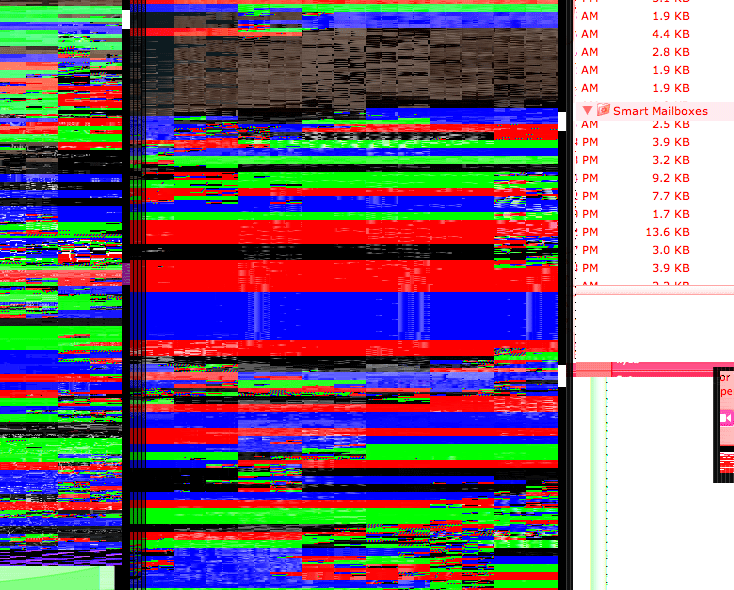
 Ever wondered about the various settings in the Font smoothing style pop-up of the Appearance System Preferences panel? Thanks to a recent crash, I was forced to revisit the font smoothing settings, which I literally hadn't looked at in years.
 Given the relative seriousness of the
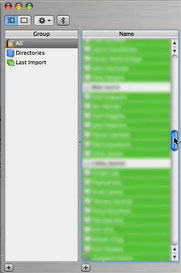
  Given my background with it, and its role in leading to an unexpected but welcomed career change, I'm clearly a fan of OS X. But sometimes, I really question the quality assurance (QA) testing that goes into the OS and its associated applications. Consider the following glitch I ran into yesterday with Address Book.