Skip to content

macOS Apps

Articles about OS X applications.

When is a sorted list not a sorted list?

One of the things I like the most about OS X 10.4 is Automator, Apple’s new tool to help automate routine tasks. There’s an amazing amount of power hiding beneath a relatively simple user interface. The fact that users can create their own Automator actions (not workflows, but the actual actions that show up in the Action column), as described in this hint published today, means that Automator can be easily extended by those with a bit of programming experience.

Considering both Actions and Workflows, there are already over 100 entries on Apple’s Automator Actions download page, which is quite cool. (This does, however, pale in comparison to the 1,289 Dashboard widgets currently available for download.) In any event, Automator is a good tool to have around, and I’ve already put it to use on a number of occasions.

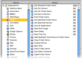
Automator sort orderThere is, however, something that irks me about its interface. Consider the screenshot at right of the Actions associated with the Finder Library entry (hover and click to zoom).

If you scan the list of Actions, you’ll find that they’re not in alphabetical order. Well, they’re sort of alphabetized. Look a bit closer, and you’ll see that the list is actually sorted by the relevance indicator, just like the search results in Mac Help. While this makes sense in Mac Help, as you’re searching for something that’s not definite, it makes no sense at all in this context. What is this list relevant to? The Finder Library entry? If that’s the case, then how come “Get Selected Finder Items” sits at the top of the list with 100% while “Filter Finder Items” (which sounds very similar) scores 0% and is sitting down near the bottom?

Within the relevance sort, the sort is then alphabetic, so with some practice, you can eventually find what you’re looking for. But Apple’s use of the seemingly-undefined relevance criteria makes the task much more difficult than it should be. Consider the iTunes Library entry; it has four levels of relevance, which means the alpha sort restarts four times—and one of those times is for one lousy item! It takes way too long to find a given entry in a list ordered in this manner, and there’s no reason for it at all that I can see.

You might think that using the Applications Library entry (the first one in the list) would solve the problem, since it selects all actions and displays them at once. But no, even in this situation, the relevance sort order is maintained! As a result, I never use this entry, as it’s really, really hard to find anything.

The solution seems simple to me: Apple, please sort the Automator actions by alpha, not relevance. If you’re going to insist on a sort by relevance, then at least give us the option to sort by alpha instead…

Sept 16th Update: I emailed Sal Soghoian, the AppleScript Product Manager at Apple (and all-around good guy!) to ask for some clarification. I asked “can you shed any light on exactly how Automator sorts its action lists?” He told me that Automator does indeed sort on relevance, and that “relevance is based on input/output types, keywords, keyword order, categories, and the related actions parameter.” He also mentioned that an alpha sort has been a popular request, so hopefully we'll see it soon...


And then there were seven…

A while back, I wrote about the many faces of Apple’s OS X applications. At the time of that writing, I identified six-ish unique interface looks:

  1. Old School Metal
  2. Aqua
  3. Smooth Metal 1
  4. Smooth Metal 2
  5. Pro Interface
  6. Other/No Interface

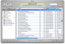
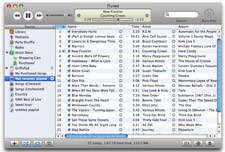
With the release of iTunes 5.0, it seems there are now seven interfaces. For lack of a better description, I guess I would call this one Smooth Metal 3—it seems to incorporate aspects of both Smooth Metal 1 and Smooth Metal 2, yet it doesn’t exactly match the look of either of its cousins. Its predecessor, iTunes 4.9, fell squarely in the Old School Metal bucket. Here’s how the new iTunes interface looks, compared to the old:

Small old iTunesSmall new itunes

On the left is iTunes 4.9; on the right is iTunes 5.0. Click either image for a full-size version of each screenshot. There are many differences between the two interfaces, some obvious and some not so obvious. Keep reading to see some of the changes in detail, as well as my opinion on the new iTunes look.

[continue reading…]


My favorite browser

Tiger boxQuite a few people seem interested in knowing which browser is "my favorite." I wish I had a simple answer for that question, but as of now, there's not just one. Before I get to my favorite browser(s), the macosxhints site has done some tracking of browser usage via the occasional poll. I've run a total of five polls regarding favored browsers since I launched the site. Below are the results for each, showing the top three in each poll, along with the percentage share for the winner.

  • Feb 2001: OmniWeb (41%), Internet Explorer, iCab. Note that the site was *very* young at this point, and the results were skewed as most of the readers were early OS X adaptors -- hence we all used the only (and best!) native browser of the day.
  • Jul 2002: Internet Explorer (40%), Mozilla, OmniWeb. The site has grown some now, and more typical users are visiting. IE takes the lead.
  • Feb 2003: Safari (59%), Chimera (nee Camino), Internet Explorer. Safari shipped in January, and by early February, it already had nearly 60% of the Hints readership.
  • Feb 2004: Safari (82%), Mozilla, Camino. Total dominance now. IE has vanished, with less than 2% reporting they use it.
  • Oct 2004: Safari (65%), Firefox, Camino. Firefox has emerged and made a pretty serious dent in Safari's domination (Firefox garnered 18% of the votes, which is basically what Safari lost from the prior poll). IE has dropped to 0.9% usage.

I should probably run another shortly; it's been over six months, and it would be interesting to see if Firefox has eaten away at more of Safari's lead. So enough of the history lesson ... which browser is my favorite?

[continue reading…]


How [not] to upgrade to Mail in 10.4

Update:

Thank you, Andy Warwick! I'm leaving the following article online, just so I remind myself how much time I wasted on this. However, the comment from Andy (#9 in the chain) pointed me to what I was doing wrong. So for anyone who hasn't imported their email yet, the trick to using the Mail for OS X import function is this: simply point it to your old user's Library/Mail folder, no deeper.

I still think Apple's language could have been clearer (see my #10 comment), but I retract the other nasty things I said about the import routine. When pointed at the correct folder (I just tested it), it worked like a charm. Good job, Mail team. Now how about making the import screen read simply "Please navigate to the previous Mail folder"?

This is a follow-up to my The Art and Science of OS X System Upgrades article. I'm (still) in the process of upgrading my main drive, having just finished migrating my email archives last night. Why did it take so long? User stupidity plus, in my opinion, some poor functionality in 10.4's Mail import routines.

As noted in the earlier article, I had chosen to do an upgrade install on my main drive, but to not automatically copy over my user's folder (due to all the cruft in it). It was this decision that ended up costing me many hours of email migration labor. Why, you might ask, did it take so long?

After I got 10.4 up and running, before doing much of anything else, I launched Mail and set up my two primary accounts, just so I could keep up with email while doing the rest of my work. Mail may have asked me about importing old email when I first launched it, but I don't think it did -- my ~/Library/Mail folder was empty, since I hadn't moved the old Mail folders over. Apparently if you allow the user information to migrate, Mail will automatically import your old Mail messages. Ah, I should be so lucky...

[continue reading…]