Skip to content

Rob Griffiths

When is a sorted list not a sorted list?

One of the things I like the most about OS X 10.4 is Automator, Apple’s new tool to help automate routine tasks. There’s an amazing amount of power hiding beneath a relatively simple user interface. The fact that users can create their own Automator actions (not workflows, but the actual actions that show up in the Action column), as described in this hint published today, means that Automator can be easily extended by those with a bit of programming experience.

Considering both Actions and Workflows, there are already over 100 entries on Apple’s Automator Actions download page, which is quite cool. (This does, however, pale in comparison to the 1,289 Dashboard widgets currently available for download.) In any event, Automator is a good tool to have around, and I’ve already put it to use on a number of occasions.

Automator sort order
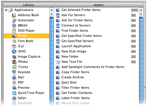
There is, however, something that irks me about its interface. Consider the screenshot at right of the Actions associated with the Finder Library entry (hover and click to zoom).

If you scan the list of Actions, you’ll find that they’re not in alphabetical order. Well, they’re sort of alphabetized. Look a bit closer, and you’ll see that the list is actually sorted by the relevance indicator, just like the search results in Mac Help. While this makes sense in Mac Help, as you’re searching for something that’s not definite, it makes no sense at all in this context. What is this list relevant to? The Finder Library entry? If that’s the case, then how come “Get Selected Finder Items” sits at the top of the list with 100% while “Filter Finder Items” (which sounds very similar) scores 0% and is sitting down near the bottom?

Within the relevance sort, the sort is then alphabetic, so with some practice, you can eventually find what you’re looking for. But Apple’s use of the seemingly-undefined relevance criteria makes the task much more difficult than it should be. Consider the iTunes Library entry; it has four levels of relevance, which means the alpha sort restarts four times—and one of those times is for one lousy item! It takes way too long to find a given entry in a list ordered in this manner, and there’s no reason for it at all that I can see.

You might think that using the Applications Library entry (the first one in the list) would solve the problem, since it selects all actions and displays them at once. But no, even in this situation, the relevance sort order is maintained! As a result, I never use this entry, as it’s really, really hard to find anything.

The solution seems simple to me: Apple, please sort the Automator actions by alpha, not relevance. If you’re going to insist on a sort by relevance, then at least give us the option to sort by alpha instead…

Sept 16th Update: I emailed Sal Soghoian, the AppleScript Product Manager at Apple (and all-around good guy!) to ask for some clarification. I asked “can you shed any light on exactly how Automator sorts its action lists?” He told me that Automator does indeed sort on relevance, and that “relevance is based on input/output types, keywords, keyword order, categories, and the related actions parameter.” He also mentioned that an alpha sort has been a popular request, so hopefully we'll see it soon...


A very cool retro CD label…

There's a Portland radio station, KINK FM 102, that has a fair number of live 'in the studio' performances each year. As a result, for each of the last eight years, they've released a compilation CD with the best of those live performances. Money earned from the CD sales goes to SMART--Start Making A Reader Today, a program that helps at-risk youth develop their reading skills. As such, I feel good about purchasing the CD each year; the fact that there are usually a fair number of tracks I like (almost all are acoustic with simple piano and/or guitar accompanying the voices) is just an added bonus.

So what's all this have to do with technology? Well, this year's CD, Kink Live 8, has one of the most unique, creative 'labels' I've ever seen. Below are small images of both the front and back of the CD:

Kink Live 8 frontKink Live 8 back

Click on either image for a larger version in a new window, and you can see the details in the front--it looks just like an old vinyl record (for those of you old enough to remember those). What you can't really see is how much it actually feels like a record, too. The grooves are there, there are smooth areas between each song, and the overall texture is very similar to what I remember of vinyl. The back side is just pure black, and polished to a near mirror-like finish. I didn't even know such things were available, but Froogle quickly pointed out my lack of knowledge on the subject.

That's it; I just wanted to point out a really cool CD label design (and plug a good cause, if you happen to like any of those bands and are in the greater Portland area). It's a nice change of pace from the image- and text-heavy labels that I usually see.


And then there were seven…

A while back, I wrote about the many faces of Apple’s OS X applications. At the time of that writing, I identified six-ish unique interface looks:

  1. Old School Metal
  2. Aqua
  3. Smooth Metal 1
  4. Smooth Metal 2
  5. Pro Interface
  6. Other/No Interface

With the release of iTunes 5.0, it seems there are now seven interfaces. For lack of a better description, I guess I would call this one Smooth Metal 3—it seems to incorporate aspects of both Smooth Metal 1 and Smooth Metal 2, yet it doesn’t exactly match the look of either of its cousins. Its predecessor, iTunes 4.9, fell squarely in the Old School Metal bucket. Here’s how the new iTunes interface looks, compared to the old:

Small old iTunesSmall new itunes

On the left is iTunes 4.9; on the right is iTunes 5.0. Click either image for a full-size version of each screenshot. There are many differences between the two interfaces, some obvious and some not so obvious. Keep reading to see some of the changes in detail, as well as my opinion on the new iTunes look.

[continue reading…]


A tale of two tech support calls…

Today, I had the (unfortunate?) need to contact two companies' tech support departments. I found the experience interesting, if not fairly time consuming. Over the years, I have had very little need for tech support, so this was a relatively new experience for me. I found both good and bad elements in both calls, and I thought I'd share what I went through, along with a few combined rants and recommendations on how to improve the tech support experience.

Case #1: Cingular

I had to contact Cingular, as I'd been having troubles with my Treo cell phone. The phone and PDA parts were working fine, but the internet connection (for web and email) stopped working on Friday morning. I started by calling the stored number (toll-free) in my Treo for customer support, but after punching my way through a few menus, I was directed to call another number. I did so, and again worked my way through a few menus to reach what I thought was "data technical support." When the rep got on the line, the first thing she asked me for was the name on the account, as well as the last four digits of the tax ID number (kind of like a social security number for companies) of the account owner. My phone is provided by Macworld, but that's not the official name of the company (Mac Publishing, LLC). Even worse, Macworld is part of IDG, and I had no idea which entity actually set up and "owned" the account ... and I certainly didn't know their tax ID number. So I had to hang up and contact Macworld.

[continue reading…]


A cold day in Hades?

Mighty Mouse imageIn case you missed the news, Apple today released Mighty Mouse, (no, not that one), the company's first-ever multi-button scrolling mouse! I haven't yet seen it in person (though I intend to visit a dealer today to check it out; they appear to be in stock at many places), but at first glance, it looks like (as is typical of Apple) the industrial design has been very well thought out.

No big huge scroll wheel, just a small scroll dot that enables scrolling in many directions (up, down, diagonally). Reversible buttons for left- and right-handed users. Touch-sensitive top buttons (left, right, and scroll), and a "force sensitive" side button -- note that though the images show two side buttons, Apple only claims four programmable buttons, so I think the two side buttons will act essentially as one button. The programming software is built right into the OS X Mouse & Keyboard control panel, and looks quite well thought out.

About the only downside I see is that this is not a wireless mouse (for now?); it's wired-only, which is a bit of a bummer -- I've grown quite fond of my wireless Microsoft Intellimouse. I'm not sure if this is a Bluetooth bandwidth limitation (as they don't want to introduce a USB-based plug-in remote device, I don't think), or just a packaging and/or time-to-market issue. Hopefully we'll see Mighty Mouse 2 with Bluetooth wireless connectivity sometime in the near future.

Even without wireless, though, this mouse looks like it could be a winner. I'll post an addendum here later today if I'm able to get some hands-on time with one in the store. And at $49, it's expensive, but not so much so that I'm not tempted to buy one!

But the real $64,000 question is ... when (if ever) will Apple make this the standard shipping mouse with new hardware purchases?


Separating the signal from the noise

Macworld logoSorry things have been so quiet around here lately. I've been caught up with relatives in town, creating and finishing my Macworld slides, and working through the first month of the Macworld transition (so far, so good, just lots of little things to work through).

Apple's recent release of iTunes 4.9 and the integration of podcasts into the Music Store got me thinking about the whole "podcast thing." I spent some time downloading, listening, and learning, and wrote about my experiences in a Macworld weblog. Hopefully people won't misinterpret my article as a slam on podcasting; that wasn't the intent. But clearly, I just don't get it ... so I asked folks to help me discover what it is I'm missing.

I'm still working on a couple other articles for here and/or the Macworld site, so hopefully the posting frequencey will pick up here in the near future -- but probably not until after Macworld Boston (July 11th through the 16th). Have a great holiday weekend everyone!

-rob.


My initial thoughts on Intel and Apple…

Macworld logoI wrote a weblog entry for Macworld covering my initial reactions to the announcement, as well as some thoughts as to what it might mean for the future. I've heard it called Macintel, but that seems to easy to me. Since it will have "Intel inside," I prefer Mintelac [min•tel•ak], since that's literally Intel inside Mac.

In short, I'm definitely excited about the potential, but quite scared about the transition ... you can read why in the full entry over at macworld.com.

[Note: I've disabled the comments for this article, as editorials such as this one are now actually part of my job for Macworld -- hence, I'd like any follow-up conversation to appear on Macworld, not here. Don't worry, my blog's not going away, and I'll still try to post here regularly. But there will be posts such as this, where the topic I wish to discuss is very closely aligned with my job, that will appear on my Macworld weblog instead -- I will always include a pointer to such articles here, though.]


Ten things I know about golf

When I have some free time (ha!), I enjoy playing golf. Despite the fact that I'm really not that good at it, I find it both relaxing and challenging. After a recent round, I was thinking about the sport, and came up with the following list of observations (and don't worry, this isn't turning into a sports blog; I've got a long writeup on Butler in the works! This was just top-of-mind last night...).

  1. If there's one spot on the fairway you don't want to be, that's where you'll find your drive.
  2. Golf balls have a strange magnetic attraction for water.
  3. Though it may appear the putt breaks left (right), it actually breaks right (left).
  4. If your irons (woods) are working really well today, your woods (irons) are not.
  5. If your score on the front nine is five shots better (worse) than your typical round, your score on the back nine will be at least five shots worse (better) than your typical round.
  6. If you consistently hit your 9-iron 150 yards, and you need to hit it at least 140 to carry the lake, you will hit it 139 yards.
  7. Trees may be 90% air, but your ball will hit that single, tiny, skinny branch sticking out roughly 99.5% of the time.
  8. When the Golf Gods force you to use five shots on a short 175 yard par three hole, then immediately let you use only three shots on the very next 440 yard par four, thou shalt not question the Golf Gods decision making process.
  9. The hardest shot in golf is your opening tee shot on a busy Sunday morning at the local course, where the crowded outdoor patio at the restaurant overlooks the first tee.
  10. If you ever stop to really consider what it takes to even make contact with a golf ball, you'll probably never hit one straight again.

Despite all this, I still find the game fun to play ... though I'm not sure why!