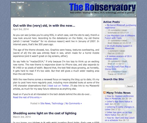
As you can see (unless you're using RSS, in which case, visit the site to see), there's a new look around here. According to the datestamp on the folder, my old theme (which I named "macbar" for no obvious reason) went live in January of 2007. In internet years, that's like 300 years ago.
 The age of the theme showed, too. Graphics were heavy, textures overbearing, and (worst of all) the site was entirely fixed in size, which made for a horrid mobile experience (and it wasn't great on big screens, either). As a reminder of the "good old times," click the image at right for a flashback.
So say hello to "macbar2014," if only because I'm too lazy to think up an exciting new name. The new theme is responsive down to iPhone size, and also expands to fill 1400 or so pixels of width. Beyond that, the text field stops growing, as honestly, it gets hard to read if it's too wide. But that still gives a much wider reading area than the old theme.
With the new theme comes a renewed focus on keeping the blog up to date; it's my plan to post here more regularly post, including more detailed looks at some of the 140 character observations that I blast out on Twitter. I'll also link to my Macworld articles, as much for my easy future reference as anything else.
Read on if you're at all interested in the tech details behind the site do-over…
[continue reading…]


