Skip to content

rant

ADP’s payroll check security absurdity

Warning: The following is nothing but a rant—no charts, no photos, nothing but text—about a piece of security absurdity I ran into the other day. I am 100% in favor of strong security in general regarding financial matters, but when it's false security that does nothing more than inconvenience legitimate users, that's when I get mad…and that's exactly what this was: a security absurdity.

————————————————

My daughter Kylie recently got a part-time job; her employer uses ADP to process its payroll. When her first check arrived, it was actually a debit card—which we didn't want to use—so she had to write herself a check (using a blank they provided), which she could then deposit.

Because Kylie had a busy day ahead of her (school then work then a post-work thing), I told her I'd write the check for her, then she'd just have to sign and deposit it. But to make the check usable, I needed a six-digit authentication code that ADP provides via a phone call. And that's when I entered a hellhole of security absurdity thanks to ADP…
[continue reading…]


On the removal of iOS apps from iTunes: I hate it

The recently-released iTunes 12.7 removes access to the iOS app store, as well as management of iOS apps. This is bad on any number of fronts; here are just a few things that bother me about it…

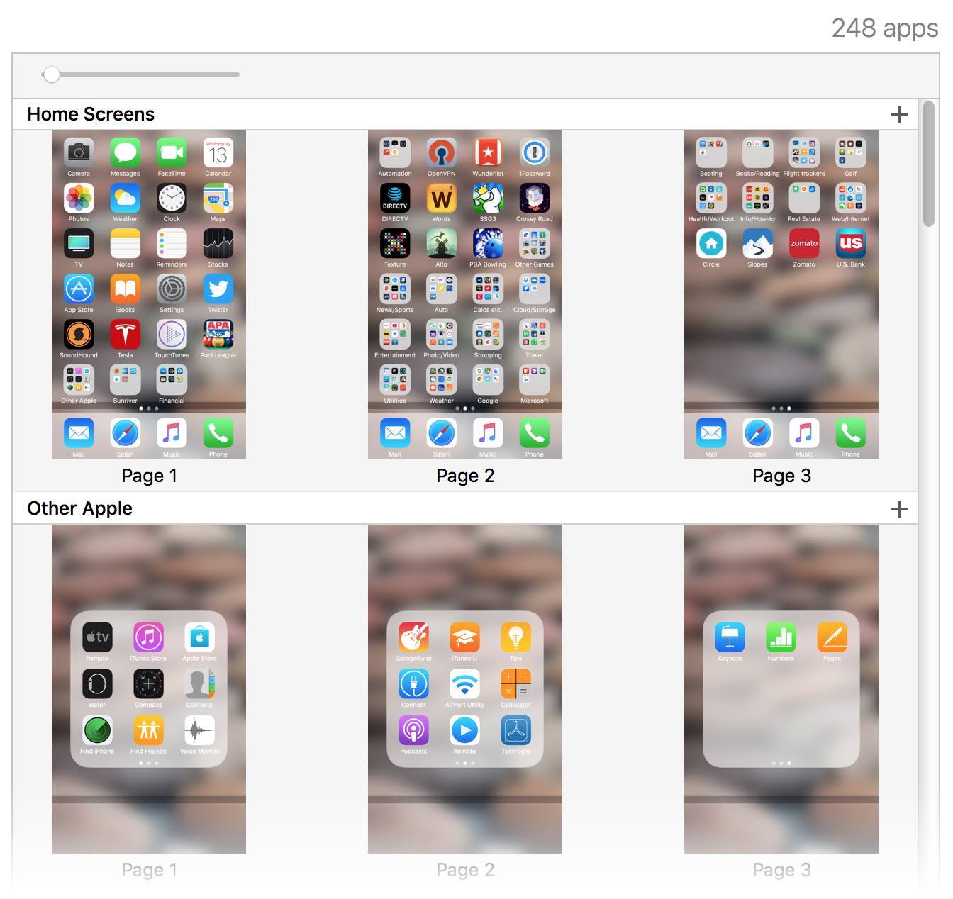
  • Migrating installed apps to a new device will now require you download all of them from the iOS device itself. This will be slow, and if you have capped internet, eat into your bandwidth. In my case, my iPhone holds 248 apps. So I'll have the joy of waiting for 248 apps to download over the internet? And, heaven forbid, if I have issues as I did with my iPhone 6, I'll get to do that over and over and over…
  • You can't organize your apps in iTunes any more, only on your iOS device. If you have a lot of apps, this is perhaps the most painful task to do on an iPhone—dragging icon by icon, across screen after screen. Ugh. iTunes offersoffered a much better method…

    But no longer, because Apple knows better, right?

  • Developers, I think, will hate this change. Why? Because not only can users not browse apps in iTunes, they can't purchase apps on a Mac or a PC at all! I spend all day at my desk, on my Mac. When I read about an interesting iOS app, I can see its web page, and then jump right into iTunes and buy it. But as Kirk McElhearn notes, this is no longer possible (temporary issue, maybe?). As a developer, losing access to anyone browsing from a non-iOS device would be deeply troubling.

But the above issues are only part of the reason why the removal of iOS apps from iTunes bothers me. An equally concerting issue is this: Browsing and buying apps on an iPhone is an absolutely horrid experience.

[continue reading…]


A modest proposal to improve the iOS Settings app

One of the things about the iPhone I don't like is that Apple requires (recommends?1)Many apps now have settings within the app, which I love, so this "separate settings" thing doesn't seem to be a hard requirement. that apps keep their preferences (settings) in the Settings app.

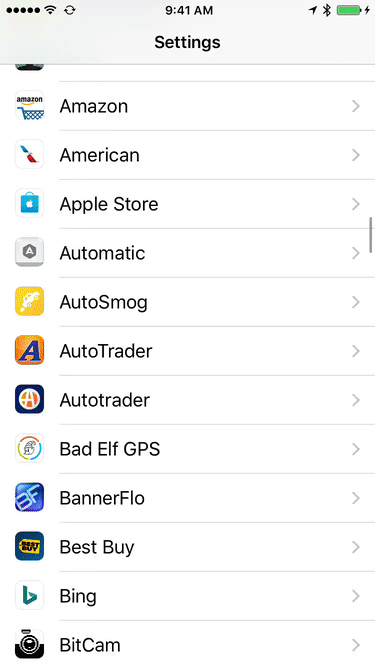
While I understand the theory (don't clutter the app with prefs, all prefs in one spot), the reality is that this structure quickly turns the Settings screen into an endlessly scrolling nightmare. I hate opening the Settings screen, knowing how much flicking it'll take—simulation visible at right—to get to the app whose settings I want to modify.

With some apps having some of their prefs within the app, and some of their prefs on the Settings screen, I find I often have to look in both places to see if the pref I want is available.

What I'd love to see is Apple recommend (require?) that apps do not use the Settings screen, and instead keep their prefs within the app. After all, if you're using app XYZ and you want to change something about its settings, the most logical place to look would be within the app itself. This would greatly clean up the Settings screen, too, restricting it to just Apple's stock apps and system-wide settings.

But barring that change, I'd like to see a more-usable Settings screen. How can it be more usable? By splitting the apps into alpha buckets, so I could tap into a letter/number, and then see only those apps on the list. Something like this very-rough mockup…

A horizontal flick on the alpha row scrolls through the letters (and numbers), then vertical flicks scroll within the chosen letter. This index would appear with the first entry in the third-party apps section, then stick to the top as the user scrolled down.

I'm sure there are better ways to do this, but something needs to be done, especially as device storage sizes increase.