Yesterday I ranted on Twitter about CNN's redesign:
Sorry, @CNN, but the new site is horrid. Overly huge imagery is not needed; I want news, not photos. Time to find a new source. Sigh.
— Rob Griffiths (@rgriff) January 3, 2015
This led to an exchange with a CNN staffer, and a couple people saying "me too!" But it felt it a bit unfair to criticize without specific data. So this morning, I gathered the data, and can now quantify my distaste for the new design.
I compared the current CNN homepage to the latest available on the Internet Archive, calculating how the space was used for each version of the site. The results were eye opening in many ways.
tl;dr summary: The new CNN design displays half as many clickable stories in the same space, with an image that takes 20% of the available screen, and sucks down over 20% of my CPU just to display its home page. Read on for the gory details.
Note: This follow-up entry details my post-CNN news sources and reading methods.
Thanks to Raymond for posting this address in the comments.
I opened a window that was 1,148 x 1,186 pixels in size, and loaded both the new and old CNN sites in tabs that window (with an ad blocker running, so I saw only content). I then grabbed screenshots, cropped to the visible page area, and started marking sections using color overlays in Acorn. I was most interested in what appears "above the fold," that is, that can be seen without scrolling in either direction.
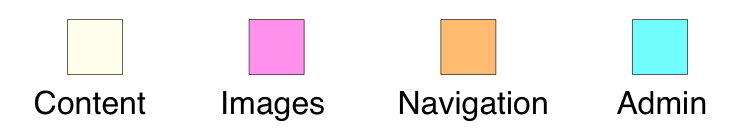
I split each version of the site into four different area definitions: Content, Images, Navigation, and Admin. (The split between the last two is somewhat arbitrary, but I used the same methodology on both versions of the site.)
Here's how the two sites looked, mapped out into those area definitions (click either page for a much larger version).
| Old Site | New Site |
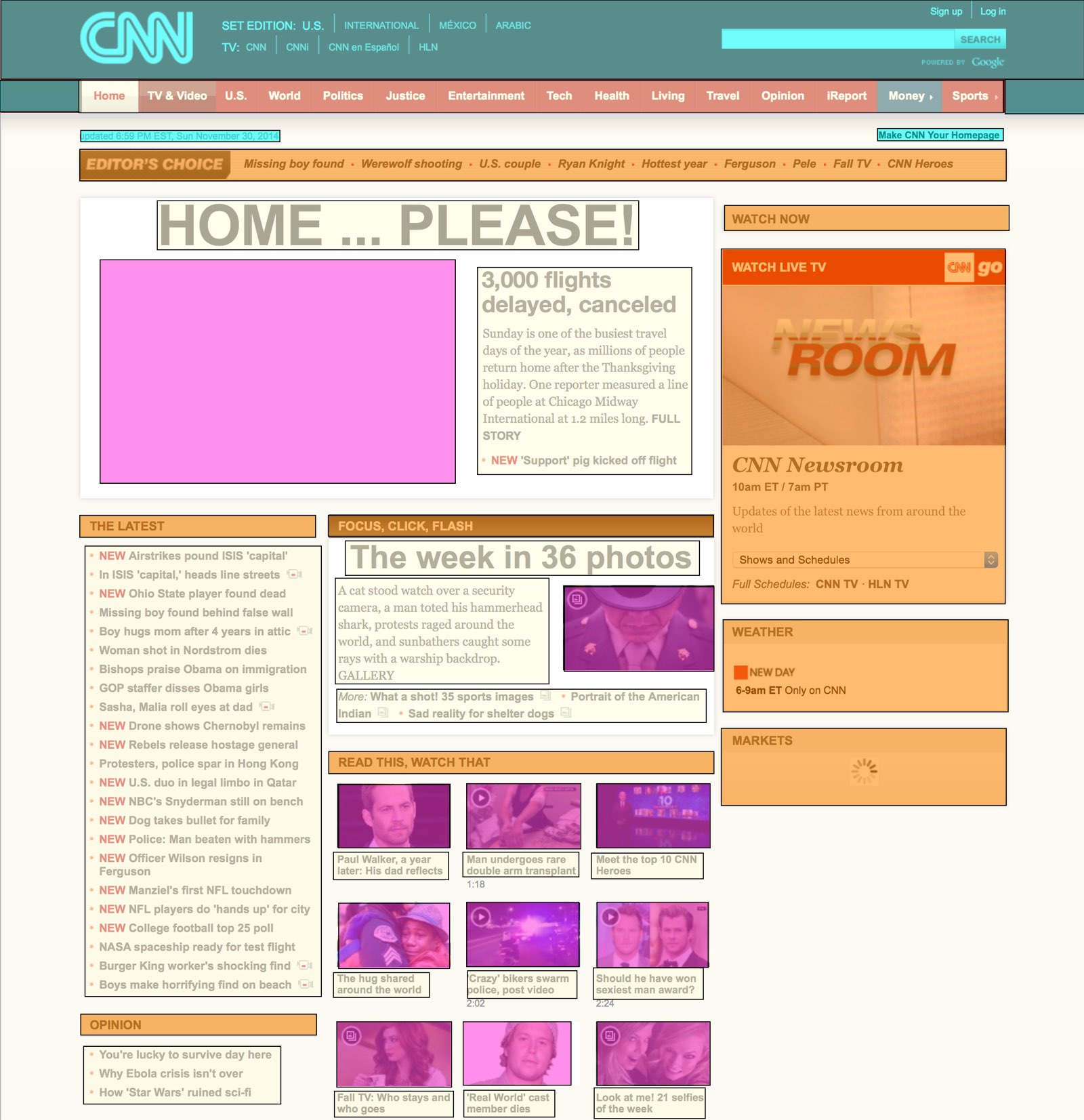 | 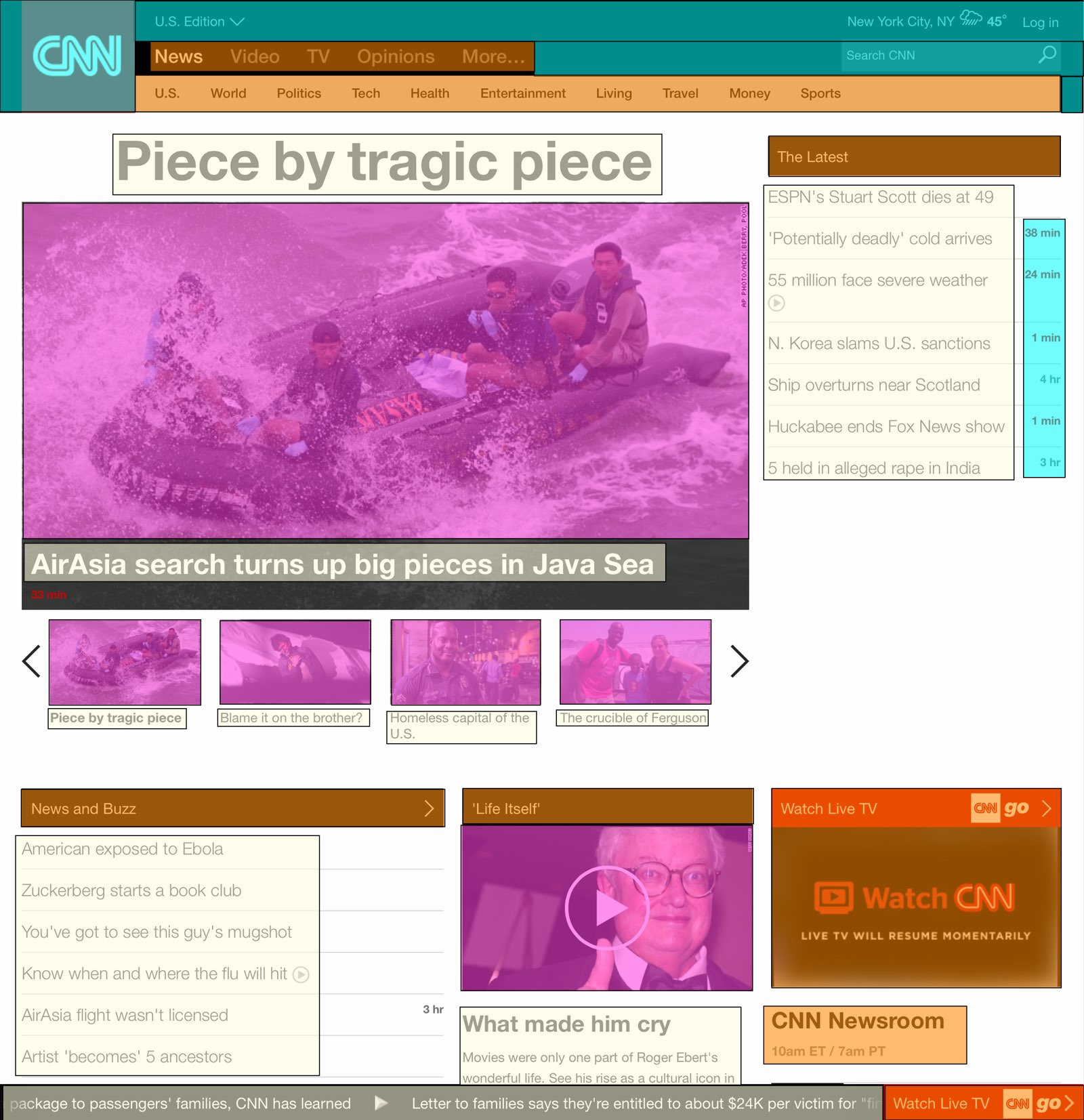 |
 | |
Once the page was mapped out, I created a simple spreadsheet that calculated the area of each type of content, based on its pixel dimensions. Here's how the two versions of the site compare:
| OLD | NEW | CHANGE | |
|---|---|---|---|
| Content areas | 21% | 22% | +5% |
| Image areas | 13% | 28% | +115% |
| Navigation areas | 19% | 10% | -47% |
| Admin areas | 9% | 7% | -22% |
| White space areas | 38% | 33% | -13% |
At first glance, this doesn't look so bad—the content areas' size is actually a bit larger than before, while the image areas' growth has come from reductions in the navigation, admin, and white space areas. If that were the full story, I'd be fine—I still think it's too much big imagery, but the content areas are actually larger than before.
Look beyond the summary, though, and things are really ugly:
| OLD | NEW | CHANGE | |
|---|---|---|---|
| Visible clickable stories | 41 | 19 | -54% |
| Largest image | 7% | 20% | +186% |
| Average CPU usage | 3% | 20% | +567% |
| Page length, pixels | 3,770 | 10,452 | +177% |
The content areas—despite being larger than before—display less than half the previous number of stories. If you compare the screenshots above, you can see the cause: huge text with large gaps between story headlines. And then there's that image, pushing everything down the page.
About that image…it's now massive, sucking up a full 20% of the visible space on the page. 20% of 1.36 million pixels—that's insane!
Why do we need to see such a massive image? "But an image is worth 1,000 words!" you say? Not when said image replaces words that used to lead to many stories; now the one massive image leads to but one story.
The other eye opener was the CPU usage; cycling amongst four of those large images (and providing a scrolling news ticker?) is apparently a hard thing to do. While the old site barely moved the CPU usage meter, the new site is consistently over 20% on my 2014 Core i7 Retina iMac—and that's while it's just sitting there; I'm not interacting with it in any way. If I were on a laptop, this kind of CPU usage would drive me crazy. 20% of my CPU to view a news page?
Finally, as you can see, the new page is nearly three times as long as the old page. That means lots of scrolling if you want to get to the bottom of the page (where, as it turns out, you can see yet more massive imagery). Ugh.
To summarize, the new CNN site (at least, the "use without scrolling" portion of the site) contains half the data as before, with an image that takes up nearly three times as much of the page. The site now takes 20% of the CPU on a brand-new Core i7 iMac just to display and sit, and it's incredibly long, making it tedious to scroll through.
This is not what I would call a successful redesign. Pretty? Sure. Usable? No.
I agree! It's horrid and I can't find the actual news on the site. Also, I've been angry at the auto-play videos attached to their stories for awhile.
The difference in CPU usage might be related to the archive.org version suppressing some of the original JavaScript or ads. A more fair comparison would be to wait until the new design is picked up by archive.org and compare both designs in their archive.org state.
I'll definitely do that once it's picked up -- but I had all ads blocked, and a "click to play" plug-in running, too. So the background load should've been minimal on either site.
-rob.
Thought ya might like to add this data point: http://www.webpagetest.org/video/compare.php?tests=150105_FJ_27J,150102_YJ_7R9 New vs Old WebPageTest.
Oh wow…that's just horridly sad. Thanks for sharing!
-rob.
How do I give feedback to CNN? I hate the new design with a passion!
So what's the solution? Looking for a decent site that doesn't slant the news either way politically so that eliminates both Fox and MSNBC I guess. I don't want political slanting, I want news.
Go to Lucianne.com or Drudge. Just links to news article without the graphics or videos.
Yeah, assuming all you want is a blatantly conservative slant in the first place.
I believe the person said they are looking for a site that 'doesn't slant the news'. Drudge is very conservative and slants the news much more than CNN. Move along.
upi.com is also a decent, simple news source.
abc.net.au/news/
No slant. No sensationalism.
Love your analysis. I totally agree. This is what happens when style overrides function.
Stick with the best: BBC.co.uk/news
Agreed! And I especially hate the news slideshow thing on the homepage. "Oh you were trying to read that? Sorry! Switched slides."
Thank you for your keen observations. I concur completely. I get this feeling of overwhelmed looking at these massive images in replace of clean, efficient, content heavy, well organized news sections. If i want to see the nose hair of someone up-close, i will look in the mirror. Maybe CNN can be urged to create a companion outline site that enables those who want to see more news articles in one glance, without endless scrolling. Might happen if more folks like you made great comments with factual evidence. Thanks again!
It also seems that they broke almost all the RSS feeds at the same time.
I am glad I am not the only one that hates it- hope they go back...
what a bunch of dumb bastards who redesigned this crap.. i would have done a better job for free.
I was afraid a re-design like this was in the pipeline. I suppose it was inevitable, given the direction the other media outlets have been taking- but I thought CNN would take heed to the negative response received by the MSNBC overhaul. The two sites now remind me of when a person attaches a hundred clip arts to a power point slide. It is less cohesive and distracts from any organizational focus.
I used to read CNN.com constantly (probably to much) on my desktop, laptop, iPad and phone. It was the first thing I picked up in the morning and the last thing I put down at night, but now it is unusable to me- especially the mobile version with the fixed top bar and ridiculous ticker- I fail to understand the use of having a temperature read out and news scroll when I'm just trying to read articles. I used to hate that CNN Money had a fixed top bar on mobile articles that let you uselessly check stock quotes, but now the entire site follows the same principle- the more you can cram in the better.
Just like after the MSNBC re-design, I will be moving on to another site- and just like that debacle, I'm sure CNN will ignore all the negative comments and pleas to go back to the old site.
They not only ignored comments about how much the new site sucks, they had an army of CNN people online arguing with users about it right after the launch. Seriously! It was like they thought they could convince a bunch of already pissed off readers that they were simply too stupid and/or unhip to appreciate the new format.
It's bad enough that, despite other cnn.com redesigns that I have weathered, I cannot continue to use the site. Bad.
I dislike the large picture. I dislike the image changing. It changes while am I trying to decide if I want learn more. I dislike the very short titles. I need better titles or a short sentence that explains what the article is about. I dislike the ticker. I dislike all of the changes.
I hated it immediately upon my first click. It was so obvious that I was seeing half the stories I used to see... glad you did the work to prove my gut feeling. Now it looks just like Fox News website.. and while I usually agree with Fox's spin on stories versus CNN's, I always used CNN because I could see an entire days news on one page. Way to go CNN.
Totally agree!!!!!
You are 100% correct. The CNN website redesign is an epic failure. Websites should focus on readability, accessability and simple aesthetics. It baffles me how anyone signed off on that abysmal redesign.
sorry if i missed it but have people also had trouble playing the videos in all sorts of browsers? (Chrome, Explorer, etc)
It's absolutely horrible. I'm literally changing my news source because of it.
Ugh I feel like CNN turned into Weather Channel website now. It's all over the place, confusing and can't tell which is legit news and which is news ads that take you to other websites. FAIL!
Agree with all the above. Plus the autoplay was incredibly annoying already, so even more reason not to visit that site. Most of all, the comments are gone...quite possibly the most entertaining part of CNN.
Agree. Not dense enough. Just news McNuggets.
I am searching for a new news source too. Could not dislike the CNN redesign more. I want news not pretty. Headed to find a better source now. Can't bear another minute of it.
I was so thrilled to find this blog! I simply CAN'T use CNN anymore. If I can actually get something to load in a reasonable time frame, I see nothing but a large picture with a caption... indicating that a reporter or affiliate has the story.... but no actual link to the story! WTF???? I spend 2-3 minutes clicking on just about everything that seems like a link... just.... never any underlying story to the screaming "advert". Next story... same thing! Searched for help, comments feedback - NIL! Searches Google for CNN update comments. Nothing until yours!
I thought it was a HOAX and they had been breached!
OMG - you mean (gulp) someone designed this ON PURPOSE?
Hope they get fired... soon!
Terrible. Basically 4 stories that you can scroll to and crashes constantly.
You can't even get to the majority of content on mobile anymore.
I concur completely. The mobile site makes the issues identified earlier even worse. Moving to different site if CNN doesn't fix soon.
concur concur concur. I hate the new cnn. I was on CNN several times a day before the new version hit the streets. Now I can't even look at it.
CNNs new website = HORRIBLE. Too big, cant find what i want to read without scrolling down endlessly. It looks like it was formatted for another screen but none of my work computers. What a complete mess. I find it irritating, clumsy, unorganized, messy. I wont be using it, its a shame because i used to love to read CNN at work and on my phone, WHAT A MESS. Did they even look at how it looks after they finished it??
Almost as bad as the MSNBC redesign. Used to be my go-to news site, but no longer. Have started using news.google.com, at least it is mostly summaries with links to the actual stories. New CNN site is awful.
I agree. The new cnn looks horrid. The black titles take too much attention away, and there just doesn't appear to be as much content on the screen as before.
CNN WAS my source too...... I can't stand the NEW format either. USATODAY is the one I use right now to get by, but nothing compares to the old site for quick access to the news. Fox, ABC, NBC, Yahoo, etc have all missed the boat on this. We want quick and informative... no junk.. no crap to weed through.. no videos... just the news.
I find the site unavegable now. Everything is "below the fold" - what a joke. Actually, most likely some smart-ass marketer from the 90's is trying to make this into the 2015 "new Coke" campaign.... bring back my CNN (Cole Classic).
If it does not, will backfire on Murdoch. Crap UI people.
The cnn site is terrible - who came up with this? There is no organization! Go back to the old manner of the website!
nbcnews.com finally toned that site back down to the point I can use it again. it was almost as bad as CNN if not worse for a while. Hate the new CNN layout too.
Don't like it a bit. And CNN is afraid to let viewers comment anymore. Not going to visit their website much anymore.
I can't believe how bad their new website's design looks like!! At first I thought my computer had a virus! I'll have to find a new source without gigantic graphics.
You can no longer get your news at a glance. I tried changing the screen size to 75% to make the HUGE images smaller, but it changed only the text information, not the images! They still take too long to load. I have had to changed my home page which I have had for 15 years to another news site... the CBC.
Agreed, it's a visual mess. I prefer to READ stories, and avoid videos. Simple is better folks, but there are website designers out there who will never leave things be. Goodbye CNN.
agree - want to read the news - not look at storybooks for preschoolers.
If I want to consume video, I'll turn on the freakin' TV or SELECT the streaming feed! Geez! i guess they fell prey to a "Image Analyst" that brought to their attention how different their 9old0 site was from their competition, and they wrote the check and jumped in the lemming line to head for the cliff. I have been a regular READER for a number of years, but the insane consumption of space by HUGE graphics and oversize fonts, and the displacement of quality content to achieve that has made this just another hodge-podge instagram with captions site. The news has, unfortunately, left the page.
Curious - has anyone done a traffic report to see if it has decreased since the redesign? Would be interested to see if there are more people like me (and everyone else on this page) who find he new site totally useless. I'm still lost on where to go now, please send suggestions. Thanks.
All I can say is I AGREE. New CNN homepage sucks.
I also hate the new CNN site - i've tried to submit my thought but can't seem to find a way
Glad to see I'm not alone! Sorry CNN.com; your redesign is HORRIBLE! Finding articles is difficult versus the old news at-a-glance view. Please revert back to the old layout or give us an option to view using the old layout. I have been reading CNN.com for YEARS, but if neither of the proposed options come to fruition, I will be taking my readership elsewhere.
Thank you for this wonderful breakdown. I generally look at cnn on my tablet, and at first, thought it was a horrible mobile app. Only to log in today off my pc and find it was the new format. It's difficult to look at. Not to mention, it feels like I'm being "fed" less news. I hope they are open to public feedback, and the site will improve.
If the layout alone wasn't annoying enough, the moving ticker is like having a small child doing jumping jacks on your desk while you try to read. How do I make the CNN Ticker stop moving? I tried AdBlock, but no luck so far. So irritating!
I deleted my bookmarks to MSNBC, NBCnews, and several others in the last few years because of their redesigns -- all of which were clearly designed for iPhones only, abandoning laptop and desktop users.
CNN wins the bad design contest this time because it doesn't work at all on my Android tablet, either! They disabled zooming on their page, and the front page (I kid you not) displays about half of one, giant word on top of a photo. The ticker overlays the photo, just chugging along and impossible to click. Great.
Now it's time to say goodbye to CNN, too, apparently.
This adblock filter removed the ticker for me:
cnn.com##.tickercontainer
Thank you so much for helping me remove the CNN ticker! It's gone.
FYI - If you would like to express our opinion on the website redesign directly, you can do so here:
http://www.cnn.com/feedback
Thanks for that; I left feedback, and I'll put that link in the main body.
-rob.
I hated it at first glance. I am never thrilled when a new design occurs, but I have always been able to work with it, and get used to it. This one, It has made me look at other news sites just so I don't have to look at this one. I went to look at the article about the terrorist act in France this morning, and I couldn't find a really good story, just images, and video. I am going to look more and hope to find a way to directly complain.
Agreed! I really tried to give them the benefit of the doubt, but the issue goes way beyond a learning curve. They simply screwed up. Actually they screwed up BAD!
Totally agree--CNN is almost unusable now. Used to be my daily source for catching up on the day's events. Not anymore--no hesitation in migrating to foxnews.com where the layout is clear, clean and east to read. CNN is going to lose major traffic with their so-called upgrade. I hope someone there is listening as almost all the feedback I've seen regarding the change is overwhelmingly negative.
I hate the new website.
Even worse, they're using spindly Helvetica Neue for body text. What an ugly trendoid mess.
Aljazeera America is much better than CNN in all respects.
Comments are closed.