Yesterday I ranted on Twitter about CNN's redesign:
Sorry, @CNN, but the new site is horrid. Overly huge imagery is not needed; I want news, not photos. Time to find a new source. Sigh.
— Rob Griffiths (@rgriff) January 3, 2015
This led to an exchange with a CNN staffer, and a couple people saying "me too!" But it felt it a bit unfair to criticize without specific data. So this morning, I gathered the data, and can now quantify my distaste for the new design.
I compared the current CNN homepage to the latest available on the Internet Archive, calculating how the space was used for each version of the site. The results were eye opening in many ways.
tl;dr summary: The new CNN design displays half as many clickable stories in the same space, with an image that takes 20% of the available screen, and sucks down over 20% of my CPU just to display its home page. Read on for the gory details.
Note: This follow-up entry details my post-CNN news sources and reading methods.
Thanks to Raymond for posting this address in the comments.
I opened a window that was 1,148 x 1,186 pixels in size, and loaded both the new and old CNN sites in tabs that window (with an ad blocker running, so I saw only content). I then grabbed screenshots, cropped to the visible page area, and started marking sections using color overlays in Acorn. I was most interested in what appears "above the fold," that is, that can be seen without scrolling in either direction.
I split each version of the site into four different area definitions: Content, Images, Navigation, and Admin. (The split between the last two is somewhat arbitrary, but I used the same methodology on both versions of the site.)
Here's how the two sites looked, mapped out into those area definitions (click either page for a much larger version).
| Old Site | New Site |
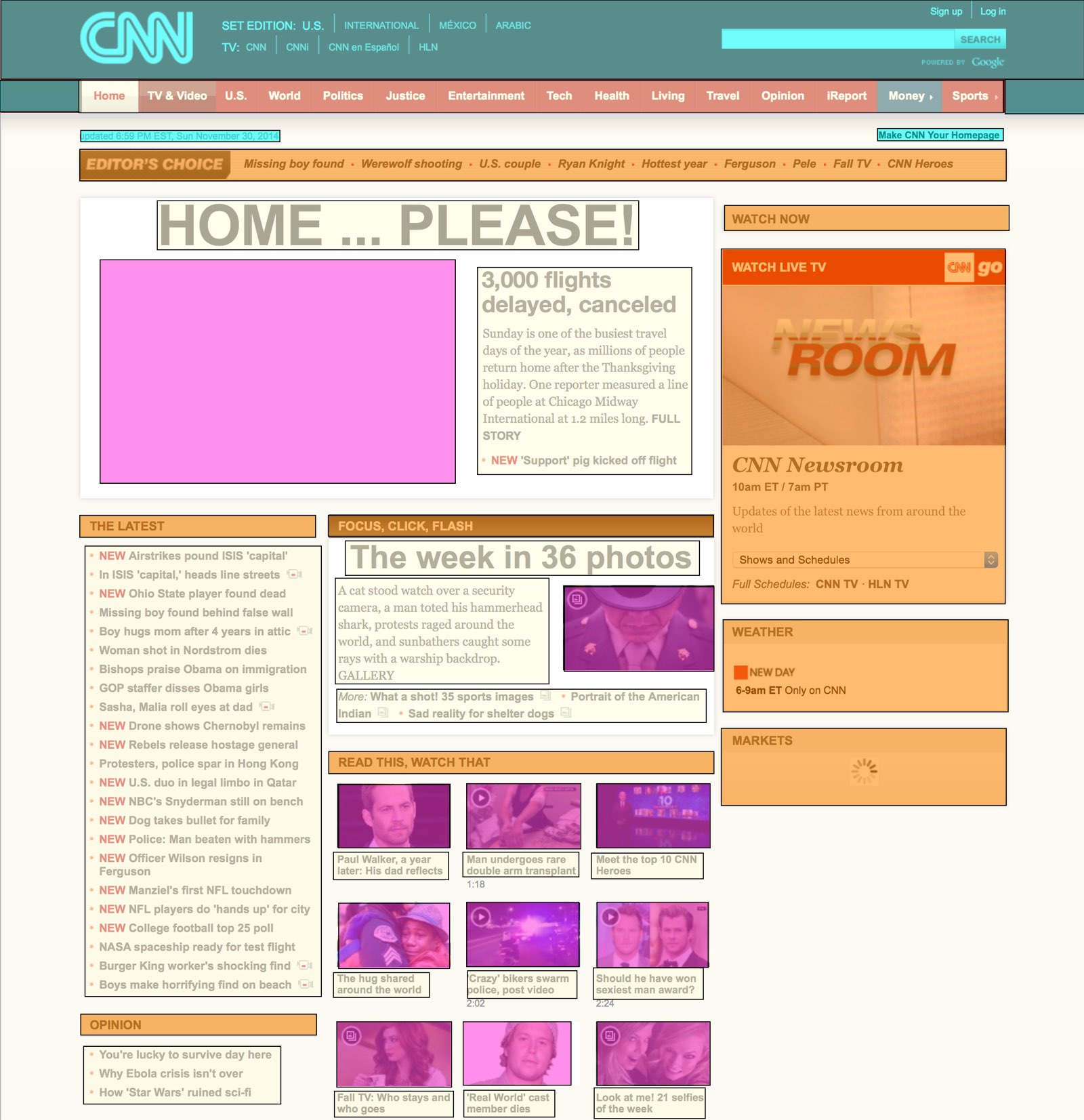 | 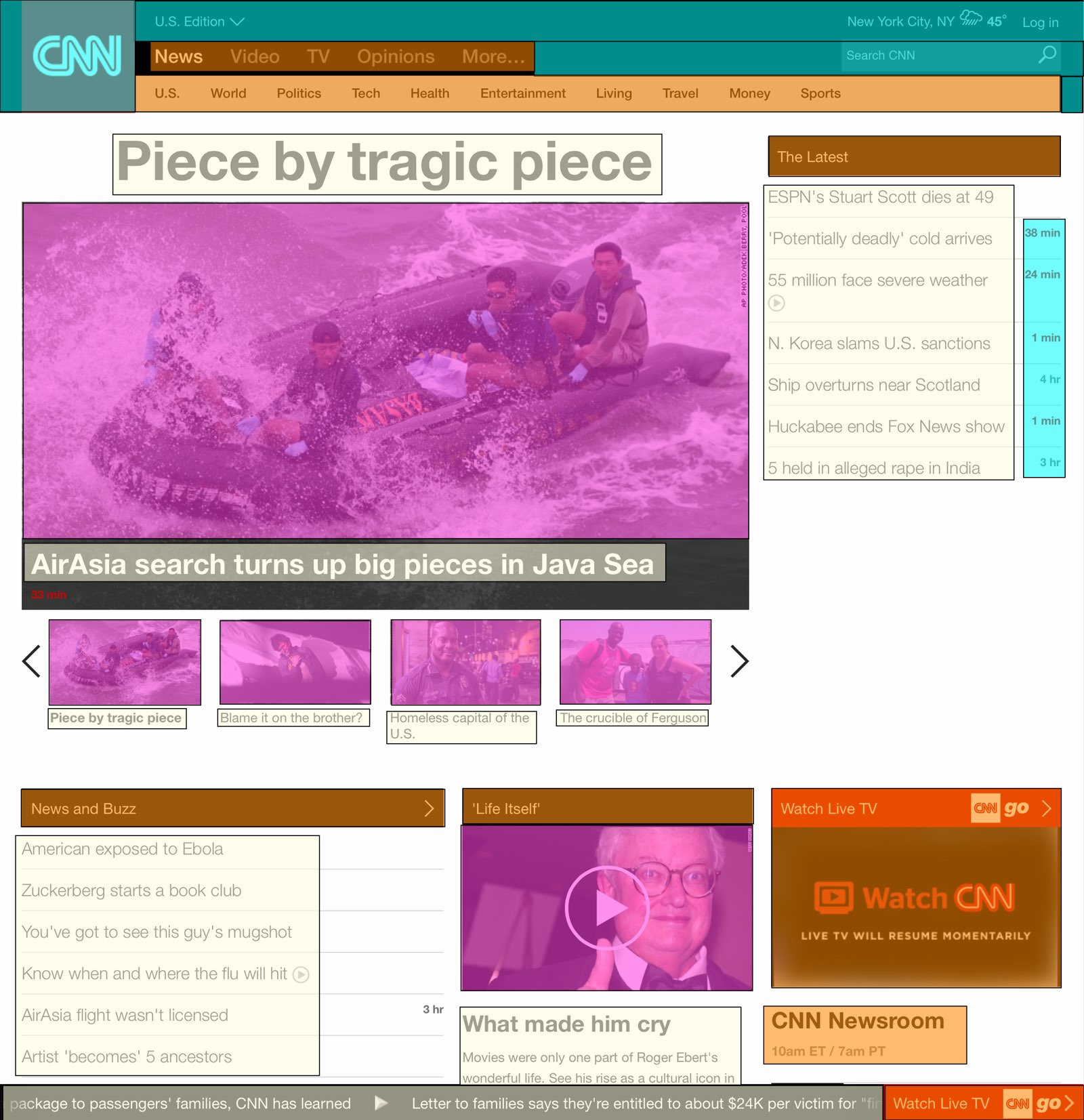 |
 | |
Once the page was mapped out, I created a simple spreadsheet that calculated the area of each type of content, based on its pixel dimensions. Here's how the two versions of the site compare:
| OLD | NEW | CHANGE | |
|---|---|---|---|
| Content areas | 21% | 22% | +5% |
| Image areas | 13% | 28% | +115% |
| Navigation areas | 19% | 10% | -47% |
| Admin areas | 9% | 7% | -22% |
| White space areas | 38% | 33% | -13% |
At first glance, this doesn't look so bad—the content areas' size is actually a bit larger than before, while the image areas' growth has come from reductions in the navigation, admin, and white space areas. If that were the full story, I'd be fine—I still think it's too much big imagery, but the content areas are actually larger than before.
Look beyond the summary, though, and things are really ugly:
| OLD | NEW | CHANGE | |
|---|---|---|---|
| Visible clickable stories | 41 | 19 | -54% |
| Largest image | 7% | 20% | +186% |
| Average CPU usage | 3% | 20% | +567% |
| Page length, pixels | 3,770 | 10,452 | +177% |
The content areas—despite being larger than before—display less than half the previous number of stories. If you compare the screenshots above, you can see the cause: huge text with large gaps between story headlines. And then there's that image, pushing everything down the page.
About that image…it's now massive, sucking up a full 20% of the visible space on the page. 20% of 1.36 million pixels—that's insane!
Why do we need to see such a massive image? "But an image is worth 1,000 words!" you say? Not when said image replaces words that used to lead to many stories; now the one massive image leads to but one story.
The other eye opener was the CPU usage; cycling amongst four of those large images (and providing a scrolling news ticker?) is apparently a hard thing to do. While the old site barely moved the CPU usage meter, the new site is consistently over 20% on my 2014 Core i7 Retina iMac—and that's while it's just sitting there; I'm not interacting with it in any way. If I were on a laptop, this kind of CPU usage would drive me crazy. 20% of my CPU to view a news page?
Finally, as you can see, the new page is nearly three times as long as the old page. That means lots of scrolling if you want to get to the bottom of the page (where, as it turns out, you can see yet more massive imagery). Ugh.
To summarize, the new CNN site (at least, the "use without scrolling" portion of the site) contains half the data as before, with an image that takes up nearly three times as much of the page. The site now takes 20% of the CPU on a brand-new Core i7 iMac just to display and sit, and it's incredibly long, making it tedious to scroll through.
This is not what I would call a successful redesign. Pretty? Sure. Usable? No.
I am having the same issue. Won't load and get long running script error message. Does anybody know how to fix this problem? It seems to be specific to just the CNN site, all other sites that I normally visit are working without issues.
I'm also having the same issue. It's frustrating because everything else works just fine. I likes the "old CNN". Now I'll have to use an different homepage because it won't load at all!!
please excuse my poor typing skills. Still having difficulties with CNN and wish I knew how to resolve things
i really think they dont want to hear the feedback. Our media doesnt report real news and its dieing. they do not want people to know what is really going on . its the only thing that makes sense...
wow, awesome breakdown!! The colors of the site are also just terrible. It's like it's trying to support Gotham City.
I kept track, over the last 7 days the new CNN froze during start up 9 out of 14 times due to the long running script error. I have the same problem on my computer at work.
I've basically stopped going to cnn.com, the layout is so horrendous.
Same here, the only time I visit cnn.com is by accident. Sometimes when I want to check news I type cnn.com before I realize what I have done. But I don't stay long. Its a jarring experience every time.
Ever since they changed the site, I'm constantly having problems opening it- long running script. Ticking me off!!!
I am giving up on CNN.com!
I'm glad I'm not the only one having problems. Sorry CNN, I will no longer visit your site.
On my iPhone it makes it harder to read as it says 'Live feed' or whatever it says...hard to browse now...bye bye CNN...hello BBC!
I used cnn web for over 20 years. I am now done with it. So many issues for my tablet. Try guardian/us
cnn.com only went live in August 1995 (Aug 30). I highly doubt you were using it the day it went live, but even if you were, you wouldn't be able to use it for "over 20 years"
My laptop just hangs, long script still running then no response. I had to change it from my home page to msn.com....which loads instantly. I wonder how many viewers and ads dollars are being lost to an UPGRADE.
I agree with this story. I really dislike the new CNN page(s).
I can't stand the new format. Time for another source for news. Even the local TV station websites are better.
Horrible format. Takes tons of time to load. I stopped visiting as well.
could not agree more. absolutely horrible website. impossible to navigate. very little actual news, just headlines and videos that play automatically. turned to ny times or washington post now for actual content.
Deleted from my favorites UNUSABLE!!!
the new site sucks
I just hate it!
Nice analysis with facts and data! I just know I don't like changes and go to the site less and less. I found this posting by Googling, "How do I turn off that ticker at the bottom of CNN's web site?" Oh my first experience with the redesign was Jan 1 when it wouldn't come up at all on my iPad 1st gen. I went out and got a new iPad but I still don't like CNN's changes ;)
I thought the automatically-playing videos were annoying; that was before the comment-troll endurance test. But this absurd, hugely folding/unfolding All-Hellvetica (pun intended) 600-point headline takes the cake.
Sorry, CNN. Bye bee bye.
Hate the change to CNN. Unable to load due to long running script. Lost me as a viewer on their website.
This week, they changed the Economy page to hide commodity prices. I tried for 15 minutes to find futures prices for heating oil and gasoline and came up empty. Last visit to CNN. I hope someone is listening.
Cnn website has been my go-to news site for 15 years. Their new site slows down my Android tablet and laptop & locks up my iPhone upon opening. Terrible upgrade - now visiting Washington Post exclusively.
Have you checked out the Oprah website? Its turned into a ridiculous nightmare too. You can find absolutely nothing, and nothing is arranged in any way to make sense. Its not in any way a communion between the Oprah people and the outside world, its basically just a big billboard in a similar way you might see a big flashing billboard when you drive down the street. The current, new, Oprah site makes no sense whatsoever. It offers nothing. http://www.oprah.com/
Glad to see that it's not just me! I hate it. Where is the NEWS? I scroll through looking for news stories, but all I find are videos, old stories, and links to OTHER sites. And, of course, as I'm scrolling through (looking for news), it freezes. Headache.
It IS truely terrible. And the nightmare continues. The same geniuses that trashed the CNN.com site have now trampled the CNNMoney site. It looks like the same oversize font/huge buttoned/terrible color schemes with no contrast that the new Office 360 / Windows 8.n OS are designed around. I now rarely go to any CNN site for anything, but I will use their mobile site because it has the same short list of stories w/o all the oversize crap with active content. Some folks JUST WANT TO READ the news. Poor business decision . . . . find new web guys.
I used go to CNN all the time to read news and stories. But now it is impossible because it is always a problem with it not responding do to a long running script. I have no choice CNN....bye...bye
PS. I wonder if their advertisers will notice that their is less people tuning in.
It "used" to be my go to site for news. Now it wont load, freezes up my laptop. Sad. Guess its yahoo.com now.
I just changed my homepage. CNN was my page for years until they revamped their site. Bad idea. I too get the script notice.
People need to lose their jobs for creating this BS. Absolutely inexcusable from the designers to programmers to QA. I've seen this before and the problem has always come down to someone at the top not understanding programming and Finance giving a lowball budget. This leads to work being outsourced (often outside the US) and managers under pressure to meet an artificial and unimportant deadline pushing off proper QA work (if done at all), believing they can just fix the bugs over time while the customer just learns to live with it.
This is how big companies go bankrupt.
"cnn.com is not responding due to a long-running script."
Same error message for weeks now on IE - home page locks up - must have used obummercare developers. heh. $15 million for some cut-rate programmers - fire them all - demand a refund - go back to formula!
I truly dislike the new CNN.COM website. My eyes have to fly all around to find anything. The pictures are too large so I have to pick which part of the picture I don't need to see. I'd rather read then see pictures. The lists go down one side then swap to the opposite and then back again. The audio icon keeps disappearing before I can change the volume. Please listen to us all and change the setup.
CNN's new website is the WORST thing on Planet Earth since the "new COKE" sham decades ago. The website is so awful!! EVERYONE HATES IT. I'll just get my news from TMZ.com from now on!
CNN's new web layout is horrible, It SUCKS. I unbookmarked it and hardly ever go there now. Do they have a death wish or is everything just geared towards mobile devices, I guess we're stuck with this trend. Thank goodness there are oodles of other websites out there with decent layouts and honest, useful news.
The last decade, CNN was always the first site I checked for news. But since this horrid redisign, I notice that I now open USA Today, BBC, Al JazeerA and a few other sites BEFORE opening CNN. I also spend far less time on the site and am quicker to close it and move on than I used to be. Frankly, I can see clearly that soon I will stop opening it altogether.
Totally agree. I used to visit CNN dot com many times throughout the day. I might visit it once per week anymore, and I rarely stay more than a moment now. It takes far too long to load and there just aren't nearly as many news stories listed anymore. Hate it.
cnn.com is horrible same as their broadcasters, I recommend to all me client to stay away from CNN because no matter how hard we try they do not listen, they do not care. All they care is their deep pockets.
The CNN website is now a hot mess. Horrible web design. CNN used to be my go to for news. No longer. Since the redesign, it's just plain unusable. It is slow to load, causes Chrome to crash, and the pictures are so large that it is useless to the related news article as I need to page up and down to be able to read the article and view the pictures.
Same here,
Long running script page will not load. Have to go somewhere else. Emails to CNN about the issue went unanswered.
Yes. Thank you for articulating what I'm experiencing. I feel yelled at whenever I click on the site. Don't like it. I hope CNN hears us, but they probably can't hear us over their GIANT font size. I'm abandoning CNN & heading over the Fox, AlJezeera or NPR.
BTW, the change is also a negative on my phone. I have to scroll right to see the featured linked articles- what a pain. We scroll up and down, CNN, not right and left. And once you scroll right, you actually have to scroll back left in order to go down again. If they're focused on mobile news, they missed the mark.
Thank you for explaining what I, as a graphic designer, knew was bad design. It's hard to believe a company as big as CNN would resort to pedestrian design. Today when viewng the site, it flashed from a white backgound to black with articles falling off the sides of the page as it did in the first few days of the redesign in early January. I've changed home pages. I can't stand to look at bad design! It hurts. Again, thank you for your effort of putting into words what people are actually seeing and why they are not liking it. Too bad CNN, you lose!
Edward Tufte once said "Every pixel on the screen should provide useful information. If it does not, it does not belong on the screen."
I have basically stopped visiting their site. In the old format there were many visible stories to click on from the homepage, as well as categories and the like. Now it is just ONE HUGE featured story, whether or not you're interested in it is irrelevant...this is what you see.
I guess what they don't realize is that there are plenty of other news sources out there with better formats. When they were first switching over, they gave the option to view the old or new. Now this is the only one I can view.
Do you know if there are any plans to change it??
I agree. The new CNN website sucks. I will no longer be visiting CNN. Site takes forever to load, crashes, and the content is sleazier than ever.
Their new site is just horrible!! It is slow, it is jerky, it is hard to navigate, it crashes. WOW, did they even test the site before rolling it out? How long are we supposed to wait while it is "loading" something. Crap, crap, crap.
I keep looking for some help from CNN on their long-running script issue but they don't offer any technical support. Shows a lack of focus on customer experience.
Their site is virtually unusable on most tablet device. There is no feedback form for their site so they're probably oblivious to why people aren't getting their news from cnn anymore.
And I thought it was because of my computer. :) I hate the new CNN website and I'm looking for a new source for my news, Like someone else mentioned...I want to read my news, not wait for minutes for large file video feeds after suffering through advertising. There is no feedback forum at CNN to let them know how we all feel and I even tried phoning them but without success. So glad I found this forum because I thought it might only be me. Thanks everyone.
Used to like their www now I can't stand it!!!!
Rob, thank you for voicing what many of us feel. I used the link you posted and also sent some feedback to cnn. I feel like some cnn.com website designer woke up and said "Clearly, none of the people that view our site can read, so we need more pictures and video. And they're all apparently blind as well, so we'll use an obnoxious high contrast color scheme with overly large text." Again, thanks for making me realize I'm not the only one out there bothered by the changes.
Comments are closed.