Yesterday I ranted on Twitter about CNN's redesign:
Sorry, @CNN, but the new site is horrid. Overly huge imagery is not needed; I want news, not photos. Time to find a new source. Sigh.
— Rob Griffiths (@rgriff) January 3, 2015
This led to an exchange with a CNN staffer, and a couple people saying "me too!" But it felt it a bit unfair to criticize without specific data. So this morning, I gathered the data, and can now quantify my distaste for the new design.
I compared the current CNN homepage to the latest available on the Internet Archive, calculating how the space was used for each version of the site. The results were eye opening in many ways.
tl;dr summary: The new CNN design displays half as many clickable stories in the same space, with an image that takes 20% of the available screen, and sucks down over 20% of my CPU just to display its home page. Read on for the gory details.
Note: This follow-up entry details my post-CNN news sources and reading methods.
Thanks to Raymond for posting this address in the comments.
I opened a window that was 1,148 x 1,186 pixels in size, and loaded both the new and old CNN sites in tabs that window (with an ad blocker running, so I saw only content). I then grabbed screenshots, cropped to the visible page area, and started marking sections using color overlays in Acorn. I was most interested in what appears "above the fold," that is, that can be seen without scrolling in either direction.
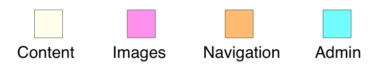
I split each version of the site into four different area definitions: Content, Images, Navigation, and Admin. (The split between the last two is somewhat arbitrary, but I used the same methodology on both versions of the site.)
Here's how the two sites looked, mapped out into those area definitions (click either page for a much larger version).
| Old Site | New Site |
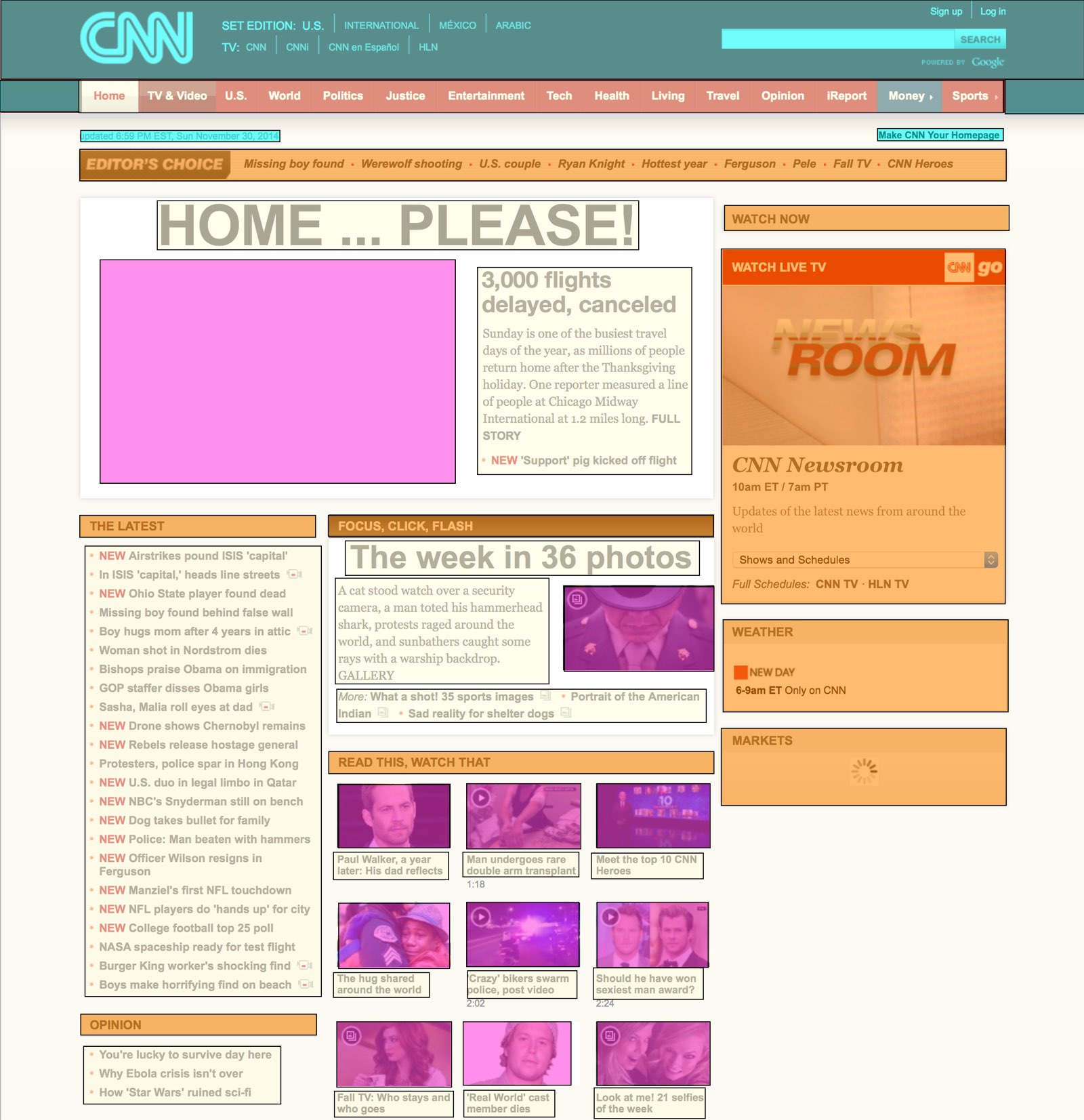 | 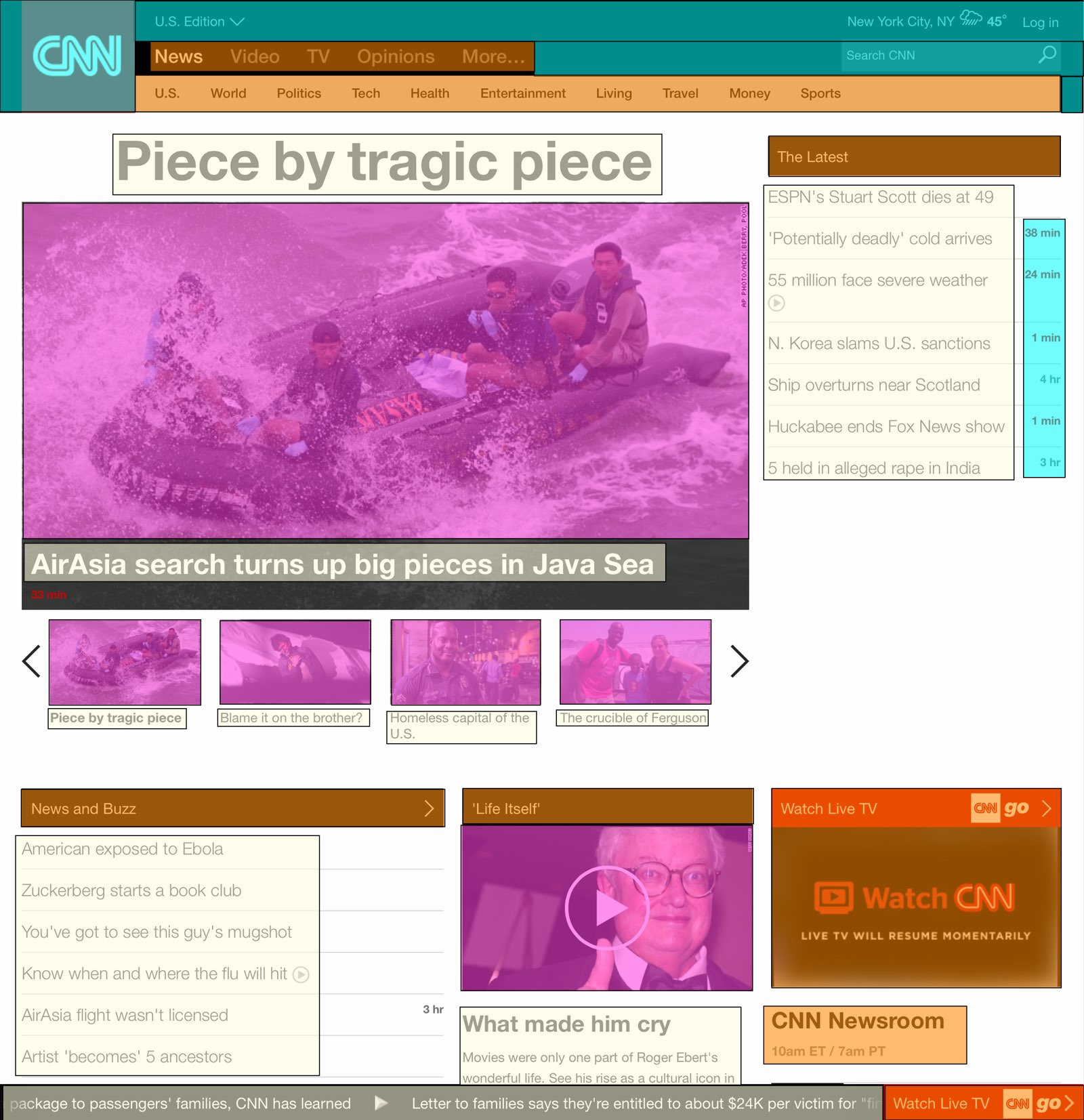 |
 | |
Once the page was mapped out, I created a simple spreadsheet that calculated the area of each type of content, based on its pixel dimensions. Here's how the two versions of the site compare:
| OLD | NEW | CHANGE | |
|---|---|---|---|
| Content areas | 21% | 22% | +5% |
| Image areas | 13% | 28% | +115% |
| Navigation areas | 19% | 10% | -47% |
| Admin areas | 9% | 7% | -22% |
| White space areas | 38% | 33% | -13% |
At first glance, this doesn't look so bad—the content areas' size is actually a bit larger than before, while the image areas' growth has come from reductions in the navigation, admin, and white space areas. If that were the full story, I'd be fine—I still think it's too much big imagery, but the content areas are actually larger than before.
Look beyond the summary, though, and things are really ugly:
| OLD | NEW | CHANGE | |
|---|---|---|---|
| Visible clickable stories | 41 | 19 | -54% |
| Largest image | 7% | 20% | +186% |
| Average CPU usage | 3% | 20% | +567% |
| Page length, pixels | 3,770 | 10,452 | +177% |
The content areas—despite being larger than before—display less than half the previous number of stories. If you compare the screenshots above, you can see the cause: huge text with large gaps between story headlines. And then there's that image, pushing everything down the page.
About that image…it's now massive, sucking up a full 20% of the visible space on the page. 20% of 1.36 million pixels—that's insane!
Why do we need to see such a massive image? "But an image is worth 1,000 words!" you say? Not when said image replaces words that used to lead to many stories; now the one massive image leads to but one story.
The other eye opener was the CPU usage; cycling amongst four of those large images (and providing a scrolling news ticker?) is apparently a hard thing to do. While the old site barely moved the CPU usage meter, the new site is consistently over 20% on my 2014 Core i7 Retina iMac—and that's while it's just sitting there; I'm not interacting with it in any way. If I were on a laptop, this kind of CPU usage would drive me crazy. 20% of my CPU to view a news page?
Finally, as you can see, the new page is nearly three times as long as the old page. That means lots of scrolling if you want to get to the bottom of the page (where, as it turns out, you can see yet more massive imagery). Ugh.
To summarize, the new CNN site (at least, the "use without scrolling" portion of the site) contains half the data as before, with an image that takes up nearly three times as much of the page. The site now takes 20% of the CPU on a brand-new Core i7 iMac just to display and sit, and it's incredibly long, making it tedious to scroll through.
This is not what I would call a successful redesign. Pretty? Sure. Usable? No.
Agreed- I cannot stand the new layout and have already started going to other sources for news, even though I've been a loyal daily CNN reader for years. There is too much visual stimuli and not enough easy to access articles anymore. Bad decision, CNN.
Thank you for the quantitative analysis of CNNs redesign. I'm not sure what demographic CNN was going for, but consumers of picture books generally aren't looking for news. I suffered the previous changes to the website, but this one has pushed me fully to BBC and Reuters.
Yes, I've moved to BBC too.
pretty----> useless! the new cnn page is very unuser friendly. terrible redesign. fire the people who made it.
This new website design sucks. Looks unprofessional. Is this news or entertainment media?
Yes, the new site is awful. CNN was my "go to" site. Lead picture is way to large. LOVED the old site. Classic case of someone out thinking themselves, or change just to change. Bye CNN.
Agree - don't want to look at a preschool storybook.
Leave feedback here http://www.cnn.com/feedback/forms/form5.html?106
I agree, bring back the old else I'll have to move elsewhere for my news.
Not only is the new design a huge setback to usability, the writing is often hard to parse. Today one of the paragraphs about the French crisis was unintelligible. Also, I don't like the "What we know, what we don't know" sections. How can you write "what you don't know?" Makes no sense.
Horrific
The new site is horrid. I have no idea how they could pull the trigger on this. I've been going to CNN for many years and am depressed to have to move on to another more user friendly news source. To even look at the site for a few seconds gives me a headache. Sports Illustrated recently destroyed their site in the same manner and now CNN follows. We want solid news...not huge photos!
this site is pure garbage now. What were they going for here I wonder , perhaps cheap tabloid? I'm out of here if I wanted a picture book I'd go to Amazon children's section.
When I first opened the site, I thought my font had been enlarged on accident so I tried to shrink it down so I could find the rest of the news stories. Needless to say, it didn't work and now I'm onto other news sites because I'm not 12 years old. Thanks for the memories....
I hate it as well. MSNBC did the same thing. Blow up the pictures in your face as if saying and perhaps censoring....this is what and only what you get to see. We're feeding you what we want you to see. Here--look at these pictures without the story first. Educated readers want to skim quickly for information not have it handed to them in a painfully slow manner. I've gone on to other sites that deliver much more on the front page that serves as a index to what's going on in the world. This totally sucks. Hard to find actual journalism these days, thanks to Rupert Murdoch and his monopoly of the news media. His censorship and propaganda network machine needs to be dismantled.
Good article. I despise the new design. I'd say "what the hell were they thinking" but we know exactly what they are thinking... that we are all just a bunch of drooling idiots with toddler-aged attention spans. It is really embarrassing that I used to consider CNN a respectable news source. Maybe I'm a drooling idiot after all.
Dear CNN, I am neither blind nor do I have ADD. I don't need ridiculously large font along with even more insanely larger pictures. I also prefer to read an in-depth article, not little bits of news sprinkled here and there.
I am sure the site redesign is making some people very happy, especially those other news organizations who now have people flocking to them.
I like to read the news word by word in regular size font, paragraph after paragraph as if I am reading a newspaper. My brain feeds on that. I am not a 6 year old who would read a big size book with big pictures and big size words!
hate the new look - just hate it It's ridiculous and reflects what some millennial thinks news should look like. Why can't you just give me news I can see? No need to be Huffington. I'll have to get NYT or WSJ or something else, anything, as new homepage
I absolutely HATE the new CNN web site design. It's impossible to decipher and, for a news site, relays zero news content on its homepage. It's difficult to figure out what news, precisely, CNN is trying to impart, and it's overly time consuming to figure out how to navigate to the areas where there is some informative content. I also detest that most of the content seems to be delivered by way of video rather than written columns. I can scan a written article for knowledge in a fraction of the time it take to watch an entire video (and, besides, what makes CNN think that everyone wishes to have video playing in the middle of the working day?).
A six year old could do a better design job. I shall be going elsewhere for my on-line news.
Agree with every word!
You took the words right out of my mouth.
So frustrated with CNN's redesigned website. I've been a faithful CNN follower for years, but navigating this website on my mobile device is a NIGHTMARE! So sad to have to go to another service in order to read the news.
It's bad enough on a laptop sized screen, but on a mobile phone it's absolutely horrendous. And, spot on with the increased CPU usage.
Same here, I'm on CNN now once in a day to see the headlines then I move on to other sites to get the details. I'm not sure how they will monetize it when we don't have much to click through. I see serious job loses coming to CNN staff very soon.
I thought something was wrong with my computer! Hate.it.hate.it.hate.it
It is the worst design I have seen for a long time. Gone to BBC. Sad.
Well I was going to complain about the new CNN website but I think all 137 folks that posted prior to me nailed it. Just posting now to add to the number - if it doesn't change back soon, like tomorrow, I'm switching to BBC. The news changes by the time the entire downloads finish and I'm not blind - I can skim more than one article at a time.
I knew I wasn't alone! I am not an 80 year old near blind man with Coke bottle glasses! CNN, please reduce the giant font and photo content. Awful! I have also been perusing the other news sites that I have never tried before.
I'm simply going to go to Fox News or BBC. This new website looks like a bunch of high schoolers designed it.
what a horrible presentation. For CNN is everything is 120 font size. Learn from BBC.com guys!
Very obnoxious. I don't use CNN anymore because of it.
I agree... horrid... ugly... pain to navigate through to the real information... moving on!
moving to BBC as well - please post any other news sites that you recommend.
It is much worse on smart phones, the useless annoying floating header takes away at least 25% of the screen, and forcing the mobile site, the desktop view does not even work anymore. What a bunch of totally clueless morons.
Will switch to a new website for news, hate the new format from CNN...wow so bad
Yikes! Worst website ever. I want to READ the news not have my screen full of pictures and videos. Horrible font. Confusing to navigate. Too much scrolling to find anything. Get rid of that scrolling news updater at the bottom. And that live tv video that runs automatically and can't be turned off. Like I said I want to READ the news. I'm not a 3 year old who wants to look at pictures and videos. I'm off to find a new news site.
Spot-on analysis of CNN's site redesign! The image heavy, huge font, reduced content makes for bad UX. BBC is now my go-to news site.
THE NEW CNN SITE REDESIGN IS OFFENSIVE AND "IN YOUR FACE". I LIKE TO VIEW WHAT IS BEING OFFERED IN THE NEWS. THEN PICK WHAT I AM MOST INTERESTED IN FIRST. THIS NEW DESIGN IS MORE WHAT CNN "WANTS"
This redesign is nuts - on my 1440x900 15" Macbook Pro all I see is a GIANT picture and maybe 16 huge letters for a headline. Everything else I have to scroll down to see... hate it... and the black/white alternating background is just disturbing.
Could not agree with you more! CNN obviously hired some new junior web designers who were brought up reading comic books.
I agree with pretty much every point you've made. Further its an industry trend that's related to making it big and tablet-centric. The BBC website did a similar makeover, not as bad but just about. The result is websites that are nearly unusable and have LESS content. The sites are so heavily focused on one issue that they actually don't report anything else. Everyone complains about how the media are just doing short sound bites and no substance, this is part of that trend.
Reporters and editors better smarten up or else they'll be replaced by robots, oh wait I just did. My solution was to go to a news gather source. I already use Digg and now instead of going to CNN and BBC I'm using Google News, which is unfortunate but I have no choice.
i have stopped reading cnn after years. removed it from bookmarks/favorites etc.
the same thing caused me to leave si.com
and sfgate.com.
CNN, what that hell? You have been pushing to use your application which looks just like the same. It is horrible. I liked your old design. I could spot news quick. now I am lost with huge images of irrelevant crap. :(
agree with your comment.
I totally agree with your overall assessment and appreciate your providing the analysis to document it. I just sent CNN an email explaining why I thought the new site was terrible and citing many of the same complaints you voiced. For years I have kept CNN.COM open during waking hours and checked it constantly during the day for updates, to verify information, to see what was going on in the world. I now find it useless for any of these purposes and have switched to BBC.
Can't believe cnn is not reporting on how bad their new website is, but to be fair, maybe they are and I just can't find it because the new site is so awful.
I could not agree more. I do use a regular browser on a 1900x1020 monitor to go to CNN - which has always been my go to news service.
NOW, its just A LOT OF WORK to use their site. BY that I mean I have to scroll and work my eyes more to pick out the most interesting content.
And I am sorry, my tolerance for a lot of work on websites has grown thin over the years.
Thanks for writing this article and arguing the case for us.
I have left CNN for good. What an absolute disaster of a site. It started with them censoring viewer comments, then they got rid of comments altogether.. and now the site targets 10 year olds. Good job CNN!
i have left them too. they are atrocious. like an entertainment website.
Bye CNN, you are confused.
Big blow up lading page followed by banners so you can get users to watch mediocre pseudo news ie entertainment videos so you that can get add revenue.
My news bookmark tab now only contains BBC, Al Jazeera America and Reuters who are very clear in telling you which content in News, Opinion, or Entertainment.
Your arrogance will probably rule your reasoning and you will ignore the outcry of loyal followers because you convinced after months of planning you got it right. Goodluck
I am moving to BBC I feel like I have dial-up Internet access!
I didn't think anyone could come up with a worse web site redesign than MSNBC, but apparently CNN was up to the challenge. This is the worst news site design ever.
Hi guys, I totally agree, their redesign sucks big time, I can't see the titles at a single glimpse. I will have to use some other website for news. Hope the genius who redesigned it gets fired.
I agree with everything. And the site is almost impossible to navigate on a mobile phone in the browser. Terrible. I've gone from checking CNN a few times a day to once every few days, and then remember how difficult it is to use and immediate switch to BBC or The Guardian.
Goodbye CNN. Not a fan. I liked being able to quickly scan all of the headlines and stories.
Comments are closed.