Yesterday I ranted on Twitter about CNN's redesign:
Sorry, @CNN, but the new site is horrid. Overly huge imagery is not needed; I want news, not photos. Time to find a new source. Sigh.
— Rob Griffiths (@rgriff) January 3, 2015
This led to an exchange with a CNN staffer, and a couple people saying "me too!" But it felt it a bit unfair to criticize without specific data. So this morning, I gathered the data, and can now quantify my distaste for the new design.
I compared the current CNN homepage to the latest available on the Internet Archive, calculating how the space was used for each version of the site. The results were eye opening in many ways.
tl;dr summary: The new CNN design displays half as many clickable stories in the same space, with an image that takes 20% of the available screen, and sucks down over 20% of my CPU just to display its home page. Read on for the gory details.
Note: This follow-up entry details my post-CNN news sources and reading methods.
Thanks to Raymond for posting this address in the comments.
I opened a window that was 1,148 x 1,186 pixels in size, and loaded both the new and old CNN sites in tabs that window (with an ad blocker running, so I saw only content). I then grabbed screenshots, cropped to the visible page area, and started marking sections using color overlays in Acorn. I was most interested in what appears "above the fold," that is, that can be seen without scrolling in either direction.
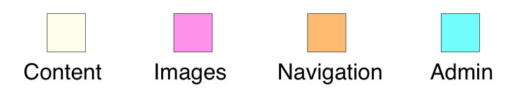
I split each version of the site into four different area definitions: Content, Images, Navigation, and Admin. (The split between the last two is somewhat arbitrary, but I used the same methodology on both versions of the site.)
Here's how the two sites looked, mapped out into those area definitions (click either page for a much larger version).
| Old Site | New Site |
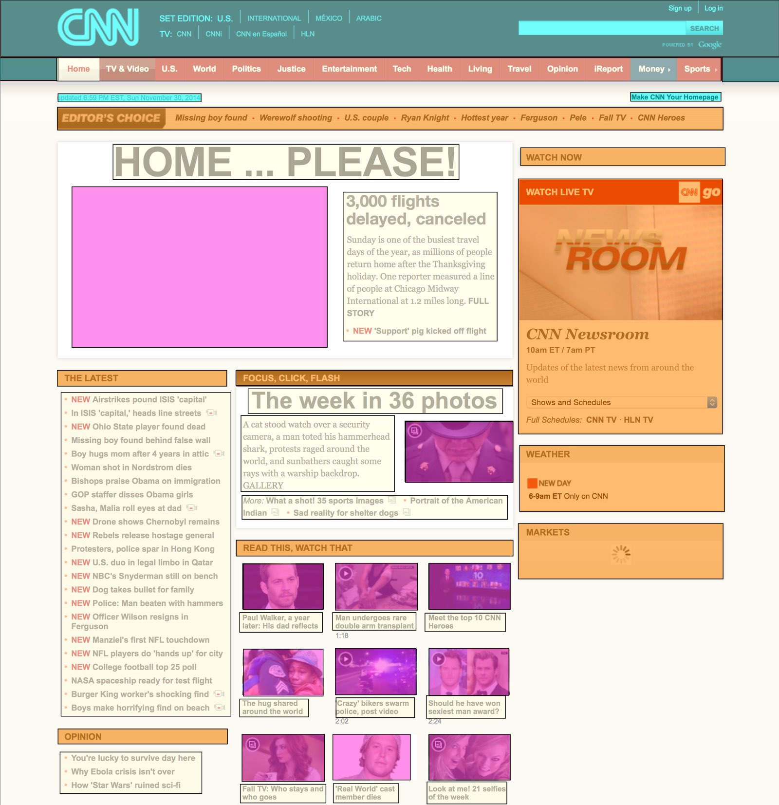 | 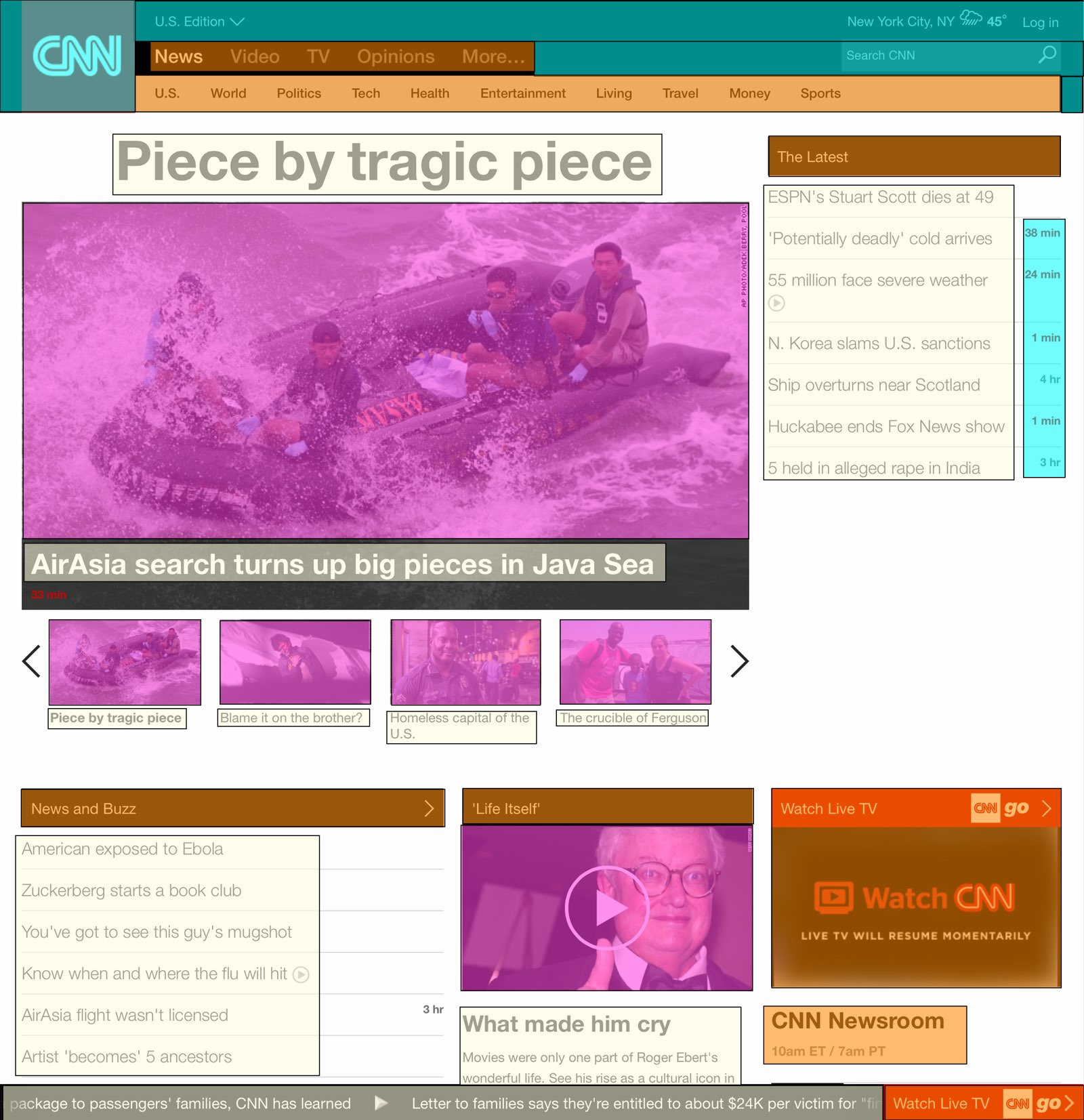 |
 | |
Once the page was mapped out, I created a simple spreadsheet that calculated the area of each type of content, based on its pixel dimensions. Here's how the two versions of the site compare:
| OLD | NEW | CHANGE | |
|---|---|---|---|
| Content areas | 21% | 22% | +5% |
| Image areas | 13% | 28% | +115% |
| Navigation areas | 19% | 10% | -47% |
| Admin areas | 9% | 7% | -22% |
| White space areas | 38% | 33% | -13% |
At first glance, this doesn't look so bad—the content areas' size is actually a bit larger than before, while the image areas' growth has come from reductions in the navigation, admin, and white space areas. If that were the full story, I'd be fine—I still think it's too much big imagery, but the content areas are actually larger than before.
Look beyond the summary, though, and things are really ugly:
| OLD | NEW | CHANGE | |
|---|---|---|---|
| Visible clickable stories | 41 | 19 | -54% |
| Largest image | 7% | 20% | +186% |
| Average CPU usage | 3% | 20% | +567% |
| Page length, pixels | 3,770 | 10,452 | +177% |
The content areas—despite being larger than before—display less than half the previous number of stories. If you compare the screenshots above, you can see the cause: huge text with large gaps between story headlines. And then there's that image, pushing everything down the page.
About that image…it's now massive, sucking up a full 20% of the visible space on the page. 20% of 1.36 million pixels—that's insane!
Why do we need to see such a massive image? "But an image is worth 1,000 words!" you say? Not when said image replaces words that used to lead to many stories; now the one massive image leads to but one story.
The other eye opener was the CPU usage; cycling amongst four of those large images (and providing a scrolling news ticker?) is apparently a hard thing to do. While the old site barely moved the CPU usage meter, the new site is consistently over 20% on my 2014 Core i7 Retina iMac—and that's while it's just sitting there; I'm not interacting with it in any way. If I were on a laptop, this kind of CPU usage would drive me crazy. 20% of my CPU to view a news page?
Finally, as you can see, the new page is nearly three times as long as the old page. That means lots of scrolling if you want to get to the bottom of the page (where, as it turns out, you can see yet more massive imagery). Ugh.
To summarize, the new CNN site (at least, the "use without scrolling" portion of the site) contains half the data as before, with an image that takes up nearly three times as much of the page. The site now takes 20% of the CPU on a brand-new Core i7 iMac just to display and sit, and it's incredibly long, making it tedious to scroll through.
This is not what I would call a successful redesign. Pretty? Sure. Usable? No.
Terrible Design. Regadless of political slant. Many more clicks available on previous site. Im done with CNN.
Hate it!!
Horrible ... No, worst than that. Rather than argue the merits of just how bad the new design is, it's easier to just find a new news source and not waste any more time. They are hell bent on this new change so you might get more satisfaction talking to the tires on your car ..... let them have it.
Hate it, will check it out to see if any changes were made over the next week or so, then I'm on to another news source.
its THE WORST. Fire the designers. I really liked the old CNN
The redesign has left cnn entirely unusable on my iphone. And also annoyingly, the weather won't change to my current location and is stuck on New York, New York. I haven't been there in three years.
I have a mac book pro 13 and before I could visit the website and immediately see the most important news .. now i just see a huge image … the word manhunt and after tons of scrolling I can finally read the news … personally i much more prefer the old design. the new design is unusable on my 13 inch screen
Why the need to change things for the worse? Such an annoying site.
Hate the new design, and also hate that it eliminates "Justice" as a section. Booooo!!
Justice was my absolute favorite section of CNN. I can pretty much read any other type of news from different websites, but I have yet to find another news site that actually splits out a separate Justice section like CNN did. All the others make me go through the entire US news section.
It's horrible. Between the exaggerated size of the content, useless alerts, and menus that come out of nowhere, it is unusable.
I agree completely. The new site makes my brain hurt...and it's not from reading informative news. I will also be moving on to a new site for my news.
Any other suggestions for where to go? Something like the old cnn.com site? I've tried the few things that have been suggested here and am not finding something with the same approach. What a pain...
try BBC.... funny that their first page looks like the old CNN screen
Agreed, completely turned me off the website. What WERE they thinking?
The new site is a giant leap backwards. I used to hit CNN many times a day but with the new design I can't stand going there anymore. Too frustrating. Who at CNN hired the next door neighbor's daughters's ex boyfriend to design this thing?
Agree - it was also my go to site. Want to read the news - not look at a children's page with all of the pictures.
.
I also cannot stand the redesign. I have gone from a daily user to not at all..... that previous site was just fine. Maybe too many video for my taste, but other than that it was a joy to navigate.
I hate the new 'IN YOUR FACE' webpage. CNN and one local webpage was all that I needed. I didn't like ABC or NBC or CBS or any other. Now they have gone the route of the others. I can read the news faster than watching a video load up and listening to somebody prepare me to what they are going to tell me in a video.
The site is HORRIBLE. I also went from a daily user to completely moving on. The old site was fine. Did someone go blind? Who is the new designer? First, the autoplay video that i have to disable. Now the entire screen is blocked by 1 picture. What???
Horrible design. I may as well go to the Fox News site.
Absolutely awful design from every possible design perspective. CNN just loves alienating its dwindling readers
Actually, I don't see any of those story links on the right hand side, like you show in your "new" image above. I pretty much ONLY see an image and headline. It takes up my WHOLE screen. Why? I'd like to change it, but don't know why my laptop would show me nothing but an image. Is there a setting I can change on my laptop, pertaining to display maybe? I'm just over it. I can't do anything on CNN now except stare at a HUGE image taking up my entire space, and have to scroll down for any other news story...Jeez.
Since I wrote this piece, they changed the page -- I think because of the importance of the attack in France. I'm hoping (?) it's temporary, and it'll go back to it's ugly-usual soon. But if it doesn't, I'll re-do this post, because it's truly completely stupid now.
-rob.
Hate it .... overview at a glance not possible. I will spend much less time with CNN as a result.
1) unusable on iphone - even the iphone +
2) data hog site - auto plays video
3) if you try to expand story size, header frame expands instead (on mobile)
4) stories are on top of each other
5) scrolling down page you accidentally pop up other menus or stories without trying
6) home page - okay - we get that you think certain stores are more important that others but not everyone does - the new France terror story, got it, it's really bad, but still, don't cover the whole front page. We'll still find it if you make it normal size.
7) dark backgrounds suck - it's black and red everywhere
8) can't find simple list of news stories by topic
9) every story has a video or picture with it - it's too distracting and hard on eyes to have to search for the story titles
10) can you let some users use old version please!!!
11) can anyone suggest new site to get decent news
Designed by kids, for kids.
DESPISE your new website design. Hate it. Fix it!
seriously, just a horrible and annoying design. On the hunt for a new home page now...
Now it's gotten even worse! I create my own homepage because none are adequate for my needs, but CNN has always been the click of choice for my news. It's worse than MSNBC now, so I just created links to Foxnews, Rueters, and LA Times because of the clean easier navigation. I'm not sure which of these new 3 will be my standard goto page but it sure won't be CNN anymore. Kinda sad after all these years of reading CNN.
Hey CNN, it is your site, you own it, you can make whatever changes you want, link whatever 'promoted stories' you want, embed videos all over the place, I get it. I just won't use it anymore.
CNN, why can't we just READ the news? Between you overblown into graphic a la New York Post, constant scrolling, it's insane. I recommend abcnews.com for snackable news one can read instantly.
A few years ago CNN changed it format to add more Flash and Video’s but they still kept some of the nice new article links. I didn’t like the changes but it was still usable, but it took more clicks to find information. They added some more pictures but you could still read and find stuff pretty quickly.
The new CNNs new website format released a few days ago is absolutely HORRIBLE. Everything is way to BIG! You can’t find a dam thing on the website. I have carpel tunnel and my wrists were really hurting after spending a few minutes scrolling down endlessly to find an article. I used to like going to your website to read articles quickly and efficiently when on my PC, but now all I see is a ton of large pictures and no articles. Finding articles is difficult versus the old news at-a-glance view.
I even tried your website on my Samsung S-5 Android phone and I think I had to swipe 15 times to get to the bottom of the homepage. What a frigging joke your website has become! You have messed up your website for both PC and mobile phone users. I guarantee your traffic to your website if going to drop significantly.
My mother who doesn’t have the best vision, doesn’t care about video or picture, and who doesn’t have great eye-hand coordination with a mouse called me visible upset. She used to like sitting down every morning to go through the homepage CNN website links. She basically said that the CNN website is almost entirely unusable now. She said your new website is a giant leap backwards.
I used to also use MSNBC but stopped viewing it as it was terrible. But your new website format is even worse than MSNBCs. Maybe it is time to go back to MSNBC. Whoever at CNN made the decision to go with the new website format should be fired immediately!!!
To use simple vernacular that I hope CNN understands “YOU HAVE TRULY FUCKED-UP ONE OF THE LAST REMAINING EASY TO USE, UNBIASED, AND WELL BALANCED WEB BASED NEWS WEBSITES!!!”
The next to the last paragraph nailed it! CNN should have learned a big lesson from MSNBC.
Can't stand the redesign. It is so gigantic and distracting. I've tried to click over to read a few times - and I last about 10 seconds. So bad.
Unreadable. And let me turn the flippin' ticker off. Completely distracting while trying to navigate the wasting-space content.
Egads! For people who really want news and not fluff this design is decidedly poor. I wonder who was used as the test audience? I am not just a bit annoyed and trying to adapt to the new underwhelming site but rather put off that the usability has diminished so strongly to the point it has no use for me.
It is horrible! I am off to Reuters!
Thanks for quantifying how much I hate the new design.
In addition, they changed their mobile page, so that an advertsement video can play automatically, even after tweaking the current firefox browser on android to require a click before playing the video!
It is good that Google helped me find this page with link minded people, so I can vent :)
It's just one of a number of sites going exclusively to what they think is "tablet format" I'm with all of you though... I want concentrated information not big pictures. I don't even watch the videos that take minutes to get across what I could skim in moments. Useless now.
It is a rather disgusting redesign. I have been looking for a reason to stop reading the CNN site once they put auto-loading videos in every bloody article and this easily sealed the deal. Just replaced the CNN bookmark with BBC so we will see how that goes.
As most have said, if CNN thinks this is creative genius, they have got it all wrong. The over-sized image that takes up half the screen is idiotic. And the stories are hard to fathom...a real mish-mash. What a waste of millions of dollars. CNN, what were you thinking? First the decision to basically run ONE STORY at a time, and now this. I hate Fox but you have been outfoxed.
I totally agree. I had always enjoyed CNN internet news - not anymore. I am now seeking news elsewhere. At work, the graphic intense design is terribly slow, had trouble resizing and fitting screen size, etc. - so slow I was tired of waiting for it to load (and we have fast servers!) Very lankly and awkward.
Dear cnn.com, We've been together for years but you have changed. You can no longer provide me with the news that I desire. I know that you have changed in order to attract someone younger. To be honest I'm not into all of the flash and DD graphics. I just want a simple news website that can keep me informed and meet my informational needs. I understand that you desire a younger demographic. I guess I'll start hanging out with Reuters and BBC. We had many good years together. I hope you will be happy.
LOL - a great comment which I totally agree with.
New site design is simply unusable. Moving to other news sources (Bing news, Reuters, etc.).
WHAT A JOKE! How can they think that anybody would like this redesign? Surely their website traffic has dropped by 50% or more due to this horrible looking piece of trash!!
Can't stand it either, so disappointing. People will probably lose their jobs over this one.
I never write on these site and this has to be the worst NEW site format ever. The new layout sucks
Notice that nobody is leaving any good reviews, only bad ones. How could they possibly think this piece of crap website would be welcomed and embraced by readers? Somebody needs to be fired! This is corporate incompetence at its worst.
I thought I had a problem with my laptop. I was a faithful CNN viewer for more than 10 years....no more! Try ABCnews.com....good layout and quality, same coverage/stories.
To the CNN Executives: CHANGE IT BACK!!!!! You're losing users! Do your advertisers know this?!
Thank you for doing this comparison. The redesign, while modern looking, is just down right bad. I may have to switch news sites as well...
This website is a worse disaster than Obamacare.
New CNN site is absolutely horrible. I bailed. Am now searching for a replacement. ABCNews so far seems to be the "winner"
Alas, "Idiocracy" is well upon us. I'll just be checking in on my news at the "Ow My Balls" website, from here on out.
BBC news -- much better and free live feed
BBC.com is way better on my mobile- it is to the point and clearly organized. I don't care for the desktop version as much, but its certainly not as bad as CNN and MSNBC
Comments are closed.