Stupid by design: Voice command uselessness
I drive a 2014 Subaru Legacy; for the most part, I'm happy with the car. But there are some design features that are just comically stupid. Here's one example…
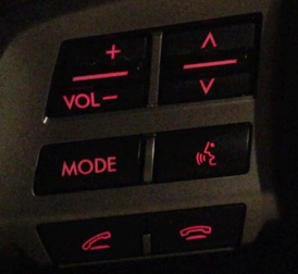
 The image at right shows the steering wheel controls on the left side of my steering wheel. The up/down arrows icon is a toggle switch to quickly change the audio track being played (or the radio station preset); it works great, and I use it all the time.
The stupid comes in just below that, with the face/speaking icon button. This button activates voice command mode, which does many useful things, such as dialing the phone, setting a destination for the nav system, etc. But you can also—you guessed it—use it to change tracks. Here's how that works:
- Press face/speaking icon.
- Wait about one second for the car to say "voice command please."
- Say "next track" or "previous track."
- Listen to car say "track up" (or "track down"), then the track changes.
Now I ask…who is ever going to use this method of changing tracks? The very first thing you do to use it—pressing the face/speaking icon—requires touching the steering wheel. The same wheel where, roughly an inch above that button, is a toggle switch that will switch tracks in precisely one step!
Did they include the voice command track changing features because someone in Marketing said they had to? Did they think there are people who prefer a slower, more cumbersome process to simply tapping a toggle switch? Did they think there are people who need audible feedback about what they've asked the car to do? (Never mind that they get that feedback by hearing the new track after using the toggle button.) Do they think there are a group of people who will use steering wheel buttons but would never use steering wheel toggle switches?
I honestly have no idea why they included the voice command ability to change tracks, but it definitely strikes me as stupid by design…or am I overlooking some really-obvious use that I'm just not seeing?