I've been tracking and updating Apple's financial results for many years, and have a number of charts that I update each quarter. I don't do much with them, other than stare at some of the numbers in amazement, but they do show some very interesting trends.


If you like numbers (really big numbers) and trends and graphs, perhaps you'll find these of interest, too. There are 10 charts in all; click on the first one at right to start the pop-up slideshow. (You can expand images within the slideshow by clicking the icon at the top right of the window. Note that some of these are really wide!)
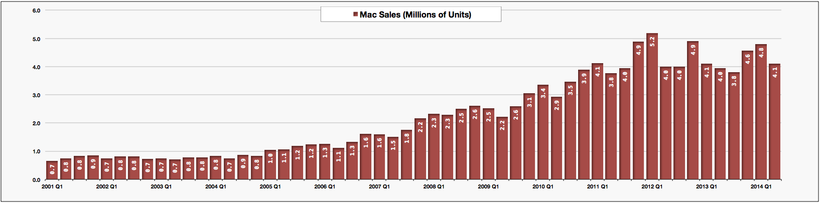
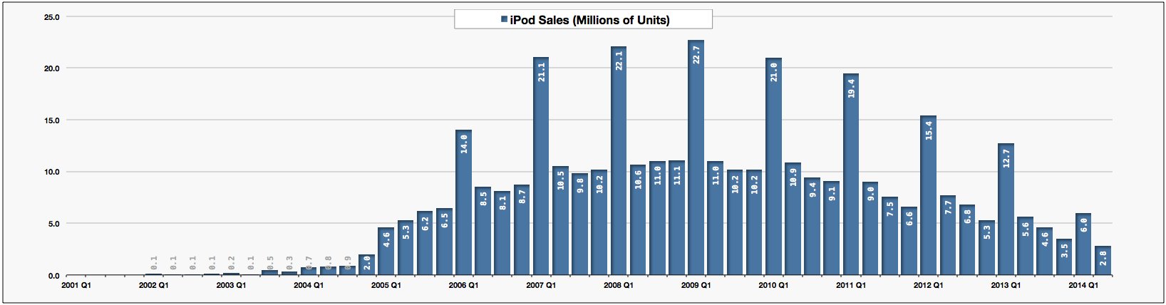
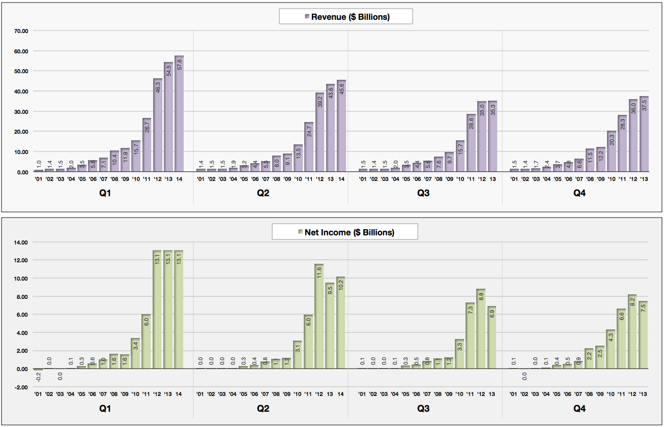
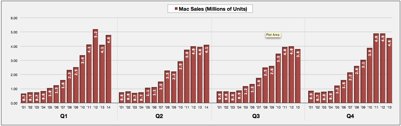
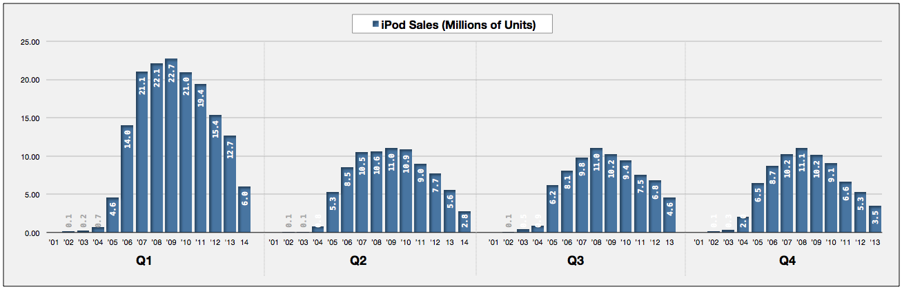
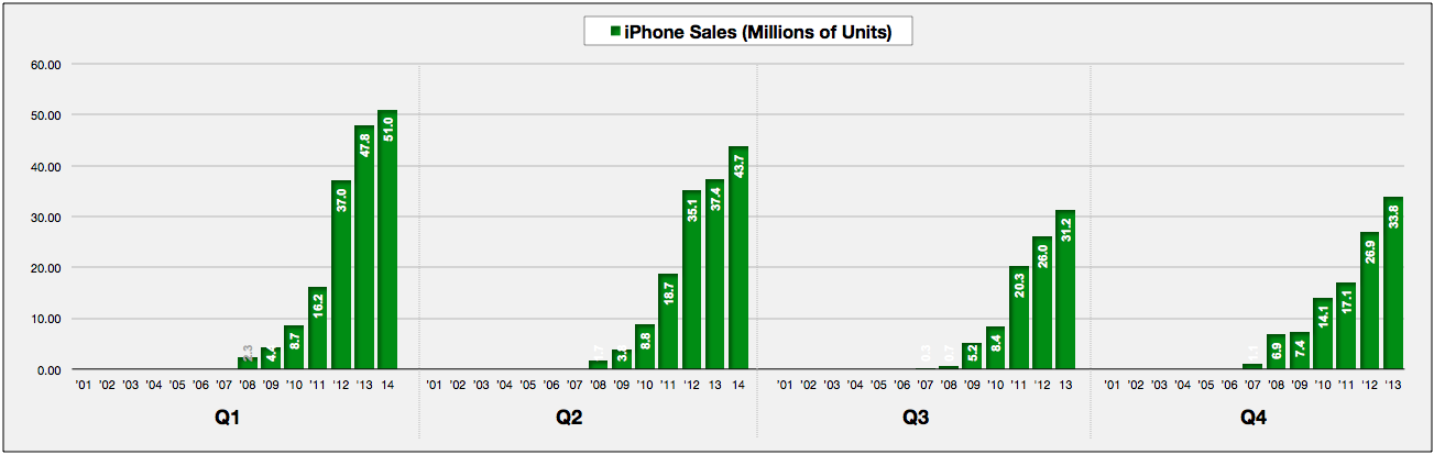
Here's what you'll see, in order: Sales Mix for the "Big Four" products; overall revenue and profits by same quarter by year; iPad, iPhone, iPod and Mac units sold by same quarter by year; and those same four categories by year.
I'll post updated versions each quarter, and like this time, without any financial analysis: lots of people get paid money to discuss and guess on that subject; I just enjoy looking at the numbers.